October 29, 2010

Shelter is completed

My work is done on "Shelter." (For the origin of this quilt, click here; for all related posts, click on "shelter" in the list of labels on the lower right side of the blog page. Double-click on the above and other photos for a clearer, enlarged photo.) "How do I feel, now that it's completed?" two good friends have asked. One of these friends, Mary Beth Clark, did a series of quilts about the loss of her mother, who had died more than 40 years previously, when Mary Beth was eight years old. (For one of those quilts, "The Last Squeeze," click here and scroll down to Episode 39.) "Does is make it any easier, having done these quilts?" I asked her several years ago, wanting to hear "yes" as an answer. "No," she said. So, how do I feel? I feel a sense of satisfaction that the piece is done. It is the most challenging piece I have done in terms of design decisions and construction techniques. The importance of the quilt to me in terms of its meaning is what gave me the steadfastness to persist through the difficulties, to undo and rework when I could see that something wasn't quite right. With this quilt done--with this hope expressed for the sheltering of our son--I can continue on with work on other ideas lined up, other aspects of my grief and loss. Will that line-up ever be at an end? I don't know. I think I hope not. Designing and making these quilts keeps Jeremy present in my heart, in my mind.

As I worked on "Shelter," I also worked on a talk, aimed at an audience of my faculty colleagues at Knox College, a talk about the central place scholarship had in my life for over three decades, and how my live has turned from scholarship to the making of art since Jeremy's death. The center section of this talk is taken from an earlier presentation about quilting, done in 2005, but this new version brings in my scholarship, and also shows the progression of quilts since 2005. I've put the talk into a web version, so that others can read it too: "From Study to Studio: Meaning and Motivation in Scholarship and Art." It was interesting to me to see how much I figured out about the quilts in the process of writing the talk, in particular, that "Loss" and "Shelter" are closely related through their color palette, as are "Pine Grove" and "Landscape." It seems unlikely that I wouldn't have realized this as I designed them, or at least when I worked on them, but I didn't. Since the talk, I've thought further about the palettes and their meanings. In "Loss" and "Shelter," t
he inclusion of the very strong complementary colors of orange and blue contributes a kind of vibration that refers to the vibrancy of life--life lost, and life hoped for. In contrast, the analogous palette used for pinegrove/landscape with its much lower level of contrast is fundamentally "quiet" and represents the refuge I need from the loss. So maybe one of the deep attractions of quilting is this immersion in color, which has such a direct link with emotions--even if I'm not thinking about it explicitly while we design/sew.

Here are some detailed shots from "Shelter." Color variations are due to different attempts to get the color correct. The full view of the quilt above probably is the best representation of the colors. Details of stitching are best seen with double-clicks on the shots below. The quilt top was done with a combination of machine piecing and hand-appliqué. The quilting was all machine-stitched in the ditch. Some photos show the appliquéd join between the tiers of color.


Most of the fabrics are commercial batiks, but there are also quite a few silks and the occasional piece that I painted or dyed myself.
In the turquoise, blue, and red-orange sections, the complexity of texture is created through variation in value (dark/light) and to some extent by hue (e.g. turquoise/green). In the black section, that didn't work, as mixing in a lot of gray diluted the sense of "blackness" that was important to the me. I used some batiks that had an element of blue or green, but to get more variation I needed to move to texture: velvet, satin, brocades.

At the end of a conversation with the new rabbi at our congregation, during which my husband and I talked with him about our lives in the wake of Jeremy's death, I asked, "Is there a prayer for someone with a broken heart." He replied, "The Hasidic Rabbi Menachem Mendel said, 'There is nothing more whole than a broken heart.'"


May Jeremy find shelter in the open arms of all who loved him.


Fusing with Frieda Anderson

My local quilt guild hosted Frieda Anderson last week. I took both of her workshops, one on free-motion quilting and one on fusing. Our guild is lucky to have as one of its members Jean Lohmar, who regularly wins national awards for her superb machine-quilted quilts. Jean regularly offers classes for the guild, and all I knew to this point was from her. I know it's good to learn from more than one teacher, so I signed up for Frieda's class, and am glad to have learned new tips and gotten ideas for some contemporary-style quilting. The fusing class was the big surprise. I took it only because Frieda was here in town, and because I know it's good to try out techniques/styles, even if you think you won't like them. I don't know that this workshop will have the same impact on me as the similarly-motivated class I took with Suzanne Marshall in 2004, which so enriched my life with the addition of hand-appliqué, but I can think of a couple of projects I've had in mind for which fusing would make construction a great deal easier. After the many months of the very challenging construction work on "Shelter," it's probably not a bad idea to give myself something a little easier for the next idea-centered quilt. It might also work to do a fused version as a first step, and then a pieced or appliquéd version after that.

The quilt above (about 17x17") is a version of Frieda's "Laughing Leaves" quilt. I'm more interested in geometric shapes than organic, so I put in squares and rectangles instead of leaves. You can see the obvious influence of Melody Johnson's work as well, another member of the "Chicago School of Fusing." Below is a detail of the quilt. Click on any of the photos for an enlarged view that will allow you to see the stitching. Following Frieda, I've stitched "in the ditch" around each design element. This is for the sake of appearance only; the fusing alone holds down the pieces. This is fine for wall pieces; if you put a fused quilt through the wash, the pieces would stay fused down, but the edges would fray.


And here's a little piece (5x6) that I made with scraps:

Thanks Frieda!


September 11, 2010

Quilting Shelter

I've been working on quilting "Shelter" for about a week now. (Click on the image for a closer-up view.) I want to highlight the complexity of the piecing/applique as it is, rather than add more complexity through the stitching, so I am quilting entirely with in-the-ditch quilting. For the non-quilters reading my blog, this means very careful stitching directly in the seam line. If done precisely, the stitching is almost invisible, as it sinks into the "ditch" of the seam. It's a kind of quilting easier done by hand than by machine, but hand-quilting is not an option for me right now because of the pain and numbness I've had in my hand. (I've gotten a good deal of relief from several weeks of occupational therapy, but I still need to be careful.) So, I'm doing the quilting by machine, which means very slow, careful following of lines. It needs every ounce of my attention--I found that I couldn't even have quiet piano music on at the same time. It feels like a kind of prayer. Given that the inspiration for the quilt was itself a prayer, this is a welcome experience. (Here's a post that describes the origin of the quilt.) This method of quilting is also giving me an extended stretch of time to spend very close up to the texture of the quilt, which I'm happy for. It will be hard to let it go.

I was worried that I would have difficulty where each tier met--that the quilt might pucker up at those three large seams as I sewed the seams interior in each tier. But I pin-basted very carefully and closely, and have sewn the large seams first, then doing the interior seams throughout each tier (about 3" apart). No puckering! My thanks to master quilter Jean Lohmar, who helped me think through the quilting.

August 28, 2010

Screen-printing and batik workshops


I'm back home from a couple of days of mixed media workshops in Chicago. I did two workshops; the first was on Thermofax screen printing taught by Pokey Bolton, and the second was on soy wax batik with Melanie Testa. For the screen printing workshop, we were able to send an image in advance, so at the workshop we each had a personal screen to work with, as well as other screens that Pokey brought with her. I sent in an ink drawing:

In my favorite piece, I printed it in two different directions, overlapping.

Do double-click on these images for a much better view. The photo at the top of the entry is a detail of this wider piece. I like it. I may just mount it as is and put it on the wall. I like the process of printing quite a bit. One quilt I have in mind includes some repeated words/phrases. Printing might be a good way to get them onto fabric.

And here are a few of the many small pieces I did in the batik workshop. The first was one of several I did to see if I could get fabric usable for my quilts dealing with stones; the wax was applied with a paint brush. Yes, the resulting fabric works, though straightforward painting might do just as well, with less trouble.


The next one was done by first using paint to stamp black triangles onto the white fabric. Then I put wax down in larger triangles and painted all with black. (Thanks to Melanie, who gave me a mini-lesson on varying scale in pattern design as I was trying to figure out what to do after the small stamped triangles.)

This next one was an experiment to see what I could do with a pattern like the one I used in the screen-printed piece, created here with a tjanting tool that allows one to "draw" in wax. The blobby squiggle came from turning the tool upside down by mistake.
And a last one--this one was to try out red and black together, playing around with a potato masher (the parallel lines) and a ravioli cutter (the squares). Another quilt I have in mind involves red and black, and it could be that batik (or printing) would be one way to get to the image I want.

So, I had fun learning a couple of new techniques, with the guidance of two excellent teachers, and there's a chance one or both of these will be of use in future quilts. Before the summer comes to an official end, there's one more technique I want to try out--painting with thickened dyes (rather than the acrylic paint I've used before). More complicated, but different results.


August 14, 2010

The best iron ever

Quilters are always on the search for the best iron. For regular sewing on the ironing board, I use a Black & Decker Digital Advantage and am happy with it. But if I'm ironing more than a small length or two of fabric, I turn on my Ironrite mangle ironer. It is a joy to use--both because it irons yardage quickly and beautifully (I can't imagine ironing dyed yardage without it) and because each time I sit at the machine, I think about my mother. My mother would wheel the machine into the kitchen when it was time to iron. She used it not only for sheets and tablecloths, but also for my father's shirts. She was delighted, though, when cotton/polyester blends eliminated the need for her to iron, and when she and my dad moved to a condo, the ironer was stored in the basement. She would have given it away, but I said I was interested in it. I wasn't a quilter then, but I like linen table cloths, and my mother and her sister had both given me all of theirs, as they were happy with permapress replacements. Ironing a linen table cloth by hand is really tedious, though, so I didn't use the tablecloths very much. When my parents died in 2003 and we emptied their condo, the Ironrite came to me. By that time, I was also quilting, and I use it regularly. Nothing like it. I'm guessing this one was purchased in the 1940s (my parents married in 1942), and it is still working fine. They are no longer made, but can sometimes be found online. For a website with information: http://hubpages.com/hub/Ironrite_Mangle_Ironer
And if you're interested to see how the ironer works, check out this great promotional video from the 40s: https://archive.org/details/MakingaN1946_2
The video begins with the fancy stuff (helps me remember how my mother did my father's shirts), but for the demonstration of ironing flat yardage, fast forward to 6:30 for sheets (you wouldn't want to fold up the material first like this, but you'll see how the general process works). Don't miss the scene at 7:37 of what happens with the sheets. Then keep watching from 7:57 to see her do a tablecloth (no folds--this is how I do yardage).

Here's the machine closed up. My mother put some gray contact paper on top--she used that surface for folding laundry.

I like the company logo:

August 8, 2010

A week of work

Here are the results of a week of fabric dyeing, six separate sessions and about 40 half-yard pieces of fabric. I'm pleased with the results--both in the fabric created and in the figuring out of a personal routine for the process of dyeing. I've had enough success to feel confident about doing more, and I usually understand why one or another piece missed the mark.

My main focus was to create fabric for a quilt version of a pastel piece I did a couple of years ago at a mixed-media workshop at Arrowmont (each rectangle is a 9x12 piece of pastel paper, covered with layers of pastel):


(More on this workshop and other non-quilt work produced there in this post, on another blog I contribute to.) Here are the fabrics most likely to go into the quilted version, two different shots:


I think I'm going to try one version using the fabric just as it is, and then another version in which I add painted layers to the rectangles, to get more variation in hue/value across each piece.

Along the way, I also created the beginning of a stash of hand-dyes for further quilts in the "Pine Grove" palette, which is close to the landscape palette, but more far-reaching. So, happily, virtually everything that is rejected for the landscape project can be included in the pine grove pile. Almost all of these landscape and pine grove fabric pieces are flat-dyed solid (as explained in the previous post). I also did three pieces of grey mottled fabric in a value parfait (according to Ann Johnston's instructions in
Color by Accident), intended as fabric for stones:

And I tested out a couple of small pieces of linen (flat-dyed solid) to use as background for appliqued stones. (Double-click to enlarge, so you can see the texture here--quite nice!)


Now I plan to take a week off from dyeing. I'd like to cut rectangles for the landscape quilt, to see if I need other greens, and I'll also select further colors for the pine grove palette, adding in a variety of teals, some bronze-reds, and more gold.

August 4, 2010

Back to dyeing

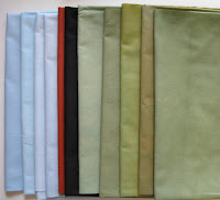
High on the list for this summer has been to get back to dyeing fabrics. As August rolled in, I knew I needed to get going on this, to take advantage of the hot weather while it's here. I reviewed my notes from Carol Soderlund's great workshop that I took in April of 2009, wrote up step-by-step notes for myself, and began. I'm starting out with colors that I'd like for a midwestern landscape quilt (a fabric version of an earlier piece I did with pastel on paper) and also to build up a supply of fabric in the palette for further Pine Grove quilts. The results from the first two days are above. The three greens on the right are all the same dye formula, but with different methods for the dyeing. Not all the colors turned out to be exactly what I was aiming for, but comparing them to the one-inch samples I was working from (sample book from the workshop), I can see that this is because of "misreading" the color from the small sample. Two pieces of the green were done in a traditional low-immersion method, but the 3rd green piece and all the other colors I did with a flat-dyeing method from Robin Ferrier, which is easier for doing multiple pieces in different colors, and also easier on my hands (I'm trying to rest my right hand because of pain from too much hand-sewing). Both methods yield solids, with very slight variations that are pleasing rather than "defective." The pieces that were flat-dyed were consistently lighter in value than the sample swatches, so I'll just take that into account in the future.