Showing posts with label stones. Show all posts

May 12, 2016

Change of direction


Back in early March, I started working on a final quilt in my series about loss, one that would focus on stones, and would include some kind of imagery of stones; see this post on the design, and then two more posts on dyeing, discharge, and stitching trials for the stones, here and here.   Then I had a chance to get some productive critique of the work when meeting with quilting friends in Chicago, and the work has gone through significant change since then.  I realized that I wasn't really interested in the kind of rectangular patchwork background that I had been working on, but rather on the stones themselves--they needed to be the central focus.  When something isn't working, it's a relief to figure out what's wrong!  Here's where my thoughts have been going since. . .

About ten years ago, I made a small piece, with the light gray area the size and shape of the headstone on my son's grave.  The idea behind the piece had to do with the Jewish practice of leaving a stone on the headstone of a loved one when visiting the grave.  I thought I would quilt stones into the narrow, dark gray band.  


Around the time I was working on this piece (2007), my friend Mary Beth came for a visit to Galesburg, and we went out to the cemetery.  Mary Beth did a couple of small, rough sketches, thinking about adding in stones, and maybe cropping the composition.  


I was moved by the drawings, but also was more drawn to abstraction.  I thought that even quilting in stones would detract from the abstraction of the composition.  Yet the piece felt incomplete without some gesture of stones, and I never proceeded further with it.  It's been folded up and put away for a long time. 

But now, having finished the piece on "Holiness," in which I aimed to capture something of the essense/nature of the stones placed on graves, I realize that I want to confront the stones "face to face."  In "Holiness," I worked with color.  For the final piece, I will come back to shape.  I took out the small gray/blue piece and decided the first thing to do would be to increase the size, and to also draw stones placed on top of the grave, so going back to Mary Beth's drawings.  I knew the stones would need to be larger than the small ones I actually put on the grave, but I wanted to keep them about the size one could still hold in one's hand--somehow that seemed important to me.  So, starting with stones that size, the whole composition ended up about 36 x 60.  Here's the sketch on newsprint:
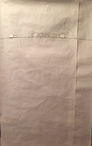

But even though this is about twice as large as the gray/blue piece, it still seemed too small to me.  I made a leap and started sketching larger stones.   


Finally, I drew with the sweep of my arm, rather than my hand.  I'm down to two stones; each of these is about 36" wide.  It feels like I'm going in the right direction.  I like the idea of limiting it to just two stones, with the suggestion of more of the headstone to the right and below.  (There will be more space at the bottom--I'm not sure how much.)  It feels like David and me, visiting Jeremy's grave. 


Next steps:

  • work further on the shapes of the stones
  • do stitching trials for the stones--I'm thinking these will be "drawn" with a single line of stitches.  But I could switch gears and do these as large appliquéd shapes.
  • decide whether the top of the headstone will be indicated by a seamline between two slightly different colored fabrics (a light and light-medium gray), or whether it will just be a stitched line
  • decide on fabric (I've dyed light gray samples of a number of different fabrics; I'm thinking of using linen, either for the whole thing, or for the bottom piece if seamed.)  

And some influences: the work of Karine Léger (so beautiful) and this by Ellsworth Kelly.


April 8, 2016

More trials

I did more trials this past week, collected below:


Some are pretty awful (like the large piece done with deconstructed screen printing in top left); others are better.

stamps with Cleanline resist on gray cloth

Thiox discharge on gray cloth
Using stones themselves as a resist, suggested to me by Beth Berman.  I love the results, but not sure they're right for this particular piece.


Flour paste resist on white cloth with black thickened dye 
Stitching trials (done a while back in a workshop with Dorothy Caldwell
After all these trials, maybe I'll go back to stitching.  Still thinking. . .

March 31, 2016

Dyeing and discharge trials for images of stones

I'm back to working on the large quilt having to do with stones.  In my previous post on this quilt, I mentioned being unsatisfied with the composition of rectangles.  I have played some with that, but it's still unresolved.  I decided to work on another aspect, and come back to the composition later.  As indicated on the sketch of the quilt, I plan that some of the rectangles will contain some kind of images of stones.  This past week, I've done a number of trials, using all the surface design techniques I thought might yield the kind of gestural, abstracted image I'm thinking of.  Here are the results, with techniques listed below the image.  (The details about all this are as much for my own record as for other readers--feel free to skip over them!)


·       flour paste resist, drawn into and then discharged with Thiox
·       flour paste resist, drawn into and scraped with thickened dye
·       thickened dye, stamped on
·       clear print paste used as a resist, then scraped with thickened dye

·       monoprint with thickened dye
·       Color Magnet, painted and drawn
·       thickened dye, painted and drawn
·       Thiox paste used to paint and draw

·       Cleanline resist used to paint and draw


I started out with the intention of using line drawings, and thinking that the flour paste resist would give me the best results.  But I tested out painting and stamping more solid images as well, and am very glad I did, as I think those gave the best results.  Here are the ones that I will be following up with more trials:
Cleanline resist, painted onto light gray fabric, overdyed with medium gray, LWI [low water immersion]

Jacquard Color Magnet, painted onto white fabric, then overdyed with medium gray

Thiox discharge paste, painted on.  When I do further trials, I will cut off the discharge process sooner, for a less opaque result.

Thickened dye, painted onto grey fabric.  The monoprint images were very similar to this.

Thickened dye, stamped onto gray fabric.  I diluted the color too much, but definite possibilities using stamps.

Four years ago, in a workshop with Carol Soderlund, I made a number of stamps with shapes of stones.  Towards the end of my trial process this week, I remembered I had these somewhere, and dug them out.  Very glad I did.  In further trials, I will use these with discharge as well as with different concentrations of thickened dye.  Below are stampings I did at that 2012 workshop.


I am excited by these results and look forward to further trials using these selected techniques.  The discharge option is the trickiest, as the color the fabric discharges to varies according to the exact dye applied before the discharge.  I'll also have to keep better track of the concentration of thickened dye that I use for the painting/stamping processes.  Sometimes a quilter has to behave like a lab scientist!

March 9, 2016

Progress on "Holiness" and another quilt about stones


Holiness is now basted and the hand-quilting has begun.   Hand-basting on the floor took about a week.  Now that that's done, I can begin on the next quilt about stones.  I can only hand-quilt for about 30 minutes each day (to prevent injury to my hand,) so that gives me lots of time to work on another quilt.

Here's a small sketch I did a while ago, a quilt that would include some drawings of stone shapes, probably done through scratching into flour-paste resist, but with other methods also possible (direct drawing with thickened dye, monoprint, discharge, etc.)  I was thinking of an arrangement of the stones that would recollect the way stones are lined up on a gravestone.  When I showed the sketch to a friend, she said it reminded her of the layout of a cemetery--all the better.  (Thanks Louise!)


I'm thinking of this as a large quilt, about 70x80.  I redid the sketch, re-drawing to eliminate overlap in the rectangles, and then tried folding up yardage to size and putting it up on the design wall.  Very difficult to work with.  Then I put the drawing into Photoshop, and filled in spaces with different values of gray.  That got me further, but I decided it would be better to do a small maquette with actual pieces of fabric rather than continuing on the computer.  You can see a couple of results below. These are about 15x18."  I cut 3" strips from the various grays I thought I'd like to use, and then cut them further to size.  In the first trial, I used a range of values from light to dark, but with a preponderance of medium values.


I did several more versions, concentrating more and more on the medium values.  Below is the 5th iteration; mostly medium, but keeping one light in the corner and a few somewhat darker.  This is getting closer, but I'll try another step towards a narrower range of value, all medium.


Then I'll work further on the composition--I'm not satisfied with the relationships between the shapes. I'll start by tweaking the design I have, but I think I'll likely end up starting over again.  Having the range of values set may help me rethink the composition.

And not everything I've been working with is gray!  I'm just finishing up a hamsa for a friend who is in the middle of chemotherapy.  A hamsa is an amulet commonly found in Jewish and Middle Eastern cultures.  This website has many nice images and some explanation.  This hamsa is a little smaller than my own hand.  I enjoy doing the embroidery, and keeping my friend in mind as I sew.


I'm thinking I will face it with another piece of cloth, cutting it into the hand shape--like this one I bought years ago and carry around in my purse:


And here's another one I made for a group quilt, put together for another friend undergoing treatment for cancer.  The Hebrew word in the center is "Chai"--life.


February 13, 2016

From "Stones" to "Holiness"


In the last two months, I've spent a lot of time in my basement wet studio, dyeing many gradations of different grays.  After the first set of gradations, which went from dark gray to very light, I found myself especially drawn to the very lightest of values.  (The photo above shows scraps from the fabrics that were eventually cut into blocks.)  So, already having narrowed from a palette of neutral stone colors to gray, I found myself narrowing it further to very pale grays.  This inclination of my eye and heart led me to an understanding/decision about the aspect of the subject--stones--that I was moving into:  the quality of holiness.  The original commitment to stones as a subject goes back to the experience of the Jewish practice of leaving small stones on a grave.  I've thought about why one would leave a token of a visit, and why stones serve so well as such a token.  I've been drawing stone shapes for many years now, thinking that the beauty of the shapes would be the focus of a quilt--and it may yet still be.  But I also wanted to work abstractly, extracting from the stone as an object something of the quality that so draws me to it.  As I puzzled over my attachment to the pale gray fabrics, the idea of holiness settled into my mind.  The holiness of the place where the stones are left--the cemetery itself, as well as the grave of a loved one--and the holiness of the relationship--of the love, of the attachment, of the grief--that is embodied in the gesture of leaving a stone.

I had been thinking for a while about a composition that would be very similar to an earlier landscape quilt, "Late March."  I had adjusted the proportion of the rectangles to be more suggestive of the actual proportions of random stones--they would be 9x11" rather than 9x12".  But once I found the new subject of "holiness," rather than "stones," that seemed too small, and I scaled up the blocks to 14x17.  The final composition is 85 x 70." As I chose the colors and decided on the layout, I had these qualities in mind:  quiet, secure, solid, protective, encompassing.
"Holiness" [photo from August, 2016; unquilted cloth stretched on a wood frame]
Most of the quilts I've made in the wake of my son Jeremy's death--quilts like Loss, Shelter, Regret, and Accident--have been exhibited and then rolled up and put away--they are not meant to be used or hung on display at home.  But this one I can imagine actually using as a quilt.  It won't be for a while, though, as I plan to hand-quilt it, which will take some months.

This last photo is for those who are interested in details about what dyes I used.  Unmarked squares are from dyes I mixed myself from primaries; one other one I mixed is identified as "Carol's black"--the formula known to anyone who has taken a dyeing class with Carol Soderlund.  The 600-numbers are pre-mixed blacks from Pro Chemical and Dye; the "Black CWNA, Dark Black, and Black Bang" are from Custom Set Procion Dyes.  The second number is the DOS (depth of shade), where .03 DOS means 0.03% (or 0.0003 of weight of goods).  The orange that I mixed with one bluish black is a primary from ProChem, "Strong Orange."  Not shown here are the samples that I didn't use because they leaned too much towards green, blue, or brown.


December 21, 2015

Dyeing more neutrals for "Stones"

My first blog post on stones was written in April 2009, so I've been thinking about this subject matter for a long time now, and have tried out a variety of approaches with small-scale tests.  But I haven't yet found the method/composition to settle on for a large-scale project.  Back in September, I thought through directions I could go, and came up with eight possibilities, and am especially eager to explore two or three of them.  Now that Accident II is finished, I'm able to give full attention to developing these projects.  For any of them I will need a large supply of fabric dyed in appropriate colors.  Here's my supply of neutral-colored hand-dyes, as of January 2014, when I did a systematic dyeing of gray, taupe, tan, and cream, described in this post.


I'm especially interested in using gray, and I don't have enough range of hue.  I did some dyeing last week to explore other grays.  In the photo below, the top row is a color recipe that came out gray when I dyed it two years ago; I repeated it to get a gradation of values.  But this time it came out tan rather than gray, either because of the age of the dyes (a few years old), or because I made a mistake in measuring.  Oh well, a nice tan to add to my drawer.  The second row is a value gradation done with a new gray dye powder that is a pure color, which is unusual.  Generally, both brown and black (and from them, tan and gray) are made from a mixture of three primaries: red, yellow, and blue.  But this new product is just one color by itself, which means it will never split into the component colors as some of the mixtures can tend to do.  It is also a nice neutral gray, which is not easy to achieve with mixtures.  The bottom row is an array of six premixed blacks (from Prochemical Dye), diluted into the gray range, compared to a 7th (on the right), which is a recipe from Carol Soderlund.  I'll do a value gradation of the most promising of them.  For the dyers amongst you, I've listed the numbers of the ProChem blacks in the caption.  Added to the grays I figured out from the dye run two years ago, this should give me enough of a range for the project.

Bottom row, from left, Prochem #628, 629, 604, 610, 610 plus 1/6 the amount of Strong Orange, 602A, Carol's black.


And here are the results of testing out a variety of fabrics for hand-dyed napkins.  These are all as they emerged from the dryer, as I want to use a fabric that does not necessarily need ironing.


From the left:

  1.  Kaufman Patina, 100% cotton, done as a control for color uptake, as I know it dyes very well.  It also came out of the dryer with few wrinkles.  If I end up using cotton, I will likely go with this, rather than the Roclon Nature's Way muslin I used in earlier trials.
  2. A linen/rayon "hopsack" blend from JoAnn Fabrics.  Good color uptake, and not badly wrinkled, but probably too heavy for a napkin, and the edges frayed badly.
  3. A linen/rayon blend from Dharma Trading Company.  Less color uptake, pretty wrinkled, and fabric is not as soft as I would like for a napkin.
  4. A linen/cotton blend from Dharma.  Poor color uptake, but everything else is good--not wrinkly, feels soft, heavier than cotton but still very nice for a napkin.  It will be difficult to get dark colors with this one.
  5. A linen/rayon blend from JoAnn Fabrics that has an embroidered pattern sewn into the cloth.  Good color uptake, but wrinkled the most of any of them.

So, I'll likely use Kaufman Patina or the linen/cotton blend.

August 11, 2011

Pine Grove/Stones


The making of this quilt goes back more than two years. Here's the story of the front.
And some details:

Both top and back have been finished for close to two years, but then I couldn't decide how to quilt it. I considered many different approaches. After finishing the simple straight line quilting a few weeks ago on the half-square triangle "Magenta and Friends," I realized something that simple would also be a good solution for this quilt. It took me a while, but I think this was a good decision!

Here's the back of the quilt. I had to line up the quilting by the seams on the front of the quilt, and I was worried about how they then wouldn't line up precisely on the back. They don't, but it still looks fine.
More of the story about the back continues here.

Some details: First, one of the blocks from the very beginning:

And here's an example of the larger stones sliced up--this may be my favorite spot in the quilt:

Here's another small quilt that involved cutting up stones.

This quilt is going to my brother, a potter. He has made beautiful ceramic stones.

And here are a few of his wood-fired pots:

I will miss this quilt, but I know it is going to a good home!


July 18, 2010

Small stone piece finished


I finished up a small piece I posted about on May 20. It doesn't look very different in its finished form, because all I did was stitch on the dark gray border, quilt in-the-ditch with invisible thread in some of the interior lines, and finish with a faced binding. Perhaps the border should be quilted. But somehow the starkness of the piece, without quilting, is what I want. The shape suggests a tomb to me.

Here's the back, which shows how minimal the quilting is, and also shows the method of faced binding with curved inner corners that I learned from my friend Mary Beth:


Below is a photo of several of the various things I've done on the theme of stones. The top right is a paper collage, posted about here, bottom left is a piece done with my hand-painted fabric, posted about here, and the bottom right is just a trial, may or may not go further, the stone made from my hand-dyed fabric and the background fabric from Janet Smith. All of them in the vicinity of about 15" wide.

May 20, 2010

A fabric stone collage

Time to catch up, now that teaching and the art class I was taking are both finished for the year. The collage of cut up images of stones that I did for the art class (last post) led to the fabric collage above, made from cutting up "stonescapes" I did a while ago, appliquéing hand-painted fabric onto linen. (You can see one such piece at the top of this post.) The collage is about 8" x 10." I think this is possibly a good direction to go in, accomplishing more abstraction for stone imagery. I'd like to try more pieces like this, possibly piecing them together into something much larger. But I can't go further on this until I paint some more fabric, one of the things on my list for the summer. I also realize that instead of being limited to the one or two appropriate colors of linen that I can readily find commercially, I can dye the linen myself. So that's on the list too, as well as dyeing cotton yardage in a number of colors to have available for a couple of other projects. But first I'm finishing up a simple patchwork quilt that I started as a side treat while grading papers last month, and I'm basting up a small quilt for a hand-quilting project, as I don't have anything right now for those moments when I just want to sit and hand-quilt.

The most daunting summer project is to finish up "Shelter." This will go back up on the design wall before long.

Here are some of the blocks for the patchwork quilt (pattern by HD Designs, "4-Patch Stacked Posies"):

All made from this fabric:

May 6, 2010

New direction - stone collage

Having put aside "Shelter" for a while, I sorted through other projects that have been in the closet, looking for those that would be good to work on in the context of the art class that I am currently taking ("Drawing in the Expanded Field"). One of the assignment options in the class was to take a found image (like a photograph) and change the size and manipulate it into something new. For this piece (12x18), I photocopied photos of stones, enlarged them, and then cut them up into angular pieces, but with each piece having some kind of curved line on it; then I glued the pieces onto gray paper. I like it. I can also see doing something similar with fabric. In fact, this collage method--and even the shape of the cut pieces--is very similar to the colored panel on the left side of the "Loss" quilt. But my teacher is encouraging me to keep experimenting with paper before moving to fabric--to facilitate rapid testing of a lot of options.

I have been wanting to continue my work with images of stones, but to somehow get to a more abstract level. This is one direction that will take me there.

March 16, 2010

Stones-from commercial fabric

In between the painstaking work of piecing the black tier of Shelter, I've worked on this simple quilt top, made from the pile of stone-looking commercial fabric I bought a couple of years ago, when I thought I would be using it for appliqued stones. In a previous post, I described what I eventually did with all the background fabric I had cut up for that project (along with some images of the trial applique blocks that I abandoned). And now this was a way to use the "stone" fabric. (The top is 56 x 73", with each block the size of a brick.) I'm not sure if the stripey black/gray blocks are a mistake, or if they liven it up a bit.

After I thought of doing blocks the size/shape of bricks, I had fun looking up "brick patterns" in a Google image search--certainly many other possibilities adaptable to quilting.

December 24, 2009

Genealogy of a Quilt-2


Back in this post I wrote about a quilt top pieced with rectangles that combined fabric from two ideas--thinking about a pine grove and about stones. Over the last few days I've pieced a back for that quilt. I incorporated the stone-blocks in the back, and decided to slice through the largest ones (that looked more like dinosaur eggs than stones). The photos above show details. Here's the full back:
I like it.