November 29, 2010

Midwestern Landscape: in pastel and cloth

In the summer of 2008, I did a week-long mixed media workshop at the Arrowmont School of Arts and Crafts.  One of the results of that workshop was this pastel work--layers and layers of pastel on 9x12" rectangles of paper.  I was working with an idea I had long had for a quilt about the midwestern landscape in late March.  I like this work quite a lot; it hangs on the wall in our living room.  

One of the important results of the Arrowmont workshop (where I also did some work with water color) was that it gave me confidence that I could mix colors in order to get the vision of color I wanted, which led me to learn how to paint fabric and to take a workshop on fabric dyeing.  This past summer, I finally got around to dyeing fabric for a quilt version of the landscape.  I haven't yet quilted it--still thinking about what to do--but here's the top (each block is again 9x12", total dimensions 45x60"):

And here's a table runner that I made this weekend, with smaller blocks, 3x4, for total dimensions of 12x44" 

For the back and binding, I used some sage-colored Kona fabric that I overdyed with greens and brown.

I quilted with random, narrowly spaced wavy lines, which I like.  Perhaps this would work for the larger version as well.

Looking at a detail of the front, you can see one problem with the quilting--the right/left edges of the blocks have gotten distorted out of line by the quilting.  Some people recommend quilting the lines all in the same direction to avoid this.  Others recommend alternating directions.  I tried both ways in a sample, and got distortion with both methods :-(   One other thing to try is even more meticulous pin-basting than I already do, perhaps taking care to pin right in the seams.  If anyone has suggestions for me, I'd love to hear them!


November 26, 2010

Another blog for recipes

Following the example of Kathy Loomis, whose quilts I admire, I've started a second blog about cooking, focusing on favorite recipes.

November 15, 2010

More on abstract expressionist art

Lee Krasner, Untitled, 1949. . . and me (photograph by Kay Mathew)
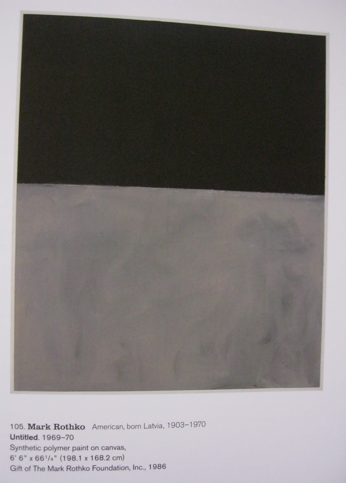
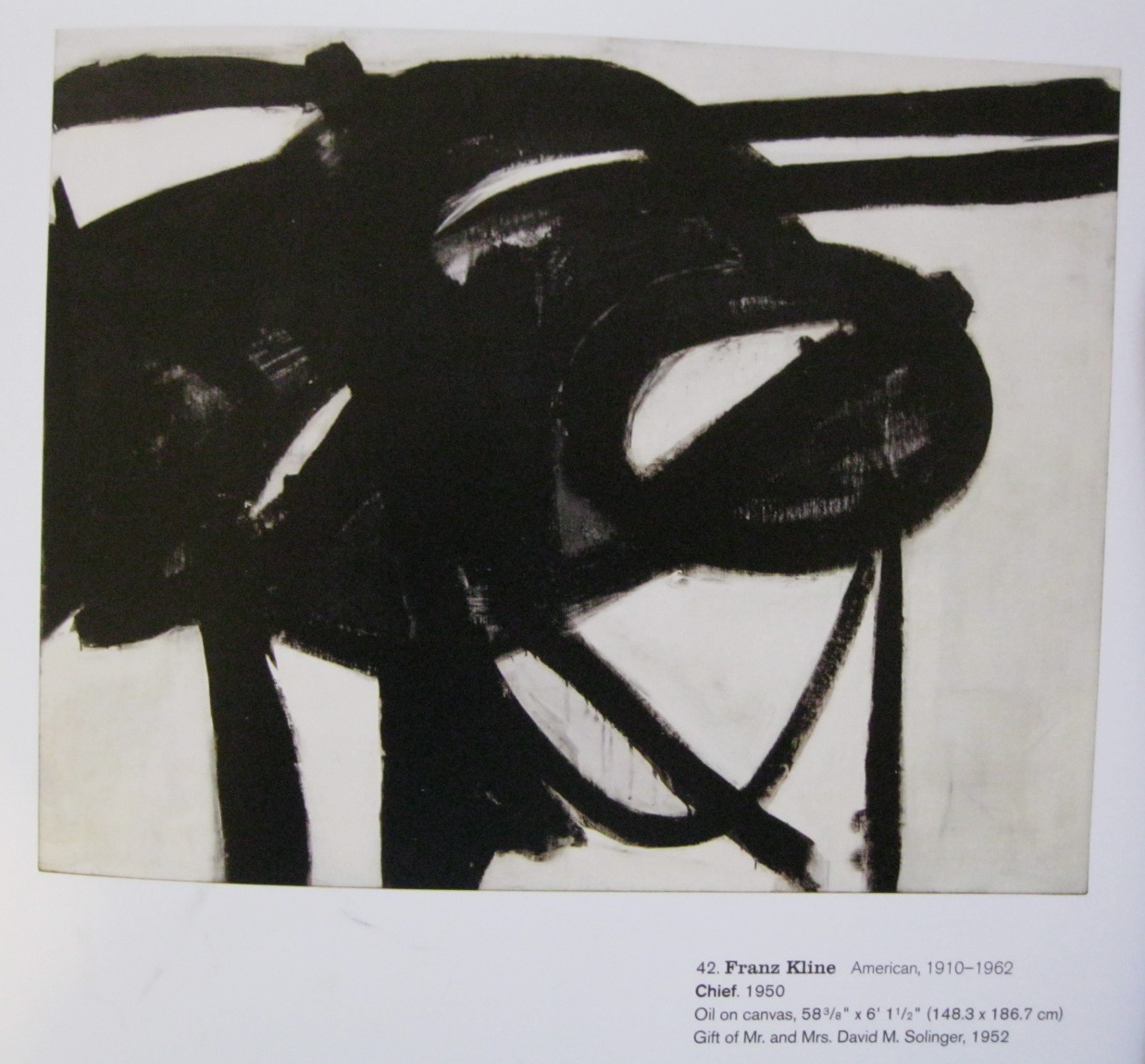
I mentioned a few days ago that I recently went to the exhibit of abstract expressionist art at MOMA.  There was so much in this exhibit that I responded to.  Some by artists I already knew and loved (Mark Rothko, Clyfford Still, Joan Mitchell, Franz Kline, Louise Nevelson, Hans Hoffman), some by artists I knew of, but had not seen work that moved me as some of the work in this show did (Barnett Newman, especially his etchings, Robert Motherwell, Lee Krasner), and then some artists I didn't know of at all (Adolph Gottlieb, Grace Hartigan, Bradley Walker Tomlin) and photographers too (Aaron Siskind, Harry Callahan).  The narrative/analysis that accompanied the art works was also unusually helpful and illuminating.  Two interrelated characteristics of much of this work were clarified for me:  the use of a grid, and the use of invented forms as a kind of language.  "The artists used the structure of the grid to compose paintings that provide compartments for the individual signs.  Gottlieb wrote, 'One can say that my paintings are like a house, in which each occupant has a room of his own.'"  Food for thought for a quilter. . .  The Gottlieb painting that this quote was next to was my favorite of his in the show, but the only image I can find is this black and white photo documenting a show in 1969 (from the exhibition catalog, Ann Temkin, Abstract Expressionism at the Museum of Modern Art, 2010); the Gottlieb is the painting on the right in the foreground. (I'm not sure if it's OK to put these images from the catalog on the blog.  I've noticed that in many quilting blogs, people put up images from books they like--people who seem to be careful about copyright when it comes to the quilts themselves.  If someone lets me know that I shouldn't have these photos up, I'll remove them from the post.)

The Krasner painting at the top of this post is another example of a grid with signs.  As my friend Kay captured in this photo, I looked at this painting a long time, and kept coming back to it.  From the museum signage:  "Krasner invented a language of private symbols that implied but did not specify meaning. . . .  These invented forms evoked the spirit of language without literally constituting it."  I have been collecting images of such private languages for some time.  I would like to make my own.  I know what I have to say, but I have not found the forms.

Some other examples of work from the show that I loved, these all from the exhibition catalog:
Motherwell, The Little Spanish Prison (pl. 2)


Mark Rothko, No. 1 (Untitled) (p. 39)


Mark Rothko, Untitled (pl. 105)


Franz Kline, Chief (pl. 42)


Clyfford Still, 1951-T No. 3 (pl. 65)
Joan Mitchell, Ladybug (p. 77)


Grace Hartigan, Shinnecock Canal (pl. 78)


Adolph Gottlieb, Blast, I (pl. 79)
And here are four of the wonderful Barnett Newman etchings--not in the catalog, but taken by Kay.  Each etching is quite small, perhaps 4x6", but done on a much larger piece of creamy paper.  These are all from a collection of 18 etchings, called Notes.


November 14, 2010

What's next?

Having sketched out some ideas for "Regret," I'm going to put that idea aside for a while. I wanted to decide which idea I would work on next, and this is probably it. Now I can leave it in the background, and keep thinking about it, while I go on to work on some simpler things.

I've started a wedding present for Peter and Maya. I showed them a number of options, from which they picked Elizabeth Fransson's "Mod Mosaic" pattern. They liked the colors she used, while suggesting that I add in orange and maybe a grayish brown. Above are three blocks that I've done as samples; the one on the left has browns, the two on the right have gray. (Clicking on the photo will show you details of the fabric.) These blocks were done just from fabric I had on hand. Tomorrow I'm making a trip to a good quilt store, and will look for a wider range, including some prints that include white. This will be a fun project.

I also have a number of things lined up that I'd like to finish, projects where the top is done or mostly done, but I have yet to do the quilting. Let's see: two quilts for my brother, a four-patch posie for Kay, a wall-hanging that Kay and I did together (black with bright solids), and a small quilt made with rectangles of commercial "stone" fabric. Then there are a couple of tops for which I've cut the fabric, but haven't yet done the piecing. And I have many scraps from "Shelter" that I'd like to play with--probably to make into postcards, cards, or coasters. So, I have plenty to do until I'm ready again to work on an idea-based quilt.

November 10, 2010

Regret


Here are the first sketches for what I think will be my next "idea-centered" quilt, this one about "regret." These sketches are each about 7"x9", black fabric cut with scissors and trials of different fabrics underneath. (I don't know why the photos on the main page are fuzzy, but if you double-click on the image, you'll get a much better one.) The shapes on the first three pieces were made through spontaneously cutting; in the fourth (on the right), I drew the shape on the black fabric and then cut it out. I think that worked better. I also like the wider shape. I'm directly influenced here by the artist Clyfford Still, whose work I came across a couple of months ago. I was really happy to see a couple of paintings of his this past weekend at the exhibition of Abstract Expressionist art currently at the Museum of Modern Art in New York; here's an image of one very close to one of my favorites. (I strongly recommend the exhibition, which is up through April 25, 2011. Here's a link to a number of the images in the show.)


Next steps? I think I'll pursue the shape in the fourth sketch, trying out other single shapes as well as combinations of shapes within one composition; same for trials of the underneath color. I'm not yet sure if this will be about "regret"--the naming of a particular type of feeling--or about "regrets"--a pervasive, underlying sense of foundations undermined. Perhaps there will need to be more than one work on this theme. And eventual size? I'm envisioning it fairly large, maybe 40 x 55.


October 29, 2010

Shelter is completed

My work is done on "Shelter." (For the origin of this quilt, click here; for all related posts, click on "shelter" in the list of labels on the lower right side of the blog page. Double-click on the above and other photos for a clearer, enlarged photo.) "How do I feel, now that it's completed?" two good friends have asked. One of these friends, Mary Beth Clark, did a series of quilts about the loss of her mother, who had died more than 40 years previously, when Mary Beth was eight years old. (For one of those quilts, "The Last Squeeze," click here and scroll down to Episode 39.) "Does is make it any easier, having done these quilts?" I asked her several years ago, wanting to hear "yes" as an answer. "No," she said. So, how do I feel? I feel a sense of satisfaction that the piece is done. It is the most challenging piece I have done in terms of design decisions and construction techniques. The importance of the quilt to me in terms of its meaning is what gave me the steadfastness to persist through the difficulties, to undo and rework when I could see that something wasn't quite right. With this quilt done--with this hope expressed for the sheltering of our son--I can continue on with work on other ideas lined up, other aspects of my grief and loss. Will that line-up ever be at an end? I don't know. I think I hope not. Designing and making these quilts keeps Jeremy present in my heart, in my mind.

As I worked on "Shelter," I also worked on a talk, aimed at an audience of my faculty colleagues at Knox College, a talk about the central place scholarship had in my life for over three decades, and how my live has turned from scholarship to the making of art since Jeremy's death. The center section of this talk is taken from an earlier presentation about quilting, done in 2005, but this new version brings in my scholarship, and also shows the progression of quilts since 2005. I've put the talk into a web version, so that others can read it too: "From Study to Studio: Meaning and Motivation in Scholarship and Art." It was interesting to me to see how much I figured out about the quilts in the process of writing the talk, in particular, that "Loss" and "Shelter" are closely related through their color palette, as are "Pine Grove" and "Landscape." It seems unlikely that I wouldn't have realized this as I designed them, or at least when I worked on them, but I didn't. Since the talk, I've thought further about the palettes and their meanings. In "Loss" and "Shelter," t
he inclusion of the very strong complementary colors of orange and blue contributes a kind of vibration that refers to the vibrancy of life--life lost, and life hoped for. In contrast, the analogous palette used for pinegrove/landscape with its much lower level of contrast is fundamentally "quiet" and represents the refuge I need from the loss. So maybe one of the deep attractions of quilting is this immersion in color, which has such a direct link with emotions--even if I'm not thinking about it explicitly while we design/sew.

Here are some detailed shots from "Shelter." Color variations are due to different attempts to get the color correct. The full view of the quilt above probably is the best representation of the colors. Details of stitching are best seen with double-clicks on the shots below. The quilt top was done with a combination of machine piecing and hand-appliqué. The quilting was all machine-stitched in the ditch. Some photos show the appliquéd join between the tiers of color.


Most of the fabrics are commercial batiks, but there are also quite a few silks and the occasional piece that I painted or dyed myself.
In the turquoise, blue, and red-orange sections, the complexity of texture is created through variation in value (dark/light) and to some extent by hue (e.g. turquoise/green). In the black section, that didn't work, as mixing in a lot of gray diluted the sense of "blackness" that was important to the me. I used some batiks that had an element of blue or green, but to get more variation I needed to move to texture: velvet, satin, brocades.

At the end of a conversation with the new rabbi at our congregation, during which my husband and I talked with him about our lives in the wake of Jeremy's death, I asked, "Is there a prayer for someone with a broken heart." He replied, "The Hasidic Rabbi Menachem Mendel said, 'There is nothing more whole than a broken heart.'"


May Jeremy find shelter in the open arms of all who loved him.


Fusing with Frieda Anderson

My local quilt guild hosted Frieda Anderson last week. I took both of her workshops, one on free-motion quilting and one on fusing. Our guild is lucky to have as one of its members Jean Lohmar, who regularly wins national awards for her superb machine-quilted quilts. Jean regularly offers classes for the guild, and all I knew to this point was from her. I know it's good to learn from more than one teacher, so I signed up for Frieda's class, and am glad to have learned new tips and gotten ideas for some contemporary-style quilting. The fusing class was the big surprise. I took it only because Frieda was here in town, and because I know it's good to try out techniques/styles, even if you think you won't like them. I don't know that this workshop will have the same impact on me as the similarly-motivated class I took with Suzanne Marshall in 2004, which so enriched my life with the addition of hand-appliqué, but I can think of a couple of projects I've had in mind for which fusing would make construction a great deal easier. After the many months of the very challenging construction work on "Shelter," it's probably not a bad idea to give myself something a little easier for the next idea-centered quilt. It might also work to do a fused version as a first step, and then a pieced or appliquéd version after that.

The quilt above (about 17x17") is a version of Frieda's "Laughing Leaves" quilt. I'm more interested in geometric shapes than organic, so I put in squares and rectangles instead of leaves. You can see the obvious influence of Melody Johnson's work as well, another member of the "Chicago School of Fusing." Below is a detail of the quilt. Click on any of the photos for an enlarged view that will allow you to see the stitching. Following Frieda, I've stitched "in the ditch" around each design element. This is for the sake of appearance only; the fusing alone holds down the pieces. This is fine for wall pieces; if you put a fused quilt through the wash, the pieces would stay fused down, but the edges would fray.


And here's a little piece (5x6) that I made with scraps:

Thanks Frieda!