May 20, 2012

Amy Walsh's "Get in Line" pattern


A few posts ago, I showed four tops in progress on my design wall.  I just finished one of these, a version of Amy Walsh's table runner pattern, "Get in Line," recently published in American Patchwork & Quilting, June 2012.  Amy's version was in silk, a range of blue and green solids--stunning.  My version is a gift for a nursing home resident, for her bedside table, so cotton was definitely in order.  The genius of Amy's pattern is that some of the strips have one fabric only, some two fabrics, and some three.  She suggests improvising size of the portions and placement of the one-piece strips, which I did, but the pattern also includes precise measurements for those who prefer that.  Amy's version used straight-line quilting; I decided to go with a simple (and easy) wavy line in each 1" strip. 

Added 5-21-12:  Here's a photo of Amy's from the magazine:

More patterns from Amy and others can be found at the pattern company she owns with Janine Burke, Blue Underground

If I had been making this for myself, I probably would have used a wider range of color, maybe using small bits of orange/rust.  But the friend I made this for really loves blue.  I brought a bunch of fabric scraps to the nursing home a month or so ago, and she chose the strips she liked.  All blue!  She let me sneak in the one fabric that has a little red in it also, but that was it.

I'm happy with how the runner looks in her room--definitely perks it up.


Here's a detail, showing the machine binding I did, with a zigzag stitch.  I've since done some trials with straight-stitching, and have found a method combining tips from a variety of sources that I think will work.  More on that in another post sometime.

April 18, 2012

"Reflected Wedges" Table Runner


OK, at Lori's request, I'll tell you next about this one of my "four tops."  I was browsing magazines at JoAnn's a couple of weeks ago, and saw this new magazine on modern quilting, a special issue from Interweave Press:

There was one pattern in particular that leaped out at me, "Reflected Wedges" by Jacquie Gehring.


I find the wedge shape very appealing.  I haven't used it much, but I did this one baby quilt a while back that is a favorite:


The wedge table runner pattern seemed a natural for the Marcia Derse fabrics that I've had in my drawer for about a year; most of these are from her "Third in Line" collection.  I bought about 10 half-yard pieces, mostly choosing because of the printed designs, rather than thinking about colors.  Some day, I'd like to do more printing of fabric (have done a little thermofax screen printing, but that's it), and her designs are inspiring.  But with a half-yard of each, there's plenty to use in quilts, while still keeping samples on hand.  I've been collecting quilt patterns designed with Marcia Derse fabric specifically in mind, as well as others that I think would work well.  Jacquie Gehring's pattern, though, made me go right to the drawer and pull some colors that would work together.  I do like how the table runner came out.  (If you'd like to see more of Jacquie's work, go to her blog, or check out her new book (with Katie Pedersen): Quilting Modern)

The table runner went together very quickly.  Thought I'd try another with some Stephanie Brandenburg fabric.  Here's the fabric:

And here's the table runner I got by cutting out wedges:


OK, but not as interesting as I thought it would be.  So I made one more, this one by strip-piecing a lot of scraps and then cutting the layers into wedges:


Not so excited about this one either.  It's possible one or both of these will look better when they're quilted and bound.  But the Marcia Derse one will definitely get done first!

April 11, 2012

Triadic color scheme with black


My sister Cookie asked for more about this quilt first, so here goes!  This is a small top (about 20x25) that will be my contribution to my quilting guild's biennial challenge for our quilt show.  The idea is that the show organizers set a challenge for guild members, some limitation that will determine this one entry.  (Of course we're all encouraged to submit other quilts as well.)  This year the challenge was to work in a triadic color scheme--that is, three colors that are equally spaced around the color wheel, like red-yellow-blue or green-violet-orange.  I had a stack of solids put aside that I built off a palette taken from flowers in my spring garden: peonies, poppies, and sage.
To reduce this to triadic, I took out the deep pink, leaving me with coral, lavender, and sage green for my triad.  So, what to do with these fabrics?  Maybe you'll be interested to see how even a very simple design can involve many steps.

I started with an image I love--something I saw recently at a superb exhibition of contemporary drawings at the Art Institute in Chicago-- a small piece by Marija Vladimirovna Ender, "Color in Space":
I love the simplicity of the swatches of color on a plain background, so my first thought was to line up rectangles, using black as the background, to better show off the light-colored fabrics:

 
Very boring.  Moving the rectangles further apart didn't help either:
 Then I tried wonky squares:

And then regular squares:

Still boring.  Then I changed the scale, making the colored squares much smaller.  This I liked!

So then I just had to play around with placement of the colors, and I threw in a little variation in value also (see photo at top for the final layout).

The next stage is quilting.  I made up a small sample with 3 squares and have begun experimenting. (As always, double-click on the image to enlarge.)

 I used charcoal gray thread here on the black fabric; I may switch to black.  I may quilt each small square with something different, or all the same, or I may leave them unquilted.  Then there will be a decision about binding: black? one color? three colors?  Decisions, decisions. . .

And since I'm on the subject of challenge quilts, here's the one I did in 2008:

This is 18x27 and hangs on the door to my studio.  The challenge in 2008 was to work in pieces of three fabrics handed out to you--I know the pink was one of them, and probably one of the greens and one of the blues.  I used this as an occasion to try out some improvisational piecing, which I'd done very little of, and also some contemporary quilting designs, varying them across the space.  

This was the first piece I quilted where I actually enjoyed the machine quilting part, so it was a very successful challenge!

April 9, 2012

Four Tops

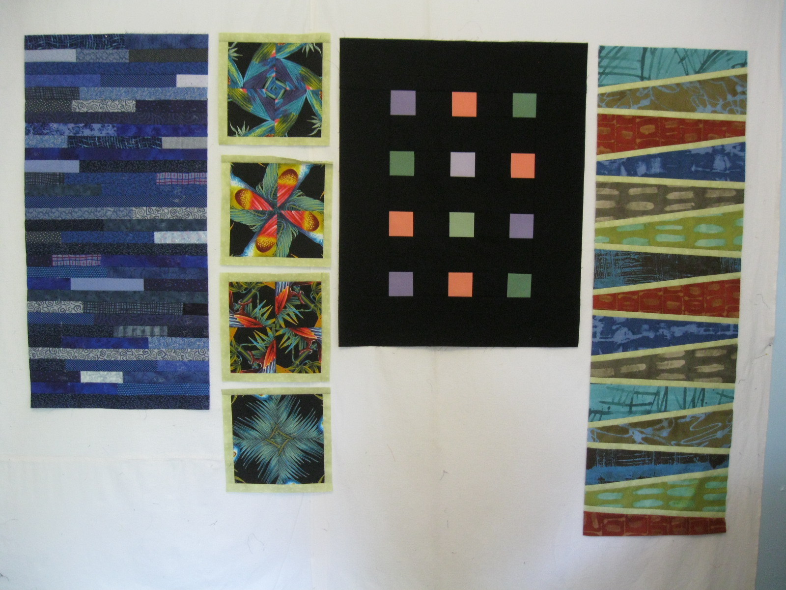
I do love Motown music, but the four tops I'm speaking of are these:


I had some extra time this weekend, and worked on four different projects.  The four blocks in the second column are part of a larger project; the other three are completed tops.  My plan is to do an individual post on each of them.  We'll see how far I get!  If you have a favorite, tell me which, and I'll start with that one.

April 2, 2012

Mod Mosaic--done!

I am pleased with how this quilt turned out--a version of Elizabeth Hartman's Mod Mosaic pattern.  You can see 50+ other versions in the Mod Mosaic Flickr group.  I've written about this quilt previously here and here.  The second post describes my efforts to dye gray fabric for the binding, but in the end I decided to go with white, as it best unifies the quilt.  I was concerned about how dirty a white binding might get, but in this case, I went with design over practicality.  


It was fun to piece these fabrics together.

The quilting was done by Mary Walck on her longarm. 
For the back, I pieced together what I had left of the fabrics.  It's fun to see some of them full-scale, including bits of fabric design that I did not include on the front--like these spiders (left out entirely) and this rooster (cut so that it's not recognizable:


Peter and Maya, I'll be sending this off to you before long!

February 5, 2012

Two-layer baby blanket

When I was in China four years ago, I met up with Knox alums Chip and Sarah Weed Chandler, there for a State Department stint.  It was Sarah who took me to the fabric market in Beijing where I bought Chinese silk brocade.  What a great time we had! When I was back at their apartment, I noticed a well-used blankie used by her then 2-year old son, a simple two layer match-up with top stitching around the edge and that was it.  Sarah said it was the most used baby blanket they had--good for wrapping up the child, but also handy to lay out on the ground for a picnic.  After finally making up one myself last week, I wrote her yesterday to check on what materials were used in her blanket.  She confirmed that a combination of regular cotton with flannel was her favorite (that's what I used in the blanket above), though she also had cotton/cotton (too thin) and flannel/flannel (not as comfortable).  She mentioned that they had just retired a couple of the blankies after 7 years of use; they wear well, and get softer with each wash.

So, I will be making more of these!  It's a nice way to use fabric that is so nice you hate to cut it up--like the Alexander Henry pears and apples above.  I had just a little over a yard of that fabric, so this blanket is 38x42.  Next time, I'll buy 1-1/4 yd of each fabric, to make it about 42" square.  The only challenge to making this is to get the cotton and the flannel just the same size, given the different "give" of each fabric.  For sure, pre-wash the fabrics, as flannel shrinks more than regular cotton.  For this blanket, I cut them to pretty much to size, then laid them together on my cutting table, trimming up the edges to make them even.  Next time, I'll do the size-matching on the design wall instead; I think that will give me a better match.

January 25, 2012

"Late March"


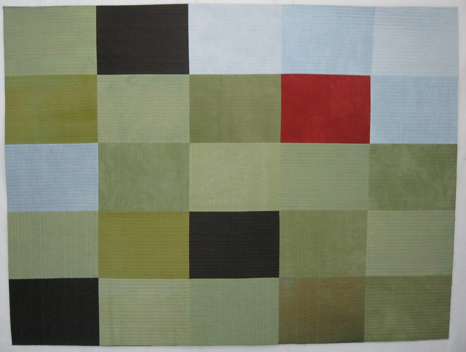
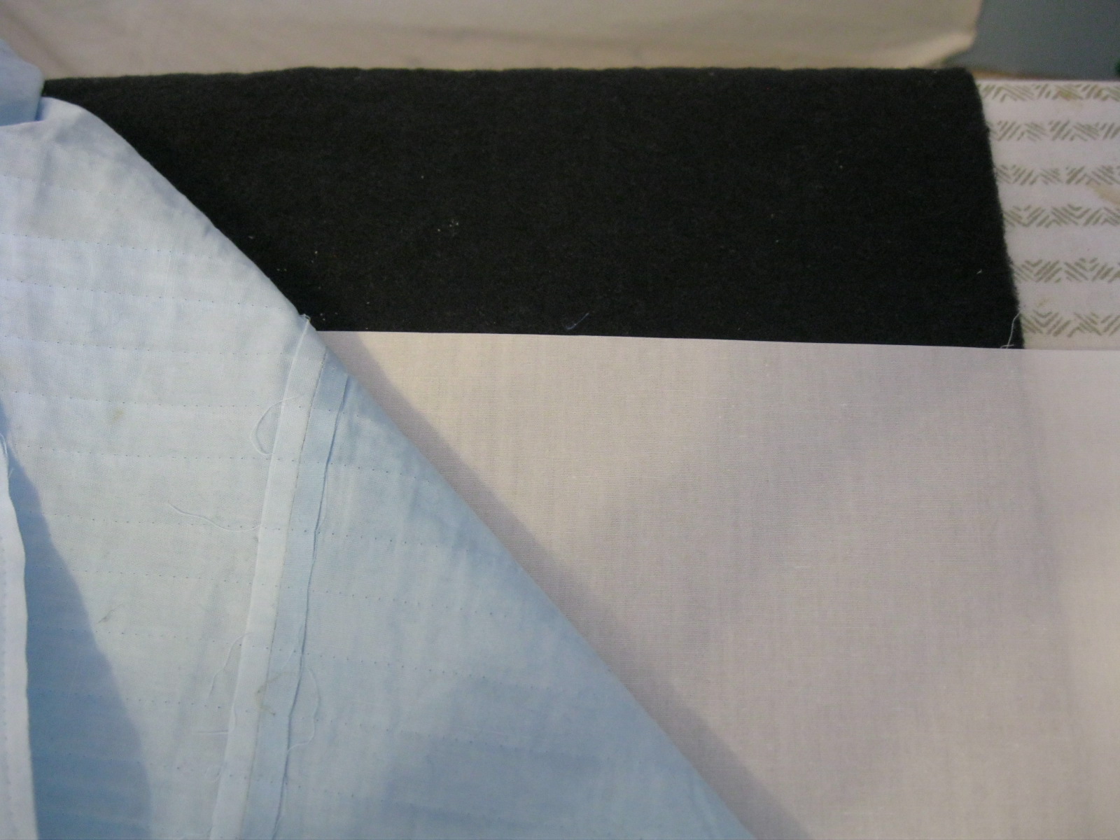
This quilt has been in the making for seven years.  In winter of 2005, I signed up for a Design Workshop with Weeks Ringle and Bill Kerr that would be held that June.  We were told to come with three ideas for quilts.  My first idea (and the only one, until about a week before the workshop) was to do something about the midwestern landscape in which I live.  Toward the end of March, I drove out into the countryside, and took a lot of photos.  I bought fabric in the range of late-winter colors that I held in my mind.  (Missing from the memory is the predominant straw color that I see when I look back at the photos--which I find interesting, but didn't made me change the palette.)  Shortly before the workshop, another idea took over, and I worked on that quilt, "Loss," for three years.  Not long after I finished "Loss," I went to a multi-media workshop at Arrowmont, and, using thick layers of pastel on 9x12 sheets of pastel paper, I made a kind of trial version of a quilt, going back to my idea of landscape.  You can see it in the second photo of this post.  My husband and I both liked the piece so much that it's been hanging in our living room ever since.  With the confidence from the Arrowmont workshop, and the experience of a great dyeing workshop with Carol Soderlund, I then went on to create hand-dyed fabrics for a cloth version of the composition.  Making the quilt top was simple once I had the fabric, but I stalled for a long time wondering about how I would quilt it.  After many samples and consultations, I decided on parallel straight-line quilting, with some changes of direction from one area to another.  I finished the quilting about a month ago.  But, alas, I immediately saw two problems:  First, I had the quilting lines in the light blue "sky" going vertically, done in order to contrast with the horizontal "fields."  But it definitely looked wrong, and I decided to take out all the stitching in that upper/right area, and to re-do it horizontally.  As long as I was doing that, I would correct the second problem as well:  The black batting I had used in the quilt was showing through the light blue fabric, shading it down in a way I didn't like.  (Why black batting?  I was doing in-the-ditch quilting in the seams, and was afraid some of the batting might peek through.  I thought black would be a better option in case that happened.  But I wasn't thinking of what it would do to the light blue section.)  Here's a photo that compares black batting and white under the blue fabric--after I had taken out the stitches:


As you can see, definitely better with white batting!  So. . . how was I going to get the black batting out and white batting in?  As luck would have it, I had to make a trip to Chicago a couple of weeks ago, and spent an evening with Mary Beth.  As we talked about one or another option, she had the brilliant idea of leaving the black batting in place, but slipping in a piece of white cloth over it.  Same benefit!  And a much more feasible method for quilt-surgery.  So that's what I did.  I used the white fabric that was the base for the hand-dyed fabric, and I starched it heavily, to aid in sliding it into place.  Here's one piece placed over the lower section of blue.


Then I placed another piece over the upper section.  (Using two separate pieces was easier than trying to cut one piece in the precise "L" shape needed.)


And here's the new sandwich, pinned and ready for quilting:

EXCEPT. . . As I pinned (using straight pins, I'm not sure why), I apparently was pricking my finger from time to time, leaving spots of blood on the fabric.  (They may be visible if you double-click to enlarge the image.)  So, I stopped and wiped out the blood with cold water, taking care not to stretch the fabric as I did so.  Waited until it dried, put in safety pins, and then re-did the quilting with horizontal lines.  Better!

Some details (the lines are about 3/8" apart):


I used Invisafil thread, a very thin polyester thread that I like a lot.  I used dark khaki through the whole quilt, and the thread blended well in each area--though when I re-did the quilting in the blue upper corner, I changed to a pale gray thread instead.

On the back, I used a green Kona cotton that I over-dyed with brown, and a faced binding with curved corners, method from Mary Beth--it really makes a nicely tailored corner.