September 29, 2012

Dyeing old linens


I have a trunk full of old linens from my mother and my aunt, both of whom delightedly abandoned linen for permanent press.  I have pulled several tablecloths and sets of napkins that I use from time to time for special occasions (and that I can easily iron with the mangle that I also acquired from my mother), but that still leaves me with lots of linens.  This week I got up the courage to try dyeing some of them--they seem so precious, but surely it's better to do something that may give them a new life, rather than just leave them in the trunk in the basement.  The photo shows three different linen napkins on the right, compared to pfd cotton on the far left.  A little lighter in value than the intended color, but that's fine.  Now to consider how I might use the linen.  It is so beautifully soft.

September 26, 2012

Regret--further thoughts


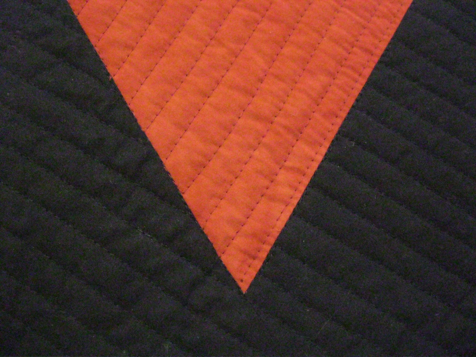
Since my last post on "Regret," I've gone back to my blog several times for one reason or another.  Each time I've looked at the top photo on my August 31 post, I've thought, "not there yet."  I'm thinking the idea behind the quilt might be better expressed by focusing close up on the point of highest tension in the piece--the narrow space between the two figures, as in the photo above.  (Ignore the quilting trials currently in the piece--I'm thinking now just of the interaction of the shapes.)  Very early in the process of sketching this quilt, my friend Mary Beth made a frame around this section, suggesting a focus here.  As I worked on the larger piece, I forgot about this, and then remembered it again more recently.  I thought I would make it as a second quilt.  But maybe this is what I should move to now--this smaller section, sized up to a large quilt.  The next step will be to cut out some large truncated shapes and play around with them on a background. 

August 31, 2012

Regret


For several years I've been making notes and sketches for a quilt about "regret."  In the last year or so I finalized the design, seen above in a small maquette; the final quilt will be about 60x72."  My interest has been to capture the nature of the feeling of regret, which to me has to do with a missed connection between two people.  My experience of regret has been intensified by the death of people I love--my parents in 2003 and my son in 2004.  Once a person is gone, those missed/failed connections become more salient, and, at the same time, there is no longer a possibility of repair.  No further chance to apologize, or to change a behavior.  Working on this quilt has helped me understand the pull that regret has come to have in my life.  Working on the quilt hasn't eased the pain, but it has helped me live with it.

There are still key decisions to be made on the construction of the quilt.
  • Should the black figures be appliqued onto one large background piece, or should it all be pieced?  For a long time I assumed I would use applique, but I did this maquette through piecing, in order to get reliably sharp points on the figures (e.g. in photo below).  Other design features will follow from the method I end up choosing.
  • Should the rusty/red background fabric be somewhat mottled or closer to solid?  (This is all fabric I'm dyeing myself, so I can control for this.)
  • What quilting will best express the meaning of the piece, including the differentiation of the figures from the ground?  In this maquette I used mostly straight-line quilting, with one-direction in the figure and multiple directions in the background.  Maybe reverse that?  I've also tried out some hand-quilting in the second figure. (Shown below--you'll probably need to double-click on the image to see this.  I originally machine-quilted the whole piece, but picked out the stitching in the upper right corner so I could try some other things.)
I have received some very helpful (and conflicting) advice from people whose critique I appreciate and trust, and I will be doing some more experimentation along the lines they've suggested.  But probably most important, I now need to make some quiet space to think about which decisions will most successfully express the ideas I have about regret.

July 28, 2012

Beginning to draw


I have started drawing this summer, and am enjoying going out and finding bits of nature to draw.  The different grasses above are from the meadow at my brother's house in Vermont. (Double-click on the image to see more detail.)  I was inspired by an exercise called "Find a Child":

"If you have a child of two or three, or can borrow one, let her give you beginning lessons in looking. It takes just a few minutes. Ask the child to come from the front of the house to the back and closely observe her small journey. It will be full of pauses, circling, touching and picking up in order to smell, shake, taste, rub, and scrape. The child's eyes won't leave the ground, and every piece of paper, every scrap, every object along the path will be a new discovery." From Learning by Heart by Jan Steward and Corita Kent (NY: Allworth Press, 2008; first published 1992), p. 14.  I recommend this book highly!  For more on Corita Kent (Sister Corita), look here.

Even without a child at hand, the core of the instruction in the exercise is clear:  slow down, look closely.  I spent a good bit of time at my brother's drawing.  I tried both pencil and Pigma pens, and found I liked the pens best.  I will be taking a workshop in the fall where I'll be doing printing on fabric, so I am wanting to build up a body of images that I might want to use.


When I came back home, I turned to my own garden:

Some dried coreopsis and baptisia leaves:


Then I added colored pencil (a dried lily bud and lamb's ear):
It interests me that the drawing can be effective (in the sense of giving a feel of the actual subject) even without me being able to be in control or precise:

Then I went out and bought some Derwent Inktense pencils--you use them like colored pencils, but can then go over them with a watercolor brush to get something like watercolor (here rudbeckia triloba):


In addition to these nature drawings, I also played with some line patterns as possibilities for printing on fabric:

  
All three of the above consist of an element repeated horizontally and then vertically.  This is obvious for the lines in the middle drawing.  The top one is a row of curved humps. The bottom is a series of the Hebrew letter "tet."


June 19, 2012

Triangle Toss (pattern by Corey Yoder)


This quilt is sized down from a pattern by Corey Yoder, published in the May/June 2012 issue of McCall's Quilting.  I love the white of the original, but don't think it's very practical for a baby quilt.

I had to make this quilt in a hurry, as the baby arrived five weeks early.  I had all the fabrics on hand, including the diagonal stripe that I've been wanting to use for a binding for a few years.  I was delighted when I finished the top and realized that the colors were just right for the stripe.  I did also try a solid orange for the binding, which gave the quilt a more unified look, but the playfulness of the stripe seemed right for a kid's room.


I've also had yardage of some "paint drip" fabric on hand for a while, waiting to be the back of a baby quilt.  I think this works well with the top.  (Thanks, Louise--this was one from your "shop.")


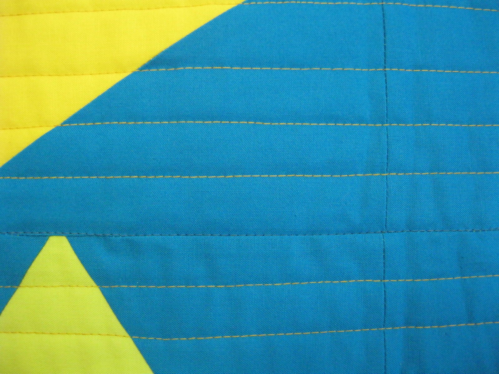
I did horizontal line stitching, starting with aqua thread in the ditch on the horizontal seams, and then orange thread spaced about 3/4".  I was happy with how the orange thread blended quite well with the yellow and lime triangles as well as the orange ones, and contrasted with the background.

You can see I didn't do so well on all the points.  (I console myself that when you look at the quilt as a while--as in the top photo--you don't really notice it.)  This pattern was made from templates, not my favorite way to work--I find it easier to be accurate when cutting with a ruler, and even still, precise piecing is a challenge for me.  One reason I like improvisational piecing. . .


Turns out that I chose colors that go really well in the new baby's room.  I put a sleeve on the back, and they'll use it for a wall-hanging. 

May 26, 2012

Best machine binding!


I love the look of a hand-stitched binding as the finish to a quilt, and I enjoy doing the stitching as a kind of final good-bye to a quilt, having this last chance to slowly pass the whole quilt through my hands.  Unfortunately, my love of hand-sewing eventually led to repetitive-motion injury to my right hand.  I can reduce the pain through exercises prescribed by a physical therapist, but I have also had to radically reduce the time I spend hand sewing. With the time limited, my priorities are appliqué and hand-quilting, with binding in 3rd place.  So, I've been on the search for a method of machine binding that is relatively easy to do, that doesn't stiffen the binding with too much thread, and that looks satisfactory to my eye.  I've finally came up with a method that combines elements from a few different sources.  I think this is it!  I'm giving a tutorial here, and then at the end, I've put links to the other methods I've tried--both to acknowledge and thank those I've learned from and to have them there as options for others who may prefer something else.

The photo at the top shows the binding both from the front (top of photo) and the back (below, the plain tan fabric).  The basic method is this:  the double-fold binding is sewn to the back of the quilt, flipped over, and then stitched down with a straight stitch, with top thread matching the binding fabric (here, rusty red) and bobbin thread matching the back (here, tan).  Here are further details:

Sew the double-fold binding onto the back of the quilt.  I cut the binding at 2-1/2" and then fold in half.  I sew the binding on using the width of my general purpose foot, which is between 1/4" and 3/8" (seems overly precise to call it 5/16).
When you get about 3/8" (or whatever your seam measures) from the corner, sew an angle to the corner of the quilt.  This is a new tip I just learned from Mary Beth Clark, who learned it from Wanda Hanson.  Thanks Wanda!  It really helps make the corner come to a nice point.
After you've sewn the binding on all around, press the binding out away from the back.

Then at each corner, fold the miter under and press in the line on the back side.

Pull the binding around to the front (teal fabric is the front), and stitch down with a straight stitch.  Choose a top thread that blends with the binding and a bottom thread that blends with the fabric on the back.
Stitch quite close to the edge.  This will insure that the stitching on the back side falls in the backing, not on the binding itself.  You'll probably be able to feel with your finger as you sew that the stitching line is over the small hump of the binding on the back.
This photo (like the one at the top of the post) compares the resulting stitching on the back with that on the front.  Choosing different threads to match binding and backing is key.  It's a little trickier to keep the bottom thread off the binding when turning the mitered corner on the machine.  Three of my corners looked like this, a little off on the back (double-click on the photo for a closer view):


 But one of the corners was great on the back!  I think with more practice, I'll be able to do better on the corners.


A detail about beginning and ending the top-stitching:  I didn't want this spot visible, so I left long threads at the beginning and ending, and buried them in the quilt with a needle.  See below for links to tutorials on how to sink the threads.


As long as we're looking at this table runner, here's a view of the quilting stitch, a sashiko-style pattern I recently saw in the NQA quarterly (Mary DeRay, "Mocha Latte," The Quilting Quarterly, Spring 2012, pp. 36-37).  It's a really nice, simple stitch for a vertical space, and easily changeable in size along the wedge.


And here's the finished table runner:


LINKS:
Machine binding where you sew binding on the top, fold under, pin, and sew in the ditch from the top:
http://fibermania.blogspot.com/2010/03/binding-tutorial-1.html (including a full tutorial on all binding steps).  Two other tutorials of a very similar method: http://www.redpepperquilts.com/2009/11/binding-tutorial.html and http://modernquiltrelish.blogspot.com/2010/08/binding-business.html. I love the look of this method, and when these quilters do it (Melody Johnson, Rita of Red Pepper Quilts, Marny Buck and Jill Guffy), it comes out great.  But to get it to work at all for me, I had to spend a good deal of time with the pinning, and I still had trouble getting the back of the binding to look consistently good.  So--looks great from the front, but time consuming, and I wasn't happy with the back.  So, I kept looking.

Machine binding where you sew binding on the bottom, and then use a decorative stitch on the top:  http://patsloan.typepad.com/quiltershome/pat-sloan-machine-binding-tutorial.html.  What I've outlined above is very close to this--except that I uses a straight stitch rather than the button hole stitch used by Pat Sloan (plus I added in a couple of other small tips).  I much prefer the look of the straight stitch--not as obvious as the decorative stitch--and it also keeps the binding more flexible.  Below is a little sample showing a zig-zag stitch on the top and a button hole stitch on the right edge, towards the bottom.  (Double-click for better view.)

Also, the first time I saw machine binding was in a workshop with Weeks Ringle and Bill Kerr.  Their method uses single-fold binding, which I don't like as much as double-fold, and the one time I tried it, I had trouble getting it to look good at all.  Of course, all of Bill and Weeks' bindings are beautiful when they do it!

And as I was searching the web to try to find the tutorial that mentioned ironing the binding and miter so I could acknowledge it (can't find it), I came across this tutorial that shows back to front machine binding with a straight stitch!  I'm kind of relieved to know someone else is doing this--it must be O.K. :-)
http://aquiltisnice.blogspot.com/2011/03/machine-binding-tutorial.html

Two methods of burying threads in the quilt.  I use mostly the first method, but the second one when the tails are short: http://www.youtube.com/watch?v=OV3jNXy3Mn0  http://www.youtube.com/watch?v=M3gl4K8Z7XM&feature=player_embedded


May 20, 2012

Amy Walsh's "Get in Line" pattern


A few posts ago, I showed four tops in progress on my design wall.  I just finished one of these, a version of Amy Walsh's table runner pattern, "Get in Line," recently published in American Patchwork & Quilting, June 2012.  Amy's version was in silk, a range of blue and green solids--stunning.  My version is a gift for a nursing home resident, for her bedside table, so cotton was definitely in order.  The genius of Amy's pattern is that some of the strips have one fabric only, some two fabrics, and some three.  She suggests improvising size of the portions and placement of the one-piece strips, which I did, but the pattern also includes precise measurements for those who prefer that.  Amy's version used straight-line quilting; I decided to go with a simple (and easy) wavy line in each 1" strip. 

Added 5-21-12:  Here's a photo of Amy's from the magazine:

More patterns from Amy and others can be found at the pattern company she owns with Janine Burke, Blue Underground. 

If I had been making this for myself, I probably would have used a wider range of color, maybe using small bits of orange/rust.  But the friend I made this for really loves blue.  I brought a bunch of fabric scraps to the nursing home a month or so ago, and she chose the strips she liked.  All blue!  She let me sneak in the one fabric that has a little red in it also, but that was it.

I'm happy with how the runner looks in her room--definitely perks it up.


Here's a detail, showing the machine binding I did, with a zigzag stitch.  I've since done some trials with straight-stitching, and have found a method combining tips from a variety of sources that I think will work.  More on that in another post sometime.