April 1, 2017
And the winner is. . .
Matt and Autumn chose the medallion setting for the log cabin blocks. I think this will be striking! Above are four blocks extra blocks, sewn together. I'll use eventually use this for trying out quilting patterns. Below are the other 80 blocks up on the design wall, in the final layout. I have numbered them and put them aside, as this will be a good project to bring with me to a four-day retreat with quilting friends in May. The final quilt will be about 60" x 75."
March 28, 2017
Scarlet and Gray
Beginning in January, I took a ten-week 2-D Design class at the college where I used to teach, which kept me away from blogging for a few months. I did continue to work on textiles as well (the course work was mostly in the computer lab), but I didn't have the time/motivation to write up what I was doing. I plan to do a post about some of the work from the design class, but right now, I want to get up some photos of log-cabin blocks in different settings. I've made 80 blocks, which will go into a wedding quilt for one of my son's best friends, Matt and his wife Autumn. They chose the colors from their wedding (which was some months ago)--scarlet and gray. I had a large trove of hand-dyed gray fabric leftover from "Holiness," but gave them a choice between commercial prints and hand-dyed fabric for the reds. They chose the hand-dyes.
Today I've been playing with different settings for the blocks. Many different arrangements are possible for log-cabin quilts. I tried a few others beyond those below, but these 5 are my favorites. Now Matt and Autumn get to choose! (I haven't used all 80 blocks in any of these trials, so the actual quilt will be expanded from these.)
| hand-dyed fabrics versus commercial prints |
![]() |
| Diagonals |
![]() |
| Medallions |
![]() |
| Barn Raising |
![]() |
| Triangles |
![]() |
| Zig-zag |
December 28, 2016
Recognition
When making each of the quilts that developed into my series about loss, I worked from compelling needs of my own; I had little thought of an audience. But as others have seen the work, I have found out that it speaks to other people as well, and that is gratifying too. I've recently received two requests to show my work, one in a museum, the other in a book. I am grateful for this recognition, and the chance it provides for more people to see two of my quilts.
The museum: The Wisconsin Museum of Quilts and Fiber Arts asked me to contribute one or two quilts to their upcoming exhibit on the theme "In Death", which will be on exhibit from July through December, 2017. They left the choice of work up to me. I'm probably going to submit "Self-Portrait, Year 2: Beneath the Surface" and "Holiness."
The book: I was also invited to include "Self-Portrait, Year 2" in a book being put together by the Modern Quilt Guild, featuring about 200 "modern" quilts made in this century; the book is scheduled to come out in February, 2018.
Thanks to all of you who have helped me in the journey to make this work.
December 26, 2016
Further exploration of napkins printed with paper-laminated screens
I've also been working on the printed napkin project, started in the workshop I took with Claire Benn in October. In the last week, I've made two more screens (bottom left and bottom right in the above photo), and I tried out six colors for the base fabric. On all six, I used a dark value of Dharma's MX Indigo-colored dye when pulling the prints. My thoughts on each of the above, with numbering starting with the upper left.
- Lavender: This screen was made by stamping with 2"acrylic squares. I'm happy with the color. I also like the design, though I've just made another screen with the same size squares, hoping that I get a better application of the matte medium that I stamp with. I'd like to have more lavender showing after the print.
- Chartreuse: For this one, I cut out bowl-shaped stamps from sheets of foam, and stamped the screen. I'm happy with both the color and the design.
- Teal: For this one, I drew on the screen columns of interlaced squares, a pattern I have used in quilting. See the photo below for an example where I used very fine black thread for the design. But when I "drew" with a squeeze bottle filled with liquid matte medium, the result was very different. Once I got over disappointment about how messy it was, I have to admit that I like the randomness of it.
- Rust: The color is OK, but the design (another adaptation of a quilting design) is awful!
- Light blue: This design was made by stamping with 3" acrylic squares. Opposite problem from #1--too much medium transferred to the screen, so not enough dark Indigo got through the screen.
- Coral: This was an attempt to use one of my line drawings of clover, also done successfully as a quilting design. Again, the matte medium applies much more loosely, and this ends up looking like a bunch of spiders instead of flowers. I do like the color, though.
![]() |
| Interlaced squares, quilted with Invisafil thread. |
![]() |
| drawing of clover, 2012 |
THE COLORS: I wanted to have six colors that worked together, but I think I may go with just four. It is much more difficult than I anticipated to pick an array of colors that work with each other as well as with the dark indigo. I am also thinking of another color array of neutral tans and/or grays that I would print with black. In the two photos below, just think color; I won't continue re-use the "clover" screen on the coral cloth.
WHAT MAKES A SET? I have been trying out colors and designs at the same time, but it may be that a set would be more pleasing if it was one color in four designs, or four colors in one design. Here are two pieces from October, just blue and the cream color of the muslin cloth I'm using as the base fabric. These are unified by the blue/cream color scheme, and also by the commonality of a stamped image to make the screen.
So many choices. . . Your thoughts most welcome!
Hamsa embroidery
I've also been doing some embroidery. It started back in the spring of 2014, when I began doing a variety of embroidery stitches on my "Plain Spoken" quilt. I eventually ripped out all that embroidery on that quilt because I didn't like the look of the varying stitches on this quilt. But I did like doing the embroidery. I used some of the stitches for borders on hand-dyed napkins.
And I've also used them on a series of embroidered hamsa gifts. A hamsa is protective/good luck amulet, common to Middle Eastern cultures. I made two for friends in cancer treatment. The first was incorporated as a block into a quilt made by friends. The second hangs from a loop of thread.
This fall, I made four more as gifts for several adults in my congregation who I tutored for their collective b'nai mitzvah ceremony this November. This first of these I did in a class with Laura Wasalowski, fusing pieces of my hand-dyed fabric.
![]() |
I liked the look of the applique, which gave a multi-color base on which to embroider, but I didn't like stitching the embroidery through two or three layers of fused cloth--very difficult to get the needle through. So, I did the three others with needle-turn applique, no fusing.
![]() |
Before changing to applique, I had stitched a blue outline on some violet cloth. So I've continued stitching that one.
![]() |
| Difficult to see, but I used shiny gold thread for some of the stitching in the outer fingers. Looks nice in person! |
December 24, 2016
"Confetti"--a wedding quilt
It has been many months since I've made a quilt. I finished piecing "Holiness" in March, 2016, and then worked on a couple of other pieces about stones until deciding in June that the series was complete with Holiness. The next couple of months were spent preparing for my August exhibition (with a side-trip to a workshop with Paula Kovarik). I spent September preparing for a print-making workshop with Clare Benn in October. For a few weeks after the workshop, I did follow-up work from that, lining up elements of the cloth napkins I'd like to be making. But I really missed sewing, so I interrupted the napkin-making to come back to a quilt I had started in the spring, a wedding gift for friends. The inspiration for this quilt was one by Cecilia Koppman:
![]() |
| La Torre de Babel (The Tower of Babel) by Cecilia Koppman |
I liked the neutral background and the splashes of color. I saw a photo first, and only later the title of the quilt. Not so appropriate for a wedding image. . . I focused my design on the idea of confetti instead, which meant that the bits of color were all angular bits, no bars. I changed the background to beige/tan, because that worked well in my friends' living room. And though I wasn't sure if an image of throwing confetti would be denser at the top or the bottom, I've ended up with the dense part at the top.
Below is a photo of the work in progress. I improvised blocks in various sizes, and then added and combined until I got a block that was 10.5" high, with varying widths. I played around with placement of the blocks, ending up with seven rows. As always with improvisation, the early steps were playful fun, and the latter part--when one has to move from randomness to considered composition--an interesting challenge.
For the back of the quilt, I did a much simpler design, making four large "court-house steps" log-cabin blocks. I was able to use up most of the background fabric I'd purchased, including some darker pieces that didn't make it into the front. The back took me 2 days to piece, the front more like a couple of months.
Update, 12/26/16: I was very interested to see the comments on this post. Both Brenda Gael Smith and Beth Berman make a point about how the back conveys a different feeling from the front, Brenda commenting on the restfulness of perpendicular lines and Beth on the feeling of order and stability. I didn't do this intentionally (I was just going for something that would relate to the front but be much simpler to piece), but I love it that this wedding gift ends up speaking to two different sides of marriage: excitement and improvisation/spontaneity on one side, and peace/security/stability on the other side. If there were a way to design the batting inside the quilt--unseen but also key to the structure of a quilt--perhaps it could represent the painful conflict that disrupts any marriage from time to time.
November 24, 2016
Four days in New York
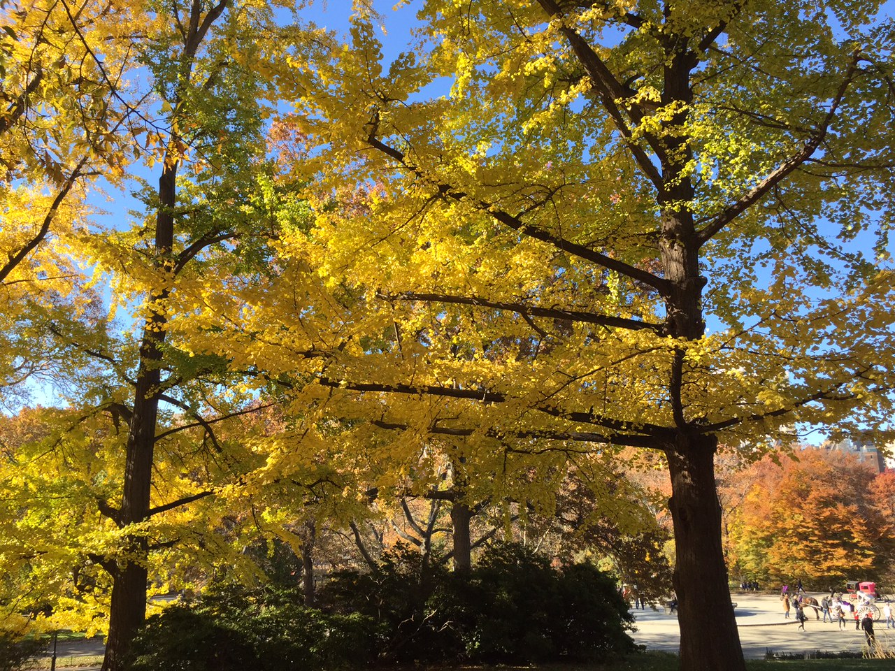
| Central Park on a beautiful fall day |
My husband and I spent four days in New York City last week. We timed the visit around the Agnes Martin exhibit at the Guggenheim, and the show was definitely worth the visit. It's difficult to convey the impact of her work in photos, as almost all of it is very quiet. Her work looks minimalist, but is at heart abstract expressionist. If you can be in New York before it closes (January 11), do go.
We filled our days with museums, walks in Central Park, music, good food, and time with friends--a lovely visit. Here are the exhibits I went to:
Carmen Herrera at the Whitney (through January 2).
Paths to the Absolute: Kandinsky, Malevich, Mondrian, Newman, Pollock, Rothko and Still, at the Di Donna Gallery (through December 3). An exhibit of 13 paintings, on the occasion of the opening of a new gallery space.
Zao Wou-Ki (1920-2013) at the Asia Society, through January 8. Zao Wou-Ki was born and trained in China, and then moved to Paris. To my eye, his landscape paintings are a stunning blend of traditional Chinese painting, J.M.W. Turner, and abstract expressionism. Here's a google image search of his paintings.
Three exhibitions at the Morgan Library:
Hans Memling: Portraiture, Piety and a Reunited Altarpiece
Word and Image: Martin Luther's Reformation
Dubuffet Drawings, 1935-1962 (through January 2). This exhibit was a revelation to me. I'm not particularly fond of Dubuffet's paintings, but was drawn to many of his drawings.
| Dubuffet, Table Laden with Objects, 1951 |
| Dubuffet, Landscape with Figure, 1960 |
| Landscape with figure, detail |
Jerusalem 1000-1400: Every People Under Heaven at the Metropolitan, through January 9. Very interesting exhibit with a combination of material artifacts and manuscripts--in many different languages. Includes a letter and a book manuscript in Maimonides own hand.
Kerry James Marshall, Mastry, at the Met Breuer, through January 29. Striking work by a contemporary African-American artist.
Paul Klee (the Berggruen Collection), at the Met Breuer, through January 8. I went to the Met Breuer for the Kerry James Marshall exhibit, and noticed they had a large exhibit of works by Klee as well, great bonus!
"The First Jewish Americans" at the New York Historical Society, through February 26
And a couple of very nice, reasonably priced restaurants:
Le Petit Poulet, 52 W. 33rd St. (between 5th and Broadway)
Il Violino, 180 Columbus Avenue (near 68th St.) (near Lincoln Center)
New York is a great place to visit!
![]() |
| View from the top floor of the Whitney Musuem |
Subscribe to:
Posts (Atom)