May 27, 2018

A new sink for the dyeing studio

No pretty pictures in this post, but if you dye fabric yourself or are interested in how it's done, here's a behind-the-scenes look at one key element of the process: the sink.

I'm lucky to have a large space available in my basement where I can do everything connected with dyeing fabric--my "wet studio." The basement has always had the double laundry sink shown in the photo on the left below. The sink was large enough to accommodate two large buckets (I often rinse in one bucket and soak in another), while also giving me the necessary space to wash out all the various containers and equipment that one uses. To the right of the sink, I have a large table with a waterproof covering.  This is where I mix up my dye solutions; there's also a dish rack for the containers/tools that I've washed out. All good, but you can see one problem in the photo below: the difference in height between the table (which is at a good working height) and the sink, which is low and deep, so I was always bending over when using it--not good for my back. Another inconvenience is that the faucets for hot and cold water were separate, so getting just the right temperatures for mixing dye solutions was always an awkward process of having to adjust from two taps. So, several months ago, after a particularly long (and painful) stretch of dyeing and printing napkins, I decided to treat myself to a new sink, shown below on the right.


old sink


new sink

  
The height of the sink is now even with the table, and the sink itself is less deep, so no need to bend over. The new sink is not as wide as the double sink, but because there's no divider, it didn't need to be. I saved some money by purchasing a less wide unit, but one still big enough to fit two large buckets.

I wanted two faucets so that I could easily fill up two buckets side by side. The faucet on the right (photo below) has a pull-down sprayer, with an easy toggle between a stream of water and a spray.  The faucet on the left is a simple gooseneck faucet. Both of these swing to the side if I need to move them out of the way. The spray faucet is helpful for washing some utensils, and great for washing out silk screens. I've included links above to the specific models, in case someone is considering a new sink of their own. (Ignore the white plastic pipe coming into the sink on the right; that's a drain from something else in the house that needed an exit point.)


Now, I am satisfied with sink as it worked out, but I made some mistakes along the way. Here are the things I didn't anticipate:

  • I ordered a 33" wide sink, thinking that was the measurement of the well of the sink (which is what it looked like on the drawing the plumber made for me). But it turns out that 33" is the measurement from edge to edge, including the rim, so the well of the sink is only about 27" wide.  The base unit had already been constructed, and holes cut in the sink for the faucets, so returning the sink wasn't an option. It turns out that it is still wide enough for my two large buckets, so I'm OK, but I would have liked another few inches. 
  • The water pressure in the spray faucet is not as strong as I had expected; it's less than in the simple faucet. I didn't know that there was variation in this from faucet to faucet; perhaps there was a different one that would have been better on this score. Again, it's workable as is--just takes a little longer to fill a bucket. 
  • The faucet on the left is cold water only; I didn't realize that this is what "single supply" meant in the description. This still works for me, since the main thing I do on the left is fill a bucket with cold water for soaking just-dyed fabrics. But if I'd realized it, I probably would have looked for a faucet with both cold and hot supply.
  • In designing the base, we didn't take into account that there's an input pipe coming out of the back wall, extending about 8 inches, so the unit stands away from the wall.  It's still perfectly functional, just means that soap bottles or sponges put on the back area are more likely to fall off onto the floor.
I will never be doing this again, but perhaps someone else can learn from my mistakes!  If I realized how much I didn't know (and how much the plumber didn't know--I later found out this was the first custom unit like this he had designed), I would have brought in a designer/contractor at the outset to help me think through everything.

If you're thinking of something like this and would like to know how much it cost, send me an e-mail and I'll be happy to let you know: pgold at knox dot edu


May 22, 2018

Five more sets of screen-printed napkins


Last week I printed up five more sets of napkins.  


I continue to be happy with how the napkins have turned out.  But now that I've made all the decisions on screen designs and colors, I found that the process of just making more of the same was not as engaging to me--a lot of physical labor, without the sense of discovery.  Yes, it's still a bit of a thrill to pull up the screen and see the design on the fabric, but I've done each of these designs enough times that there's no surprise involved. A production line is not anything like as much interesting/fun/satisfying as the design process!

I'm thinking that over the course of the summer/fall I'll dye yardage of the 7 different base colors that are my favorites, and do a run of 8 screens on each of the colors, for a total of 56 napkins. That will give me a sizable supply of napkins from which I can pull sets when I want them (usually for a hosting/thank you gift).

April 18, 2018

Appliqué top completed


Above is the final pieced top made with the appliqué squares. (Cropping makes it look a little tilted; it's not.) I spent yesterday using Photoshop to try out a number of lay-outs for this quilt, narrowing it down to four possibilities.

A) 4 vertical squares, pushed left


B) 4 vertical squares, centered
C) 4 rectangles
D) 2 x 2 squares


Much as I liked the idea of getting more color in by using horizontal rectangles of colored fabric (layout "C"), I think the simple square works best. Of course, Christy Marnell, designer of the Posh Tot quilt pattern, had already figured that out :-)  This will be a generous-lap-size quilt, about 57 x 77".

I had been thinking I would put a 2" frame of color around each square, but that resulted in a quilt that was bed-size instead of lap-size, and I didn't want to go that large.  So I tried layout "D" which I could do with larger borders.  Nice, but not as striking as layout A.  I solved the size problem by going to colored frames of just 1-1/4" wide, with a separating black sashing between the blocks of 1".  The blocks themselves are 15".  Done!

Now I'll put this aside, and go back to the triangle quilt, which needs a back and then quilting.

April 14, 2018

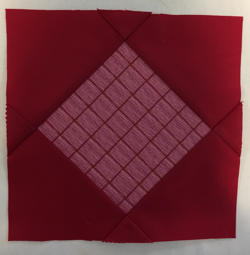
Square-in-a-square tutorial: done by folding, no cutting of pieces!


Square-in-square tutorial: made with folds, no cutting

Many thanks to Judy Chaffee, who taught this method to a group of us at a recent quilting retreat. She learned it at a Modern Quilt Guild meeting in Kansas City, where the group used it to make some charity quilts. Both Judy and I looked for a pre-existing tutorial using google searches, but couldn't find one, so I've written up how to make the block. This method produces very quickly.

These directions use two squares of fabric, 5" and 10". These are convenient if you like pre-cuts (charm packs and layer cakes), but the method works for any size, smaller or larger. The small square does not have to be half the size of the larger square—vary according to the look you are after. Making the basic version, the unfinished block will be 1" smaller than the largest square, 1-1/2" when finished.

Basic version (with photos illlustrating steps below):
1.    Put a 5" square right-side up on a 10" square, also right-side up.
2.    Line up a straight-edge (cardstock, folded piece of paper, ruler) with the top of the 5" square and fold the background fabric over the edge. Iron in place. Remove the straight-edge. (If using a ruler as the straightedge, remove the ruler before ironing, being careful to keep fold in place.)
3.    Repeat the folding/pressing on the bottom of the 5" square.
4.    Sew a 1/4" seam, sewing the two folds down (top and bottom).
5.    Iron seams open.
6.    Repeat fold-press-sew on other two sides.
7.    Done!
Step 1: Place small square on large square, both right side up.

Step 2: Place "straight-edge" over small square, lined up with its top edge.  Fold over background fabric and press. The dark 5" square is not visible, underneath the pink paper.
Step 2, another view: Folded flap lifted up, so you can see the crease.

Step 3: Both top and bottom folded down; you can see the 5" square peeking from underneath.

Step 4: Sew 1/4" seams. 

Step 5: Iron seams open.
[Ignore the fact that the central fabric is different from what's shown in the first photo. I forgot to take a photo of step 1, so had to substitute something later for the first photo.]

Step 6: Fold and press repeated on the other two sides.

Step 6: Sew seams on final 2 sides.

Step 7: Finished square-in-square.

View of the back; note that the block has two layers of fabric in the central square, so there is some added thickness.
Alternate versions (see photos below): When doing alternate versions, just be careful to maintain enough of the background fabric for an ample seam allowance (i.e., leave at least 1/2" of background showing)
•    Vary the size of the squares and/or vary the proportion of small to large square.
•    Place the square somewhere else than in the center--e.g., towards one corner.
•    Do the process more than once for multiple frames.
•    Place the square on point, or wonky. You'll end up with a square that needs some trimming down.

Smaller central square

Place the small square in a place other than the center.  And do the process twice for a double-framed square. This Thomas Jefferson block was made by Dorothy Roderick. 

On point.

A four-day quilting retreat

Each year, a group I'm part of, Quilters by Design, meet for a four-day retreat where we discuss our work and do a lot of sewing. The people in the group have all done design workshops with Weeks Ringle and Bill Kerr, so we share a common vocabulary and approach to the design process. It's great to have dedicated time to sew, to share the time with friends, and to see how a quilt design can be transformed once response and suggestions are heard from a group of creative folks.  For example, I brought with me a quilt that was in the early state of the design process.  I had finished five large appliqué blocks, using a pattern that showed the blocks laid out for a 40x40" wall-hanging.

"Japanese Gingko" by Roxanne McElroy
This has been my "travel appliqué" project for a few years, more important to me for the process (having  easy-to-transport hand-work when I travel) than for the finished product.  As I was finishing up the last block, I learned of a wedding in August that I'll want to make a quilt for, and it occurred to me to use these blocks to make a quilt, rather than a wall-hanging. My only thought was to keep the blocks in the layout shown in the pattern, putting them on a quilt-sized background (about 55x75). Mary Beth and I had a fabric shopping trip planned, so I brought along a block, and I found a batik that we both thought would work for the background.

When I got home, I laid out the blocks on the fabric, and played around with the possibility of adding colored sashing.  This was as far as I had gotten when I left for the retreat. I packed this up, thinking it would be a good thing on which to get some feedback.


Well, of the six others at the retreat, none of them thought the black/gold batik worked for the background fabric. I explained that I didn't want to do plain black--didn't seem appropriate for a wedding quilt. I had some extra fabric in the bright colors of the applique, and wondered about adding them into the mix, perhaps large triangles separating the blocks. Had I thought of any other layouts for the blocks, they asked? No, I was just going with the layout suggested in the pattern. Then Janis suggested, "What about a layout like 'Posh Tot'?" This is a pattern available from Blue Underground Studios, the company of one of women in our group, and many of us have made the pattern. (I've used it a number of times for a baby quilt.)

"Post Tot" by Christy Marnell, available from Blue Underground Studios
This suggestion quickly led to the layout below.  So much better! I never would have thought of this on my own--a great reminder of the usefulness of sharing work in a group critique. (The black/gold patterned batik will now be used on the back instead of the front.)


There's a way to go yet to finalize the design, but mostly issues of proportion and arrangement of colors (though I think this arrangement works quite well). Laid out this way, 4 blocks makes a good-sized quilt; the fifth block (lavender) will probably go on the back of the quilt. It's just as well I only need four for the front, because I have only a small scrap of the lavender fabric left over, and have not had luck finding another length of the same color batik.

The main sewing project I brought to the retreat was to put together the blocks I'd finished for another quilt, made from a pattern in Rebecca Bryan's Modern Triangle Quilts.  Here's a photo of the pattern from the book:

And here's my version (finished top only):


This quilt is a wedding gift, with colors chosen by the couple.  To get the background just the blue they wanted, I hand-dyed that fabric and the lighter blues; most of the other colors are commercial solids.

Although the quilt has the look of improvisation, the blocks were actually all done according to specific instructions in the book. I wasn't used to working with triangles, so I thought I would start out with Bryan's instructions and then improvise from there, but the triangles were challenging to work with, so I just kept following the block patterns worked out by her.  Ten of the blocks are paper-pieced.

After I finished piecing this top, I made 4 pillowcases for David and me (two each of the ones below):

I also cut out the pieces for a baby quilt that's been in my drawer for a while. And I learned a nifty way to make square-in-a-square blocks without having to cut any pieces. I've written up a tutorial and will post that shortly.

So, a very productive four days for my own projects, and a delight to see what everyone else was working on and talk through design issues in those also.

March 5, 2018

Photo-emulsion screen prints

I posted this first by mistake on my In the Kitchen blog. Now I'm putting it here where it belongs, and have added a brief comparison to thermofax screen printing in the first paragraph.

Last week I made a couple of silk screens using a photo-emulsion process for getting the image onto the screen. Here's an explanation of photo-emulsion screen printing. Happy as I am with the napkins I've printed with paper laminated screens, I was interested to try out the photo emulsion process, as certain other things are possible with this method.  (The same things are also possible with a thermofax screen, but the maximum width of a thermofax screen is 8.5." I could make these photo emulsion screens 18" square, and one could go larger.)
  • I can print a sharp-edged image, including a fine-line drawing (detail above, and image of whole screen below). I wrote out in caps the same quote from Martin Buber that I've used before, but I did it on a much smaller scale, writing onto a Wacom tablet so that the image went directly into a Photoshop file. I wrote on the diagonal, and then, in another layer on Photoshop, superimposed the diagonal going in the opposite direction. I like very much how this came out, though I would have preferred a somewhat larger scale.  


  • I can print a line drawing, as above, and have the line be what prints (here dark blue). When doing a line drawing on a paper-laminated screen, what prints is the background, leaving the line itself white.
  • I can play around with a photograph, using filters in Photoshop to abstract it, looking for an interesting design.  Here's a photo I took of a sheet of baklava I had baked, and then the printed result of a filtered image that I put into a repeat:


Many thanks to Andrea Ferrigno, who teaches printmaking at the college where I worked for many years, for taking the time to teach me how to use the photo-emulsion equipment recently purchased by the college, and to student assistants Kristina Mengis and Kristen Marvin who helped me step by step through the process.  For my ability to use Photoshop, a shout-out to the Pixeladies, Deb Cashatt and Kris Sazaki, with whom I've taken three online classes--their classes are great!