I've recently added links to a selection of my quilts in a box at the top right of my blog home page. I wanted to include the quilt above, one of the earliest quilts of my own design (begun in 2004), but I had never done a post on it, so I'm putting it here so that I can link back to it in the list. (You can double-click on the image for a larger view.) So, this post does double duty--it gets "Circles" up on the web, and lets you know that you can see a sample of my quilts by looking at the newly posted list. (If you're reading this from an RSS feeder, you can click here to get to the home page.)
Each block is 4-1/2 inches square; the circles are sewn on with needle-turn appliqué. I had some teal tone-on-tone fabrics left over from another project, so I bought a range of Oriental fabrics that included some teal, and used those for the circles. I say a bit more about this quilt in the essay I wrote about how I came to quilting and my development as a quilter.
November 1, 2012
October 31, 2012
Top complete
I finished piecing the top today. I wanted to give some close-up photos, to show the range of colors in the shot cottons. They are really beautiful.
And the whole top:
Some sources for shot cotton:
I bought my fabric from Glorious Colour, $9.50/yd, 71 colors, also available in sets, with a new full set coming out late in 2012. Also stripes.
Other sources carry the fabric also, but either less of a selection or a higher price:
Hancock's of Paducah, $8.98/yd, 19 colors
Portsmouth Fabric, $9.95/yd, 50 colors and a few stripes
Purl Soho, $10.60/yd, 56 colors
October 25, 2012
Playing with value and color
A couple of years ago, I made a baby quilt from a pattern called "Spectrum" by Judy Turner, from her book with Margaret Rolfe, Successful Scrap Quilts from Simple Rectangles.
I really enjoyed making this quilt, for which I used a range of shot cottons. It was both relaxing and engaging to make the choices of color and value. The quilt is made up of many rectangles, all cut 2"x3.5". They are arranged into squares, with either two light rectangles as the center, or two dark. My sister liked the quilt as well, and I agreed to make a larger one for her. She stood me to a collection of about 50 1/4-yard cuts of shot cotton, out of which I am getting a lap-quilt for her, and something else for me as well. It was a great treat to get this huge variety of shot cotton. I ordered it from http://www.gloriouscolor.com/, but they don't seem to have this big collection anymore. Anyway, the blocks at the top of the page are the ones I've just finished up for my sister's quilt; I've been working on the blocks on and off for about five months--a nice project to have on the side, doing a few blocks when I need a break from something else.
When I had all the blocks done, I separated them into two piles, light and dark centers, and then just put them up on the design wall in the order of the pile. Every once in a while, if I noticed two in my hand that looked too similar, I chose another in the pile, but that's it. I expected to then do a lot of tweaking, moving blocks around to get a good arrangement of color and value. But I think I might leave it just as it is! I could tweak endlessly, but this is pleasing now, so maybe I can restrain myself and leave it alone.
I also checked the value distribution by taking the photo in black and white as well. Digital cameras are a real boon to quilters!
Even without black and white, looking at the photo in the camera--where it is much reduced in size--helps one see value distribution.
October 24, 2012
A walk around the block
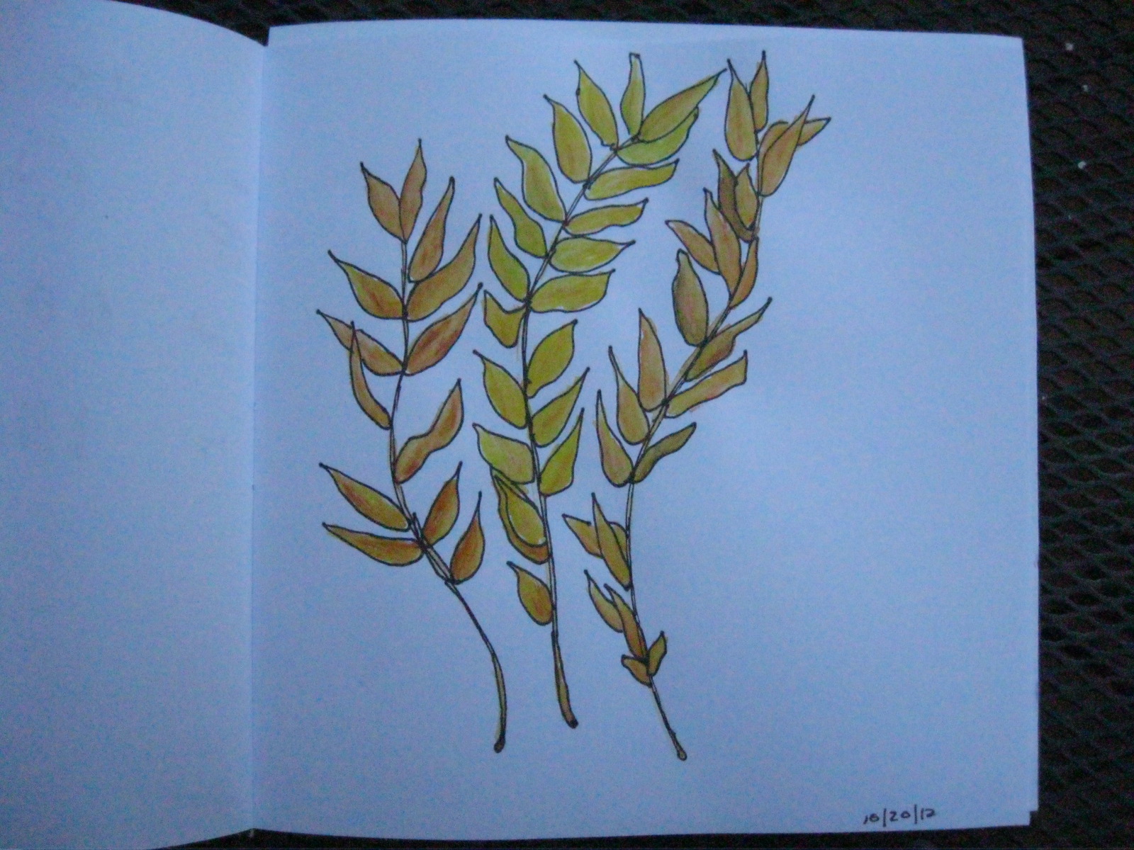
We've had lovely fall weather here in western Illinois, much appreciated after a blazing-hot summer. On a beautiful day recently, David and I were spending the day inside at our desks; we both had things that needed to get done--no time for the longer walk that we sometimes take together. So I suggested we just take a walk around the block, which we did, and then another several blocks beyond that. I picked up these ash leaves along the way--glowing variations of gold. I drew with a marker and colored in with Derwent Inktense water-color pencils. I do love the fall. . . (You can click on the photo to enlarge.)
October 10, 2012
Printing, stamping, and writing with thickened dye
I recently came back from a five-day class at the Barn with Carol Soderlund. The class was called "Visions and Revisions," and was aimed at experienced dyers. Students let Carol know ahead of time the particular areas of dyeing that we wanted to work on, and then we worked independently with Carol's guidance. There were only five of us in the class, so we got a lot of attention, and Carol was enormously generous with her time and knowledge. I took my first class in fabric dyeing with Carol in the spring of 2009. With the skills gained in that class, I have been able to successfully dye fabric for a number of quilts, but I felt I needed further help to go in some other directions, particularly in the use of thickened dye as "paint" that one can use to print, stamp, paint, and write with.
Knowing that I would like to create more fabric with the texture and/or color of stones, I worked with a limited palette of neutrals the whole week. (For an example of my previous work about stones, done with paint rather than dye, click here.) With a set limited palette, I could focus on learning techniques, and just use the array of five or six colors that I had mixed up.
I worked on over 30 pieces of fabric over the week, some about a yard long, others just small rectangles. My favorite piece is the one at the top of the post, especially the top gray tier (click on any photo to bring up a larger image). This is a silk screen print, using corn husks to mask the screen: husks torn and arranged on top of white fabric, silk screen laid on top, and then gray dye pulled through--dye goes to the spaces between the shapes of the corn husks. I printed the screen (about 12x18") several times across the width of the fabric, and then I turned it 90 degrees and printed over the first series. In the tier printed with tan, I used leaves as well as corn husks; you can see some of those shapes maintained, even though I again did both vertical and horizontal printing. Here's a detail of the gray tier:
OK, less detail on the rest! Here are the pieces I did that I am most likely to follow up on in one way or another. The next one is done with a stamp, stamped in a vertical position with gray dye and then horizontally with tan.
Here's the stamp I made for the piece--very easy to make, cutting shapes out of "Fun Foam" and sticking them on a piece of foam core as the base:
Another kind of printing is done with a thermofax screen, a technique that allows you to burn a line drawing into a screen. Here I tried out screens made from the drawings I've been doing since the summer:
Here I took the screen for the enlarged detail of salvia (on the right above), and I printed it multiple times. then I painted grey dye over one bunch to see what it would look like on colored fabric:
And here's one done from laying double-pointed knitting needles on a photocopy machine. The screen was done with the needles all parallel to each other; the print was done by multiple pulls on the same screen. This was printed on fabric previously dyed tan.
I like this next piece a lot. I started with gray fabric, wet it and scrunched it up, and then dabbed gray and tan paint on it.
And a detail--cut up, this would work well as fabric for stones.
I also made some stamps in the shapes of stones. First I used gray dye and a foam roller for applying the dye:
Then I used more colors, and I used a foam brush to apply the dye, which gave more texture to the stones.
Here's a piece with good potential for stone texture (rather than shape). It was done using a paint roller, the kind with a very rough foam roller, meant for texturizing paint application. I rolled over white fabric with grey paint. I can put another layer or two on, to have less white. Or if do another piece like this, I would probably start with an already-dyed piece of fabric and then roll over it with one layer.
I was also interested in writing with dye on fabric. I wanted to obscure the actual text, so this version was done by monoprinting: I wrote on a plastic-covered table with the dye, then laid the fabric on top of it--so the writing comes out backwards.
Here are a couple of images from fabric I printed using a "deconstructed screen"--a different (and more complicated) process than regular printing with the silk screen, and not one I'm likely to do again, but I can cut some good "stones" out of these pieces. The base of this screen was twine laid down on the screen in somewhat snaky parallel lines.
Finally, here's a photo of the wall where some of my work was hung up. A very productive week, with a lot to process in its wake. . . I am happy with the range of techniques I learned; now I need to look over the work I produced and decide which techniques I'd like to pursue further. I did not intend to create "finished" fabric at the workshop, so I'm glad to have even just a couple that I'm happy with as is.
September 29, 2012
Dyeing old linens
I have a trunk full of old linens from my mother and my aunt, both of whom delightedly abandoned linen for permanent press. I have pulled several tablecloths and sets of napkins that I use from time to time for special occasions (and that I can easily iron with the mangle that I also acquired from my mother), but that still leaves me with lots of linens. This week I got up the courage to try dyeing some of them--they seem so precious, but surely it's better to do something that may give them a new life, rather than just leave them in the trunk in the basement. The photo shows three different linen napkins on the right, compared to pfd cotton on the far left. A little lighter in value than the intended color, but that's fine. Now to consider how I might use the linen. It is so beautifully soft.
September 26, 2012
Regret--further thoughts
Since my last post on "Regret," I've gone back to my blog several times for one reason or another. Each time I've looked at the top photo on my August 31 post, I've thought, "not there yet." I'm thinking the idea behind the quilt might be better expressed by focusing close up on the point of highest tension in the piece--the narrow space between the two figures, as in the photo above. (Ignore the quilting trials currently in the piece--I'm thinking now just of the interaction of the shapes.) Very early in the process of sketching this quilt, my friend Mary Beth made a frame around this section, suggesting a focus here. As I worked on the larger piece, I forgot about this, and then remembered it again more recently. I thought I would make it as a second quilt. But maybe this is what I should move to now--this smaller section, sized up to a large quilt. The next step will be to cut out some large truncated shapes and play around with them on a background.
Subscribe to:
Posts (Atom)