March 31, 2016

Dyeing and discharge trials for images of stones

I'm back to working on the large quilt having to do with stones.  In my previous post on this quilt, I mentioned being unsatisfied with the composition of rectangles.  I have played some with that, but it's still unresolved.  I decided to work on another aspect, and come back to the composition later.  As indicated on the sketch of the quilt, I plan that some of the rectangles will contain some kind of images of stones.  This past week, I've done a number of trials, using all the surface design techniques I thought might yield the kind of gestural, abstracted image I'm thinking of.  Here are the results, with techniques listed below the image.  (The details about all this are as much for my own record as for other readers--feel free to skip over them!)


·       flour paste resist, drawn into and then discharged with Thiox
·       flour paste resist, drawn into and scraped with thickened dye
·       thickened dye, stamped on
·       clear print paste used as a resist, then scraped with thickened dye

·       monoprint with thickened dye
·       Color Magnet, painted and drawn
·       thickened dye, painted and drawn
·       Thiox paste used to paint and draw

·       Cleanline resist used to paint and draw


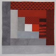
I started out with the intention of using line drawings, and thinking that the flour paste resist would give me the best results.  But I tested out painting and stamping more solid images as well, and am very glad I did, as I think those gave the best results.  Here are the ones that I will be following up with more trials:
Cleanline resist, painted onto light gray fabric, overdyed with medium gray, LWI [low water immersion]

Jacquard Color Magnet, painted onto white fabric, then overdyed with medium gray

Thiox discharge paste, painted on.  When I do further trials, I will cut off the discharge process sooner, for a less opaque result.

Thickened dye, painted onto grey fabric.  The monoprint images were very similar to this.

Thickened dye, stamped onto gray fabric.  I diluted the color too much, but definite possibilities using stamps.

Four years ago, in a workshop with Carol Soderlund, I made a number of stamps with shapes of stones.  Towards the end of my trial process this week, I remembered I had these somewhere, and dug them out.  Very glad I did.  In further trials, I will use these with discharge as well as with different concentrations of thickened dye.  Below are stampings I did at that 2012 workshop.


I am excited by these results and look forward to further trials using these selected techniques.  The discharge option is the trickiest, as the color the fabric discharges to varies according to the exact dye applied before the discharge.  I'll also have to keep better track of the concentration of thickened dye that I use for the painting/stamping processes.  Sometimes a quilter has to behave like a lab scientist!

March 20, 2016

Thinking about a red and gray log cabin quilt

I'm at the early stages of planning a quilt that will be a wedding gift for one of my son's best friends.  He and his fiancĂ©e really like scarlet and gray, so I'll work with those colors.  I'll have a good deal of hand-dyed gray fabric left over when I'm done with my current quilt in progress, so it will be nice to use that in another quilt.  I'm thinking of a log cabin quilt.  Here are some early trials for blocks.  The first group of three below is made of "logs" that finish at 1.5", with the block 3 logs deep on each side out from the center.  The grays are my hand-dyed fabrics; the reds are commercial prints.  Here I'm comparing three different fabrics for the center square.


light gray center
white center
black center

Then I did another block using all hand-dyes, a light gray center, logs increased in size to 2", and only two logs deep out from the center.  (These are reds I had on hand; if I go with solids, I will dye reds with less orange in them.)


I'm leaning towards a block that is just two logs deep, but I'm not sure on the width of the log or on solids versus prints in the red.  In the comparison below, I've folded under the last log in commercial print block, so both are just two logs out from the center.


Now I'll ask the couple what they prefer. . .  They decided on all hand-dyes (like the block at the left in the last photo).  How nice to have someone else make the decision!


March 9, 2016

Progress on "Holiness" and another quilt about stones


Holiness is now basted and the hand-quilting has begun.   Hand-basting on the floor took about a week.  Now that that's done, I can begin on the next quilt about stones.  I can only hand-quilt for about 30 minutes each day (to prevent injury to my hand,) so that gives me lots of time to work on another quilt.

Here's a small sketch I did a while ago, a quilt that would include some drawings of stone shapes, probably done through scratching into flour-paste resist, but with other methods also possible (direct drawing with thickened dye, monoprint, discharge, etc.)  I was thinking of an arrangement of the stones that would recollect the way stones are lined up on a gravestone.  When I showed the sketch to a friend, she said it reminded her of the layout of a cemetery--all the better.  (Thanks Louise!)


I'm thinking of this as a large quilt, about 70x80.  I redid the sketch, re-drawing to eliminate overlap in the rectangles, and then tried folding up yardage to size and putting it up on the design wall.  Very difficult to work with.  Then I put the drawing into Photoshop, and filled in spaces with different values of gray.  That got me further, but I decided it would be better to do a small maquette with actual pieces of fabric rather than continuing on the computer.  You can see a couple of results below. These are about 15x18."  I cut 3" strips from the various grays I thought I'd like to use, and then cut them further to size.  In the first trial, I used a range of values from light to dark, but with a preponderance of medium values.


I did several more versions, concentrating more and more on the medium values.  Below is the 5th iteration; mostly medium, but keeping one light in the corner and a few somewhat darker.  This is getting closer, but I'll try another step towards a narrower range of value, all medium.


Then I'll work further on the composition--I'm not satisfied with the relationships between the shapes. I'll start by tweaking the design I have, but I think I'll likely end up starting over again.  Having the range of values set may help me rethink the composition.

And not everything I've been working with is gray!  I'm just finishing up a hamsa for a friend who is in the middle of chemotherapy.  A hamsa is an amulet commonly found in Jewish and Middle Eastern cultures.  This website has many nice images and some explanation.  This hamsa is a little smaller than my own hand.  I enjoy doing the embroidery, and keeping my friend in mind as I sew.


I'm thinking I will face it with another piece of cloth, cutting it into the hand shape--like this one I bought years ago and carry around in my purse:


And here's another one I made for a group quilt, put together for another friend undergoing treatment for cancer.  The Hebrew word in the center is "Chai"--life.