Showing posts with label accident. Show all posts

December 20, 2015

Accident II

I think Accident II is finished; recap of previous steps here.  Final size: 57x91. I overdyed the right edge so that there is color out to the edge all around.  I layered the top on a plain black backing, no batting, the two layers sewn right sides together and then turned for a plain edge.  I had planned to do simple stitching throughout, a running stitch following the diagonal line of the image, changing thread colors to blend with each area.  I was looking forward to having the piece on my lap for the months it would take to do the stitching.  But the more I look at the piece up on my design wall, the more I feel it's complete as it is.  I've long had it in mind that this piece is a kind of banner, and I think free-flowing cloth is more appropriate to that.  Stitching would interrupt the flow of the words and of the cloth.  I may do some stitching on a smaller trial piece I have from earlier stages, to see if the decision sticks.  Comments/suggestions welcome.

I will be having a show in Galesburg sometime in fall or summer of 2016.  My plan is to hang Accident I and II next to each other.  The first (below) is there for the viewer to stand before and read each word; many design choices were made with this purpose in mind, including its overall format as a page of text.  In front of the second, where the viewer will need to step back to take in the whole, my intent is that the viewer, knowing the content of the words, can focus on the emotive content.


September 2, 2015

Accident 2, top done, and the context of the original Accident quilt


The top is done. It measures about 60 x 100."  

I do not have the full sense of satisfaction that I sometimes feel when I complete a piece--that I have gotten just what I wanted, or so close that there are no thoughts about going further.  But I am content enough to work further with this top to bring it to completion as a finished work.  I am thinking of doing hand-stitching through the top and a second layer of fabric (no batting); I have begun stitching trials.  It is less an issue of what stitching will add to the piece, as my needing to sit with it, stitching.

I have been thinking all along that I would leave a white rim around the printed area, maintaining the rough visual edges where the dye was scraped.  But I may decide to turn under the edges.  With the help of Photoshop, here's what it would look like:
If I later decide to do a different version of this piece, here are the things I would repeat and the things I would change:

Repeat:
  • the colors of turquoise, blue, ochre, and black
  • overdyeing most of the text, but leaving the key phrase in white
  • the size/style of the lettering
Change:
  • Work on making a better transition between the turquoise and the blue.  (I would need to get help with this--I tried various methods on samples, and could not get the look I wanted.)
  • Try a version with the ochre placed differently.  I'm satisfied with the slash in this version, but could see trying something else also.  Of the small watercolor sketches below, I'm most interested in #2 or 3.
  • If I leave a white rim, watch the shape of the large black area.  I didn't mean for it to get narrower towards the bottom.  (This is one thing I could adjust on the existing piece, if I decide I want to--I can just add more black.)
  • And more radically--and perhaps the most likely one of these I would do--I could change the scale and focus by cropping to the area immediately around the highlighted line.  I didn't think of this until I took a detail shot of that area of the quilt.  I think this could be a piece in itself.

* * * * * *
My intention is that when I show this quilt, it will be in close proximity to the first Accident quilt, a small piece (35x48") in which I stamped a narrative of the night my son died in 2004.  I want the viewer to be familiar with the narrative--so that it is recognized in the second piece, without a need to decipher the obscured text.  The focus instead is on expression through color and shape.  For Accident 1, I intended the reader to stand and read the narrative.  


I hope the narrative will be legible to you on screen here (double-click for a larger image), and if you read it through, I think you will see why I chose to highlight the phrase that I did.  

The color of the cloth is the color of the mud that covered Jeremy's body.  I dyed many pieces of fabric before I came to the color that matched the evidence I kept as well as my memory of it.  I incorporated much of this fabric into the back of the quilt.  I used the same color dye for the diagonal slash in Accident 2.


* * *
I could not have done this piece without a great deal of help, inspiration, and encouragement.  Thanks first to Claire Benn.  I signed up for her September 2014 workshop on "Graphics & Graffiti" in order to get more ideas for using text on cloth.  In addition to getting a lot of practice with text, it was there that I learned the technique of making a paper laminated screen; a small version I did at the workshop using a couple of lines from the Accident narrative was the beginning of this piece.  Claire had mentioned that one could work very large with this method, but when I started to think about doing just that, I realized the many challenges of upscaling.  When I wrote a few questions to Claire, she suggested that we talk it through on the phone.  I am deeply grateful for her encouragement to work this large, despite the challenges, and for the time she took long after the class to explain in detail how I could adapt the technique to this scale.  Thank you so much, Claire!

Thanks also to my husband David, who is my steady interlocutor for many aspects of this process.  He understands as no one else can the grief (and the process of living with grief) that shapes this work.  I often rely on his eye to help with design decisions as well.  And for this piece especially, he was my studio assistant, as I relied on his physical help for setting up the huge print table, and other tasks in the printing process that I could not do on my own.

Finally, thanks to my friends in the Quilters by Design Group.  They have seen all my major pieces in progress, and I depend on their supportive critique to move the work forward.  I am especially grateful that our teacher, Bill Kerr, has been able to come to some of our gatherings; the response and advice he's given on these two works on the accident have been especially important.

August 20, 2015

Overdyeing

Today I did the overdyeing for Accident-2.  Since I was doing this on the cloth alone (no screen stretched over the top), I realized I could do this step on my large padded work table, rather than on the floor.  The photo below shows the top edge of the quilt pinned to the table.  (Ignore the messy splotches on the drop cloth under the piece--it's been through the wash.)  The rest of the piece is hanging over the table and resting on the floor.  After I finished each section (applying the four colors across, from right to left), I pulled the piece up and over the back of the table.  I put a sheet on the basement floor to protect it.


I ran a line of thread loosely down in the turquoise section, to mark where I wanted to extend the royal blue.   (I removed the thread as I worked--otherwise it would have served as a resist and left a line in the fabric.)


The next photo shows me at about 2/3 down the piece.  Here I'm finishing up scraping on the new layer of black dye, and am using a narrow strip of a cut up (expired) credit card to scrape the black dye carefully on the edge of the ochre shape; the larger areas are scraped with a whole credit card--a great tool!  In my left hand, I'm holding a foam tray with a puddle of thickened dye.  I know this looks like I've made the black area totally solid, but once the dye is washed out, the letters will be gray, against the black background.


I feel cautiously optimistic about how the piece will turn out.  There is a certain amount of fixing I can do after I see how this overdye turned out.  I can't make anything revert to white, but I can add further color to areas, if I decide that's needed.  Now I wait about 10 days for the dye to batch.  I may do a little screen printing on cloth napkins with some of the thickened dye I have left over.  And perhaps I'll get back to the hourglass quilt--the top is done, but I still have to figure out how to finish it into a tablecloth.


August 19, 2015

Accident 2--penultimate version


I left this work to batch for about 10 days.  Today I washed it out--detail above, full piece below.  The final step will be to overdye the piece in turquoise, blue, ochre, and black, with the goal of diminishing the visibility of the text.  The overdye will also give me a chance to reconsider the royal blue section.  I made it narrow in this version, just edging the ochre--not sure why I did that, and I don't think there's enough of the blue.  So when I overdye, I'll expand that section more into the turquoise, and make it more of a wedge rather than a stripe, more like it was in this earlier trial.  I am satisfied with the shape of the ochre in this version.


Pulling the dye on this large piece was grueling.  I thought it would take about an hour, but it took three, on my hands and knees.  It was helpful to have done the smaller trials (about 1/3 the size), but I didn't anticipate how much easier they were to complete than the full-size version.  

Screen placed on cloth, ready to pull the dye through the screen.
I have in the back of my mind that if I'm not happy with this version, I can always do another (perhaps trying a version without the ochre divider).  I hope I'm satisfied with this version. . .


August 3, 2015

Progress on Accident 2

I'm making progress again on Accident 2.  When I last wrote about the piece (in this post), I had gotten to this point in the trials:


Since then, I've considered the helpful comments I've received, consulted with friends, and done one more trial.  The biggest decision I've made is to diminish the starkness of the text by overdyeing the piece, turquoise over turquoise, blue over blue, etc.  The photo below shows the overdyeing trial.  I tried two different values of each color, and three different values of black.  I prefer the darker overdye (towards the top of the piece, most easily seen in the black section).  This also opens up another design possibility:  I will leave a small part of the narrative in white, for the sake of emphasis.  This will draw the viewer to one key part of the text, rather than reading the text as a whole.  I have chosen a sentence to emphasize--not the one I happened to leave white in the trial piece.

I also decided not to use the "scratchy" writing in the bottom half of the trial piece.  And I will make the ochre divider less of a line and more of a thin, varying shape.  So, that left me ready to do the full-scale version.  The first step was to write out the whole narrative on a large, taped-together sheet of newsprint.  It ended up being about 52" wide and about 87" long.

I decided on a combination of printing and script, something close to my natural writing.  It took me a few tries to get the size/spacing correct.  By the third time, I gave myself room for error by writing it out first in regular pencil (easy to erase), and then going over it with a heavy graphite crayon.


I put the paper version up on my design wall so that I could work on the shaping of the ochre divider. Using a small watercolor sketch that I like, I drew a version on a separate piece of plain newsprint.  I will cut this out and use it as a guideline when applying the ochre dye.  It was possible to improvise this line/shape when doing the small watercolor, but when working large, on my knees on the floor, there has to be more planning involved.


Then the narrative-on-paper was laid down on my huge printing board in the basement, and a layer of polyester sheer laid over it and stapled down. 


The text written on the paper serves as a guide for writing the text onto the polyester sheer, using matte medium.  I put some blue paint in the matte medium, as this makes it easier to see what I've done, and also helps in the washing out process, when I will need to scrape off all the paper from the sheer, except for the parts that have stuck to the screen (which will show because of the blue paint).


Now I wait 24 hours for the screen to dry.


June 13, 2015

Accident 2

Back in March, I reported briefly on work I've been doing that is centered on a short narrative of the night of Jeremy's death.  I'm going to repeat a bit of that here, as background for an update on the new work in progress.

I wrote the narrative shortly after the accident, in 2004.   Ten years later, in the winter of 2014, I started a quilt that incorporated the text of the narrative, which I stamped into a mud-colored cloth. 


The letters are 3/8" high, resulting in a piece that is 35 x 48."   This piece is all about reading the narrative.  The words are very legible, and decisions about layout and proportions were done with a page of text in mind.  I can see the impact when people have viewed it in my studio--one has to stand and read it.   (I haven't posted a photo of the whole quilt, as  I'm not yet satisfied with the presentation of the cloth.)  In the midst of a workshop with Claire Benn, in which I learned how to make a very large printing screen through paper lamination, I decided to work again with the narrative of the accident, but to a different purpose--this time with expressiveness more important than legibility.  For this next version of "Accident," I will work large.  I have prepared an oversize print table from the top of a ping-pong table.  Claire Benn has done very large work by climbing on top of her print table.  The ping-pong table was not secure enough for that, so I removed the legs and put it on the basement floor.  I covered it with a couple of layers of felt and two layers of a heavy-weight cotton, stapled around the edges to keep it taut.  The table is 60 x 108."


 I have been working for about a month on various trials for the piece.  In the photo below, starting in the top left and going down:

  • the small trial piece I did in the workshop with Claire Benn
  • a larger trial done in my basement set-up, measures about 40x30"
  • a quick watercolor sketch to get a sense of what this would look like in a horizontal orientation (lettering done with white crayon as a resist)
  • (on the right) another sketch using a vertical orientation

Then I did several smaller watercolor sketches of the vertical orientation, trying out different placement of the ochre color.  


I used the version on the far right in my next trial.  (Would you make a different choice?  I'd be happy to hear about it.)  The next trial (bel0w) is about 52" wide, which is close to the size I'm planning for the final piece; the length will be about 100".  In this trial, the lettering is the actual size that I will be using (about 2" high).

Things I was testing out in this trial:
  • two different styles of lettering:  the top half is in close to my normal handwriting (but with lines so close together that it is not conducive to reading); the bottom half is in a consciously distorted writing.  The goal in this piece is to have the text recognizable as a narrative, but not necessarily to be read, so I'm aiming for reduced legibility.  I haven't decided yet which lettering style I prefer.
  • the transition between the turquoise and blue:  I wanted more mixture of the two than in the first large trial (where they appeared as stripes), and I succeeded in that, but I'd still like more interplay.  I think I'll try some horizontal dye scraping as well as vertical.

  • texture in the black:  In the first trial, the large black area came out uniform in appearance, even though I used four distinctive black dyes.  In this trial I did a few things to get more texture in this area:  I applied some splotches of color (blue, red, ochre) and then immediately went over them in black.  I also applied large splotches of different blacks, and let them sit for an hour before I filled in the rest of the area with the main black that I was using.  I also intentionally left some areas not thoroughly scraped with the dye, so that there would be some interruptions of white.  The screen also wrinkled in one area--not intentional--but I decided not to worry about it, and I think that just added some to the texture.  Here are some details of areas that show the variations:


When I look up close (as in the details), it seems like too much color shows in places, but if I step back and look at the whole, (as in the picture of the whole piece above), it looks better.  I may try diluting the under-colors a bit the next time.

I'd be happy for comments on any of this, and am especially eager for any suggestions on how to handle the turquoise/blue transition and the texture in the black area.  And if you have a preference for one of the two writing styles, I'd love to hear it.  Here are the two lettering styles, separated:

top rows


bottom rows


March 12, 2015

Working with words and shapes


It is almost six months since I participated in a week-long workshop with Claire Benn at the Crow Barn in Ohio.  The workshop gave me a chance to work on multiple ways of producing graphic shapes and lettering on fabric.  Most of the examples above will reappear below, as I describe the work.

The workshop was called "Graphics and Graffiti."  Most of the sample work that Claire took us through had to do with ways of using letters/words, but we were also encouraged to do graphic work more broadly.  Most of what I did falls into three categories:  writing/marking with ink (on both paper and fabric),  screen printing with shapes drawn from my "Regret" quilt, and using a paper lamination screen to print a large block of narrative text.

Writing/marking with ink:
The first day of the workshop was devoted to working with paper, using markers and then various implements with India ink.  Many of the exercises we did were inspired by the work of Denise Lach, who takes calligraphy into the world of abstract art.  Claire had us choose a phrase or sentence, and work with that over and over again throughout the day.  Several years ago, I asked a rabbi if he had a blessing for someone for a broken heart.  He replied, "The Kotzker Rebbe said, 'There is nothing so whole as a broken heart.'"  This sentence touched me deeply, and it's the one I chose to work with for these exercises.  My favorite version is the one below (which came late in the process), in which I formed the letters of the word broken with the fat end of a wooden shim.  The letters B, R, and O are in the top line, K, E, and N in the bottom line.


Screen printing with shapes drawn from my "Regret" quilt
I have long been drawn to repeated but varying abstract patterns, with some favorites being Matisse cutouts and Kuba cloth.  Early on in my quilting, I thought of replicating such a design in applique, but decided I would rather wait and come up with my own repeated shape.  Now, years later, it occurs to me that the shape I used in my quilt on 
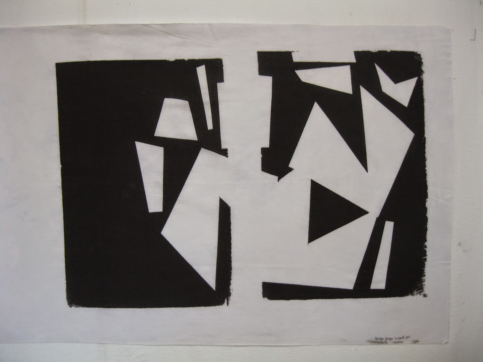
regret might also work as a smaller repeated shape, with perhaps some other related shapes added in.  Here's an early attempt:  the shapes were cut out of freezer paper, adhered to a silk screen, and printed with black thickened dye.


 For this next piece, I used one large piece of freezer paper, with shapes cut out of it and set aside; pulling the dye through the shaped holes gave me black shapes on a white background.  The photo was taken after I had made repeated pulls of the same screen; you can see some of what just one pull looks like on the far right.


I added another pull or two for more overlapping black shapes, and then added some splotches of yellow.  I like this piece a lot--not so much as a whole composition, but as material to cut up to put on note cards or to be used in some other kind of composition.


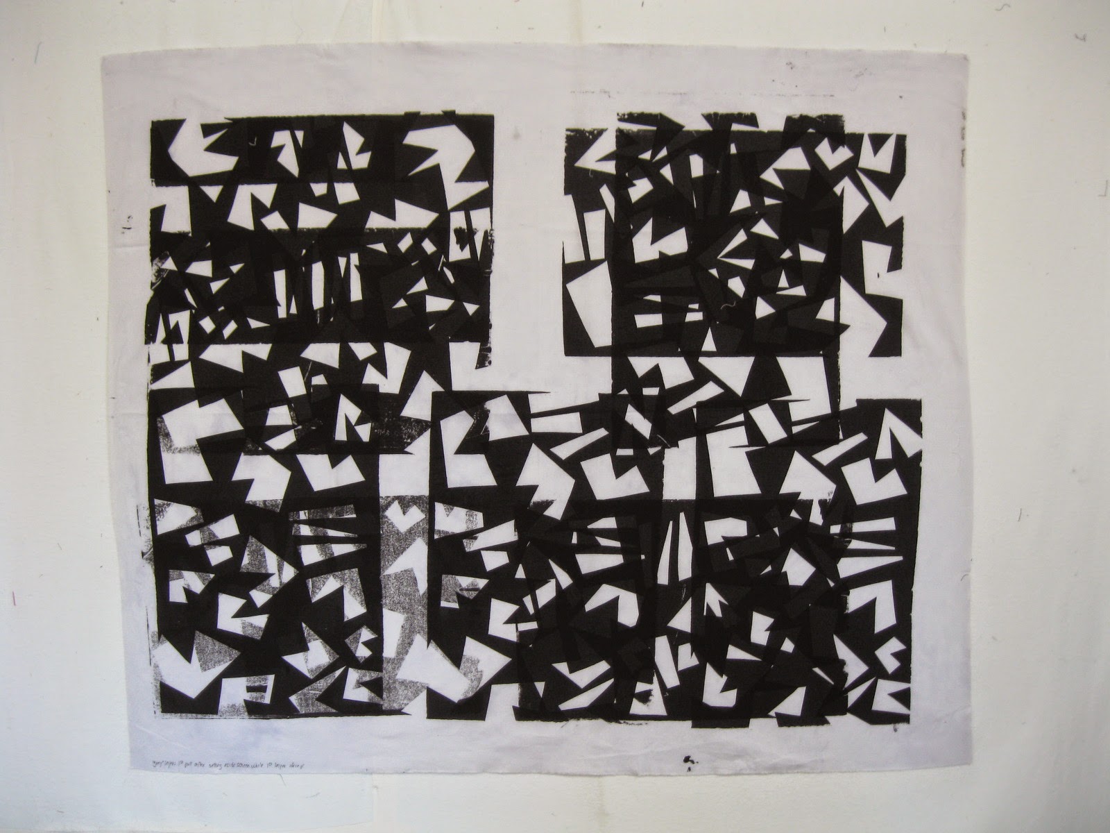
Here's another screen made with the freezer paper shapes set aside from the piece above, screened five times on a large piece of cloth.


Then I went back over with the screen turned 90 degrees from the first pull.  When doing multiple layers like this, you need to wait for the first layer to dry a bit before printing again.  I didn't realized that the first pull after the wait would come out lighter--seen in the bottom left corner in the photo below.


This mistake led to a lovely variation in texture.


Using a paper lamination screen to print a large block of narrative text
One of the techniques totally new to me was making a printing screen out of a piece of polyester sheer fabric, with no frame.  This method allows you to make a very large screen, as the fabric is about 54" wide and as long as you want.  It's called "paper lamination" because the basic process involves making paper stick to the back side of the sheer, in whatever design you put on with liquid matte medium.  So, it's a great method for making a screened image of handwriting, or any kind of line drawing.  Below is a photo of part of the screen that I made.  Most of the image is looking at the front of the screen; I've turned over the sheer on the left side, so that you can see the back, with the paper stuck on.   (Double-click on the photo to see more detail.)  Sorry if this isn't clear--it's the kind of process that is better demonstrated than written about.  Just trust me that it makes it very easy to do a large screen with direct application of line drawing.


 The text I'm using here is part of a narrative of the night Jeremy died.  I wrote the narrative shortly after the accident, in 2004.  Writing down what happened helped me stop going over and over it in my mind.  Last winter I started a quilt that incorporated the text of the narrative, which I stamped into a mud-colored cloth.


The letters are 3/8" high, resulting in a piece that is 35x48." (I haven't yet posted about this quilt--I'm waiting to make a few final decisions about it.)  As Claire explained the possibilities of working with a paper laminated screen,  it occurred to me that I could work again with the narrative of the accident, but use a very different method, to a different purpose--where expressiveness would be more important than legibility.  I made a screen, trying out different kinds of handwriting styles: script, print, all caps.  I printed two versions, one with a range of color on white cloth, and a second all black on gray cloth.  I especially like the potential for expressiveness in the multi-color one.


 I have recently begun the planning process for a very large piece (about 80x90") done with this process.

And a couple of other things:
Flour paste resist is another possibility for a large piece using the accident narrative.  This method, too, would allow me to work very large.  This technique involves spreading a layer of a flour/water mix on the cloth, and then scraping a design in with a skewer or other instrument; thickened dye pulled over that leaves black letters on the white background of the cloth.


Another way to get black lettering is to use a soy wax resist on black cloth and then discharge the black, leaving only the lettering that stays under the wax (which is washed out after the discharge process).  I tried several versions at the workshop, of which this is my favorite:

But I don't so much enjoy working with the wax, and the paper lamination and flour paste resist give me plenty to work with.


Many thanks to Claire Benn for a great workshop!  She'll be doing a similar workshop again this fall at the Barn, if you're interested, as well as a second one on "Exploring Gray through Surface Design.  You can see more of Claire's work here.


If you've never been, the workspace at the Crow Barn is great, and the whole set up is very conducive to positive relationships with other students as well as with the teachers and staff.  Here I am with Stephanie Meisel and MJ Kinman, both of whom I first met at a Barn workshop taught by Dorothy Caldwell.  Students tend to come back to the Barn, so paths can cross again in later workshops, which is really nice.