November 13, 2023

Workshop with Jane Davies, Part 2 (work on menhirs)

I last wrote about my second planned piece neolithic menhirs back in August, here.The first thing I did when I turned to this project again during my second week at the Jane Davies workshop was to draw a full scale sketch of a composition, using a roll of newsprint I'd brought with me for this purpose. I knew the facility would have ample wall space available for this, and it's more difficult to do on my design wall at home which is large enough, but is composed of foam core covered with flannel, not too good for drawing. 


This drawing is not in any way final, but I was glad to see an image in something like the size I am want to end up with (about 90" high). This is enough to serve as a placeholder, while I go on to work through the details of the composition. I am still at the very beginning of this process.

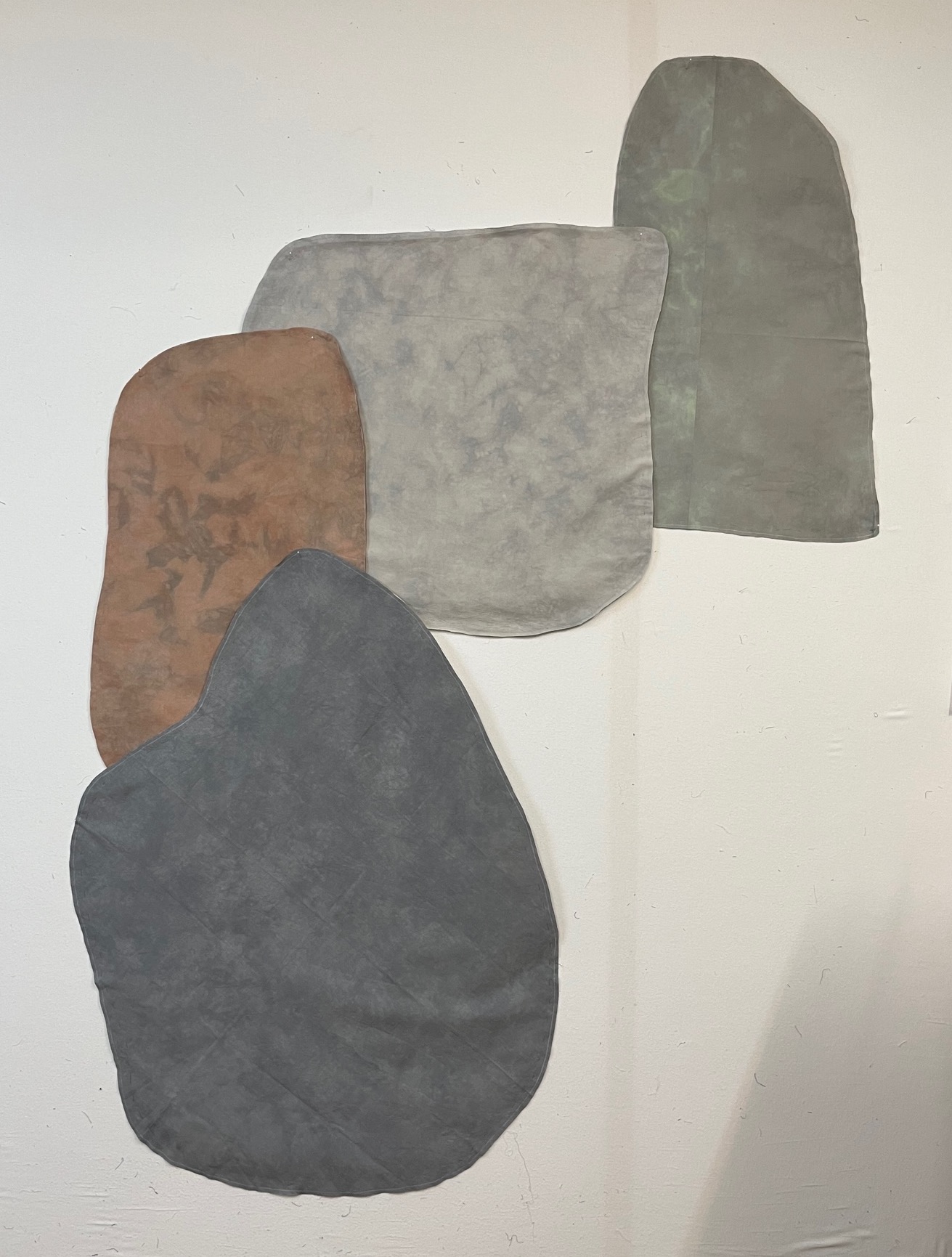
From there, I wanted to experiment with color. When I last worked on the project in my home studio several months ago (when I was thinking of four shapes rather than three), I'd cut out the menhir shapes from hand-dyed fabric I had on hand:


But this left me dissatisfied, reminding me of the challenge I'd faced before in making abstract work about stones, which are already such simple shapes. Of course, another possibility would be to move away from abstraction, towards a more realistic approach. But I'm not drawn to that for my own work, even while I much admire the superb work in this vein by quilt artist Denise Labadie.

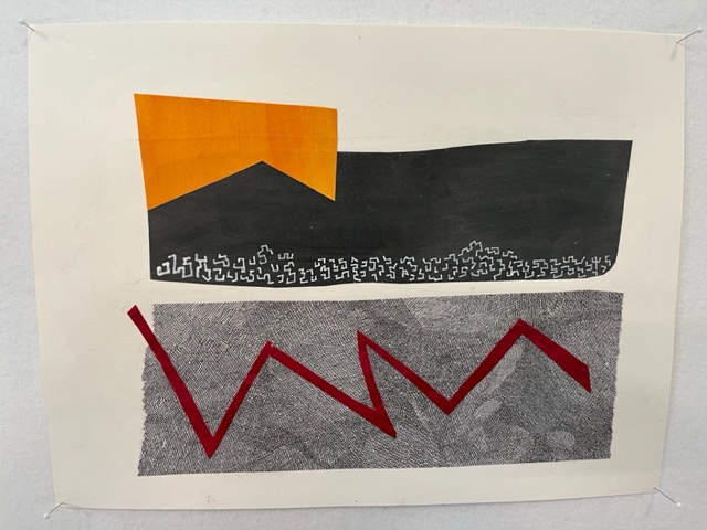
In my previous work about stones, I got to abstraction by focusing on color only, resulting in the piece "Holiness." So, I started thinking that maybe for this piece, I would focus on shape only, and not use the natural colors of stone. I looked forward to the workshop for the time it would give me to experiment, and the tool of collage for coming up with possible colors and arrangements. I decided to try colors very far away from natural stone colors, thinking this would bring the focus to shape; I used a mottled black for the background. Here are the resulting 11x14" maquettes, with the second one pulling the shapes apart a bit.

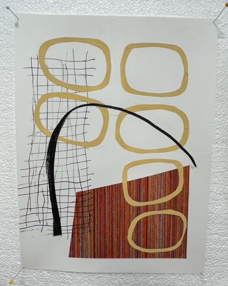
And since one of the demos at the workshop was about texture, I decided to test out texture (and shading) on one of the shapes.


While I felt engaged in these experiments as I did them, I didn't feel gripped by the results, and I would now say they were a dead end. Indeed, I'm embarrassed to even include in this post the collage sketches in green-turquoise-magenta. But I know that once the work is finally done, I'll be interested to look back and be reminded of the paths not taken. I may hold onto the possibility of some kind of texture, but the bright colors are definitely out. So the next steps will be more exploration, sketching, and testing. I have accumulated a pile of books about Giorgio Morandi to look at. His quiet, simple, forceful still life paintings are deeply moving; I think I will learn much by looking closely at his compositions.

And I find myself also looking back again at the stitched drawing of two stones that I made back in about 2015:

21" x 11"

And I also keep looking at this pencil sketch that I made during the workshop, in preparation for the large-scale drawing (click to enlarge):

11" x 14"

Who knows, maybe I'll end up with a large-scale black and white drawing of some kind.  

I'm thinking I will continue to work on this piece until I come up with what seems a promising direction, and then put it aside for a while as I go back to "Persistence," the first menhirs piece, for which I prepared the fabric this summer. The earth pigmented fabric has now cured, and is waiting for the stitching to begin. . . Once the stitching plan finalized and the contemplative stitching begun, I'll be able to come back to the second piece. I just can't do hard thinking about two big pieces at once.


November 11, 2023

Workshop with Jane Davies, Part 1

I spent the last two weeks of October in a workshop with Jane Davies at the Crow Barn in Ohio. The workshop was on "The Elements of Visual Language: A Fresh Look at Abstract Composition," working primarily with drawing, acrylic paint, and collage. You can see Jane's own work here; her youtube channel has many tutorials and online workshops. From sampling these before the workshop, I knew that Jane's methods of working as well as her materials are very different from what I'm used to, but I thought a change of approach would be a productive challenge for me, and thinking about composition is always a good thing. I was also eager to do more work with collage, which I've tried out a little bit before, and which I'd like to use more for making cards. I also thought it could be a useful medium for doing small "sketches" for my second menhir project (the one that will focus on three standing stones), making it easier for me to try out different colors, shapes, sizes, placements than using fabric. And all this held true. I made some interesting work while I was there, using media in ways new to me, and I also made some progress on the menhirs project. And when I got home, I cleared off my "project" desk in my study and set up my collage supplies so they are in easy reach.

Jane's approach was to focus on various elements of composition. An early assignment was to use line only. The first mark I made was the heavy line below. I added other lines, trying out other drawing tools/color:

9 x 12" on Bristol paper

That primary line was intriguing to me, so I explored it in another assignment, which was to work with both line and shape. I like both of these compositions, especially the one on the left, with the coral-colored circle.


I had an exchange with Rick Ortner after the first day of the workshop, describing Jane's approach, and wondering how useful it would turn out to be for me. Jane starts with spontaneous/random marks, while I tend to start from a central idea or emotion and then look for marks that will express that idea/emotion. Rick replied, "Starting from random operations is not bad. . . As long as you think formally, you can generate tons of new structures--structures with metaphorical resonances." These early drawings showed me just what Rick was talking about. Something about this looped line is very evocative to me, even though I can't identify a particular meaning in it. It somehow seems to me both menacing and comforting. I can imagine continuing to explore it, even perhaps in a large textile work.

Some technical information about the two drawings:
  • The scribbly line work was done in a new method I learned from Jane. I drew line clusters with a variety of implements (markers, graphite) on regular tissue paper. When the rest of the composition was in place, I auditioned various line clusters over the composition, cut out a rectangle of tissue with the cluster I wanted, and applied it to the collage with matte medium. Voila! One gets a line that traverses other materials with no skips or hesitations, and the tissue paper is transparent, so doesn't show. Another benefit of this method is being able to audition various lines; if I had been drawing directly on the composition, I would have had only one chance.
  • The prominent looped line and the other solid shapes were cut out of hand-painted collage paper. The paper is inexpensive drawing paper (e.g. white sulphite drawing paper from Blick's), and the paint is artist quality acrylic paint (Jane recommended Golden fluid acrylic paint). (Craft-quality paint does not give as solid a coverage.) Here's an array of the paper I painted:

Some other compositions that continue to appeal to me (these five are all 9x12"): 


On the Sunday between the two weeks of the workshop, I brought some materials back to my lodging and made a dozen or so cards. I enjoyed using techniques learned in the workshop on this small scale (4x6"), and look forward to replenishing my stock of hand-made cards with more along these lines. 


The different-looking one in the bottom right is just a rectangle cut out of the piece of newsprint that I had on my work-table to catch the paint where I went off the edges when painting 9x12 pieces of drawing paper. When I finished an extended session of painting papers and went to clear off my table, I noticed how beautiful these lines were. I got a half-dozen cards out of that one piece of newsprint. Another piece of newsprint is show below, but this one did not happen to yield such beautiful lines.  


In the second week of the workshop, we had the option of working on our own projects or continuing to do assignments suggested by Jane. I did one more day of assignments, and then switched over to working on my second menhirs project. I'll write a second post about that work.