October 24, 2016

Folding and dyeing


While I continue to develop screens for printing designs on napkins, I thought I'd also try some folding techniques, while I also tried out a few more colors.  In these seven napkins, each fabric square was dyed one color, low water immersion, and washed out.  Then I soda-soaked again, folded in various patterns, and overdyed with a 3% solution of Dharma's MX Indigo dye.  Depending on the base color, the dark blue Indigo overdye either stayed dark blue (over light blue and lavender) or changed as it merged with the base color (most noticeable on the rust colored fabric, where the orange and blue together turned the darker color to more of a brown).  Here's a record of the folds, starting at the top and going left to right for each row:

  1. Light blue base:  a diagonal accordion fold, with dark blue applied in horizontal bands.
  2. Gray base: diagonal accordion fold
  3. Pumpkin base: folded in half to make a triangle, then accordion folded perpendicular to base of triangle.
  4. Tan base: One corner secured with a clothespin, holding on to the opposite corner, I twisted the fabric like a rope.
  5. Green base:  folded vertically, and then a flag fold.
  6. Rust base: folded vertically, then folded horizontally into small squares.
  7. Lavender base:  This one not folded, but simply scrunced into a tight "hockey puck" in the base of a small plastic container and the dye poured on both sides.
My goal is to have designs that look appealing when the napkin is folded, as well as when it's open.  Getting the design to look good on the folded napkin is the more challenging of the two.  I think all of these work OK, with my favorites probably #1, 4, and 6.  I like #3 better in the folded state than unfolded.  Your opinion most welcome!


October 14, 2016

"Lines and Rows" workshop with Claire Benn


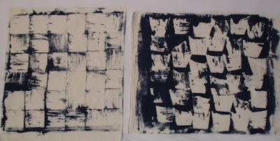
Last month I wrote about my preparation for a workshop with Claire Benn, working up designs for hand-printed napkins.  Once at the workshop, my direction changed from clean-line designs to something else.  The two above are my favorites, both done by stamping with matte medium to make a paper-laminated screen.  The one on the left used a 3" square of acrylic, the one on the right, a variety of stamps I made in a bowl shape.  The virtue of the paper laminated screen is that it can be made any size (here I'm aiming for an image 18x18), and can be re-used many times.  I've worked with a "paplam" screen once before, a very large one made for Accident II.  In that case, I wrote on words with the matte medium.  So, in addition to stamping, I can also try drawing some designs onto the screen.

Below are two more pieces made with the bowl stamps, the first stamping directly with dark blue dye onto lighter blue cloth.


In the one below, I stamped with discharge paste onto the blue cloth, and then later stamped again with dark blue dye.  I like these also, but I'll probably explore doing more designs with a screen, since I can do the whole napkin in one pass, rather than hand-stamping each unit of the design.


 And here's one I did from a thermofax screen, based on a hand-drawn design.  The thermofax is limited to about 8" across, so I needed to print three times to get across the 18" field.  I think I'll try another version of this design on a paper laminated screen.  It turns out that for this project, I like the imprecision of the paper laminated screen rather than the precise reproduction one gets with a thermofax print.


I'm pleased with the new direction, and will continue to work on more designs, as well as variations of the ones I came up with at the workshop.  

October 13, 2016

Exhibition web site now up!


Finally, the web site is up.  I've been waiting for the video of David's recital at the opening.  Everything is now there, including photos and commentary on each of the quilts and the text of my short gallery talk, which focuses on the character of abstract art.