May 22, 2014

Even with a pattern--many decisions


I recently finished up a version of Carol Friendlander's "Focal" pattern; my version above is 40 x 48". When using a pattern, I am relying on a designer for the basic composition of a quilt.  Much as I enjoy designing my own quilts, I also enjoy taking a break, leaving the major compositional decisions to someone else.  But it never ceases to amaze me how many design decisions still have to be made for a quilt, even when working from a pattern.  In this way, I find it very different from the sewing and knitting I have done since I was a young girl.  Yes, you have to choose the fabric or yarn for those, but that's basically one choice, and then you just follow the pattern.  (I know it's possible to do significant adaptation/alteration of such patterns, but I never have.)  With a quilt, even the choice of fabric is a whole set of choices, as a quilt typically contains at least two fabrics, and often many more than that.  The huge range of choices available in today's quilting stores is very different from choosing the one color of, say, cordoroy, that I was going to use for a skirt.  When I first started quilting, I found these choices daunting.  I started reading in color theory to help me figure fabric choice; from there I went further into composition, drawing, graphic design, modern art history, and more--all of which has helped me gain confidence in making design choices as I make a quilt, including sometimes designing my own from start to finish.

About the decisions I made when using this pattern by Carol Friedlander:  As always, the first choice was for fabrics.  I decided to use my hand-dyed fabric for most of the quilt, just using commercial fabric for the little triangles.  In an earlier post (which includes a photo of Friedlander's pattern), I talked about how, while keeping the basic compositional design of the pattern, I fundamentally changed the construction process.  But while the construction was different, the design remains Friedlander's, and I think it's brilliant!

Other than fabric, my big design choice was what quilting pattern to use for stitching the three layers together.  I tried out various designs, and decided to go with a casual, angular floral design in the center section, and then straightline quilting in the border, outlining each "stick."  Even that simple choice for the border came only after trying out several different possibilities on a sample piece.


The final choice was the binding.  The binding is just 3/8" around the edge, but the right choice can really pull a quilt together.  I auditioned various fabrics:  aqua, orange, burgundy, and a scrappy sequences of 4" strips of fabrics used in the triangles.  I thought the scrappy binding would likely be my choice, but it ended up competing with the triangles, rather than emphasizing them.  In the end, I went with a dusky purple, and I think it does its work very well.  I didn't have enough of one color for all four sides, and I wasn't in the mood to dye more, so I used one color for top and bottom and another for the two sides.  Even though the fabrics looked quite different in the large, uncut pieces, with one both darker and with more red in it, you can barely tell the difference in this close up:


And really not at all when you step away and look at the whole quilt:


For the back, I ended up choosing to dye one piece of fabric, a mottled chartreuse.

Done!

May 18, 2014

Daiwabo runner


About a month ago, I wrote about the runner I planned to make from daiwabo fabric, for the buffet in my dining room; you can see the array of fabrics I started with on that post.  Above, you can see the completed runner, along with a painting of the Hotel de Sens in Paris by our friend Rick Ortner.  


The runner was made using Amy Walsh's pattern, "Get in Line" (from American Patchwork & Quilting, June 2012).  Below is a closeup that shows the binding and the quilting: 


I used bias strips for the binding, because of needing to go around a couple of curves.  And since the fabric I choose for the binding was a heavy weave, I made it with single-fold rather than double-fold binding.  I haven't used single-fold binding before, but I think I'll choose it again for some projects. The reduced bulk is nice, and it uses up less fabric.

Those nice wavy quilting lines are done with a set decorative stitch (rather than free-motion quilting), a stitch that came built into my new sewing machine.  I recently upgraded from my Pfaff Performance 2056 to a Pfaff Performance 5.0.  The main impetus to the upgrade was to get enhanced quilting ability, in two ways.  1) The machine has the ability to do very wide decorative stitches, including this wavy one (which can be made wider or narrower, elongated or not).  This is a really useful stitch for a fast and easy way to quilt a project.  2) The throat space on the machine (the open space between the needle and the right portion of the body of the machine) is 10"--several inches longer and also higher than on my old machine.  This makes it much easier to quilt a larger quilt, as half of the quilt has to be able to scrunch up in that opening when being quilted.  These are the features that got me to look at the machine, but in addition, Pfaff did a great job of adding in a lot of very useful features for everyday sewing, without taking away anything I already loved about the Pfaff.  I'm very happy with the purchase.  For any sewers out there who are interested in the machine, I would recommend this 45-minute video:


The table insert that surrounds the machine is clear acrylic--so the thing that looks like a map behind the machine is actually a reflection in the acrylic of the redbud tree outside my window.

Before I put away the extra daiwabo fabric and strips, I sewed up a little log cabin block, just to see how I would like it.  Maybe someday, I'll pull out the fabrics again, and do a table runner from four larger blocks like this. . .

May 11, 2014

Embroidery!


I recently finished piecing the shot cotton "Plain Spoken" quilt.  The next step was to figure out what I wanted to do for the quilting.  On an earlier shot cotton quilt, made from just the larger-size rectangles, I machine quilted a grid, and then added hand-quilting with embroidery thread, a simple line inside each rectangle.  I thought of doing similar hand-work on this quilt, so I tried it out on the sample above, right column.  Too boring, and the narrower rectangles needed a different treatment.  I've been wanting to expand my embroidery repertoire, so I decided to play with some embroidery stitching instead (working it through the three layers of top, batting, and backing, so that it serves as quilting as well)--done in the middle and left columns above.  I love how this looks!  So, my plan is to do vertical stitch-in-the-ditch in the seams between each column to secure everything, and then to do embroidery in the narrow rectangles (0.5 x 3").  I won't do any stitching at all in the larger rectangles (1.5 x 3").  It will take me a year or two to complete, but it will be a pleasure to do.  There are 1,440 narrow rectangles in this quilt, and I'm thinking I'll try to do something different in each one.  I've been going through embroidery books, picking out stitches that will be usable for this project, and so far have about 150 different stitches (e.g., back stitch, lazy daisy, French knot, etc.).  Since many of these stitches can be used in multiple ways, I think it's possible to come up with 1,440 variations, especially since the straight stitch (example in lower left corner above) is basically a short drawn line, so there are as many variations as one could make with a drawn line. . .

With a quilting plan in place, the next step was to baste together the three layers of the quilt.  I usually secure the layers by spray-basting, with the layers pinned to a vertical design wall--a method I learned from a Patsy Thompson video.  But this quilt is 90 x 112 (for a queen-size bed), and the spray-basting works best for something smaller, and for something done by machine rather than hand-quilting.  I decided to baste this on a low-nap carpet, a method described by Suzanne Marshall in her book Take-Away Appliqué, pp. 78-79.  I have a large carpeted area in the finished attic of my house that I could use.  First, the back gets pinned to the carpet, all around the edges:


Then the batting is smoothed out onto the backing.  (For hand-quilting, I use Hobbs Poly-Down.)  Then the top is smoothed out over the batting and secured with pins around all the edges.


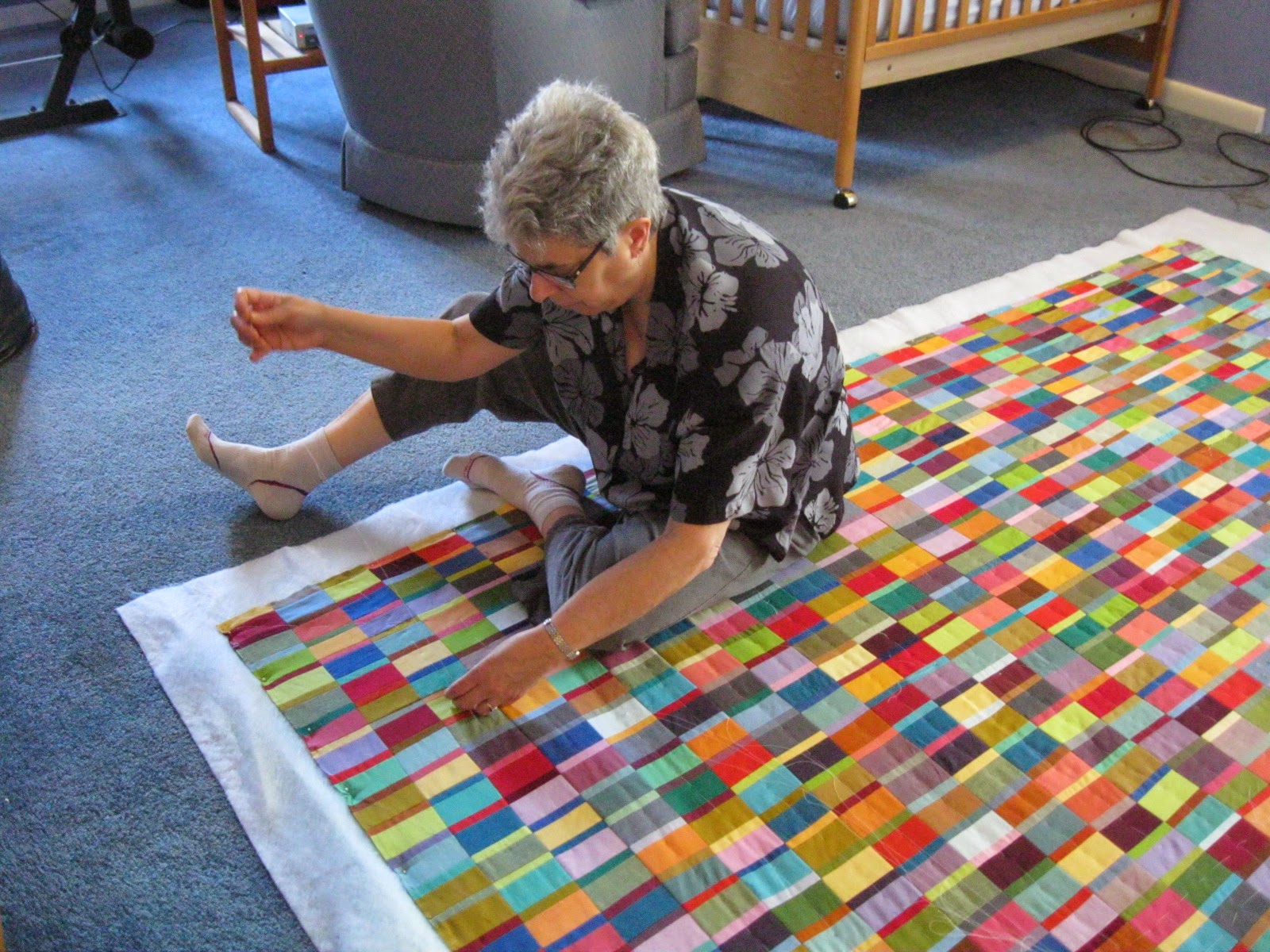
Then, you sit on the quilt and baste it!  I've never tried this before, as I couldn't believe the quilt wouldn't shift from my moving around on it, and I also thought it would be a strain on my back.


But it has been working well.  I do only a half-hour at a time, twice a day.  After a week, I'm about half-way through.  I'll have to up the number of stints to three times a day, as I've got a guest coming into the guest room on Friday!

I'm stitching in the middle of every column, and in the middle of each row of larger rectangles.  It's a pleasure to be looking at all the color combinations close up.


May 6, 2014

Drawing and Looking


Each spring, I look forward to the blossoming of my neighbor's redbud tree, whose pink cloud of flowers I can gaze out upon from my kitchen and study windows.  Today I wanted to spend a little time drawing, so I thought I'd check out the redbud flowers, to see what they looked like close up.  To my great surprise--after 23 years of looking out at this tree--I found that the flowers are not just pink, but have a base of a deep rose color, with pink petals.


Often the particular shape of the component part of a flower has come as a surprise to me, when looked at close up, but not before the color.  I am grateful to my relatively new practice of drawing (begun in 2012 and described here) for making me slow down and look carefully.  There is so much to see. . .

It also interests me that in isolating one flower-filled twig of the tree, there is no hint of the cumulative effect of the blossoms on the whole tree.


May 4, 2014

Twenty colors


Here are the 20 colors that I dyed for the group challenge I mentioned yesterday.  Included here are a few pieces made with primaries I haven't used before, Grape (bottom of middle stack), Boysenberry (the middle fabric in the middle stack) and Strong Orange (bottom of right stack).  Before, to get these colors, I would have been mixing some combination of yellow, red, and blue; it's nice to have this quicker way (just one dye in the solution) to get these colors.

Then I sorted the piles into the colors requested by each of the participants, adding some other colors from my stash as well, and marking which participant each little stack is for.

I look forward to cutting into these fabrics, thinking of each friend as I make a small composition in these different arrays of color.

Two quilt backs and two shirts


The first things I worked on when I got back into the dye studio about ten days ago were large pieces for the backs of two quilts.  Above is a light blue and green piece prepared for a queen-sized quilt.  I'm happy with it now, but it took two rounds of dyeing.  No pfd (prepared for dyeing) fabric comes wide enough to make a large one-piece backing, so I used a regular bleached muslin.  I forgot to factor in how much paler the colors turn out on this non-pfd fabric; the first pass, below, was just too light.


After I told a couple of people, "If it was for the front, I'd do it again," I realized I should do it again.  This quilt will be on my own bed, and I know I'll be seeing the back as well as the top.  So I overdyed the whole thing with more blue, and I am happy with the results--still light but much more pleasing:


Yes, the back will be a nice companion to the top:


Now this quilt is ready to baste up, in preparation for the hand-quilting I have planned.

Next in line was the back for a quilt that was pieced by my group of quilting friends, a quilt that will be donated to help with a fundraiser for the Loretto Center, where we have our annual retreats.  For this back, I dyed a circular pattern, done by folding the fabric as one would for cutting snowflakes from a piece of paper.


Below is the back with part of the top pinned to it.  The rust color is fine, but the gold color is not fully on target.  I could improve this by overdyeing the whole thing with a small amount of red and blue.   The fundraiser is a long time off, so I'll put this aside for now.


 I do love the color movement that happens in this kind of dyeing:


I also tray-dyed two shirts--so easy to do compared to the big backs!  One is a three-quarter length sleeve from Chico's that my sister got on sale.  She picked colors and a pattern that I had used on a T-shirt for myself.  Here's her shirt (on the left) and mine (on the right).  I'm delighted that I was able to reproduce the color/design quite successfully!


I had some black and red dye left over, and it occurred to me in would be interesting to try out another shirt with the proportion of the colors reversed.  I tried this out on one of the many shirts I picked up at Salvation Army last summer.  I like this combination too:


May 3, 2014

Back in the dye studio!


It's been a few months since I've been in the dye studio, which is in my basement.  This winter was so cold that the ambient temperature in the basement was about 40F, and even a space heater wasn't enough to get me down there!  But spring is finally here, and also a project that spurs me to dye a bunch of colors.  I'm part of a small group of quilters who get together for a four-day retreat each year in the Chicago area.  We've recently undertaken a challenge:  to make a small work (just sewn, not quilted) for each member of the group, with the colors determined by the recipient but the style/composition determined by the maker.  As the end result, each member will have something in the style of each other person, but in colors of their own choosing.  We can then do what we want with what we've received--perhaps put them together in a quilt, pin them up on a wall, or just keep them in a drawer.  Anyway, having a list of colors requested by nine other people stimulated a week's worth of dyeing!  I dyed a half-yard each of a number of different colors; five of them ranging from turquoise through aqua to green are in the photo above; all will be lighter once they're washed out, dried, and ironed.  I'll only use a small amount of fabric for each person's block, so this will give me a lot of new colors for my stash.  While I was at it, I dyed a couple of T-shirts with tray-dyeing; one of them is in the skinny white container above.  I also dyed a couple of large pieces for quilt backings.  The last batch of 5 half-yards is sitting in cold water now.  Once that's done, I'll start the washout procedure on the week's work and will have a big reveal in a couple of days.

(By the way, if you get notification of my posts by e-mail, I updated a couple of previous posts that marked guest posts on another blog by adding the content to my own blog--so, old information for those of you who previously followed the link.)