June 28, 2015

Learning Photoshop Elements

I just finished a three-week class in Photoshop Elements with Kris Sazaki and Deb Cashatt.  There's a second three-weeks session in July, which I'm much looking forward to--the class has been great!  The course is specifically aimed at quilters, so of the many, many things that Photoshop can do, Kris and Deb focus on those aspects particularly of use for quilters.  They'll be doing this two-course series again in October and November of this year; if you're interested, follow the link to the contact form on their class website: http://www.pixeladiesclasses.com/  They'll also be offering a course on Fabric Design in January, which I plan to take as well.  Here are some examples of the kinds of things I've learned to do just in these first 3 weeks.

Screen printing:  The one thing I've used Photoshop for in the past is to change an image to black/white and to simplify it, in order to use it for screen printing with a Thermofax screen.  I've learned some additional ways to manipulate the image in this class.  Here's a photo of some sharp leaves from a desert plant in Arizona, and then two different images derived from it.  I think they would both be interesting for printing on fabric.


This particular lesson in the class was especially geared towards quilters who might want to simplify a photo in order to do an appliqué version of the image (usually with fused fabric).  I don't do that type of quilt myself, but I decided to do a photo of that sort also, in order to practice more.  In this photo of my mother-in-law Dorothy Amor--may her memory be a blessing--and my niece Alison Hardie, I think it's interesting how the warmth of their relationship is maintained in the b/w version. I was also happy to be able to take out the poster in the background.

original
simplified

Determining quilting patterns:  Deciding on how to quilt a piece is rarely an easy decision for me. Once I narrow the choices, I usually do actual quilting samples, but getting to that point is a challenge, as it's difficult to get a sense of how the whole piece will look quilted. Sometimes I've used a large piece of clear plastic, laying it over the quilt and drawing on it with crayon (though usually just for a section of a quilt).  Turns out I can do the same kind thing in Photoshop, but mush easier to make changes, I can test on an image of the whole quilt, and there's no plastic glare! 

Here's a photo of a quilt top I'm working on at the moment (Cobblestones Quilt pattern by Kevin Kosbab, from The Quilter's Appliqué Workshop).


Here's the photo with quilting marked:

You can see better what I've done when I segregate out the layer on which I did the drawing.  I tried out various kinds of squiggles in the "cobblestones."  I don't like the circles in the second row, but the others all are decent possibilities.
Another thing you can do is change the colors in a photo.  I've enjoyed working on this quilt and might like to do another one like it.  I played around with changing the colors and came up with something else that could be a starting point for looking for fabrics:


Straightening edges:  Even though my quilts have 90-degree corners, they don't usually look that way in photos, as in "Late March," below (see how the bottom edge looks pulled in).  This is because of camera distortion that you get unless the camera is very carefully positioned, not something I can do for the snaps I take.  Lo and behold, you can correct for this in Photoshop.  

original

straightened

Playing with "fabric swatches" from the web:  Photoshop allows you to pull fabric samples from photos on the web, and play around with patchwork designs.   The black/white fabric below is Line Leaf in Black from the Bark and Branch collection by Fabric Bubb.  I added a "solid fabric" by using the paint bucket tool in Photoshop.  This was fun, but time consuming.  Reminds me that it's OK to cut into fabric I have on hand, even just for the sake of playing around!

The final assignment in the class was to take a photo and do at least five manipulations on it.  I started with a favorite photo of mine--a bouquet of flowers picked on vacation in Naramata, B.C. last summer.  I figured this would be an interesting challenge, because I like the photo so much just as it is.


But in fact, the changes I could make to it were fun to do, and I might work further with the image I ended up with.  I really love what happened to the rose in the lower left corner--might be nice to work with when I get to the fabric design class.  I don't like the big blobs of olive green; in the next session of the class I'll learn how to add texture there.  Note the copyright line in the bottom right--something else I learned how to do in this class.


There were more things in the class also--brightening, intensifying, and sharpening images.  I highly recommend the class!  The lessons are really clear (printable handouts and video demonstrations), and the feedback from the instructors on assignments and questions is prompt and very helpful.   Again, if you're interested, you can sign up to be contacted in advance about classes that will be offered.

June 13, 2015

Accident 2

Back in March, I reported briefly on work I've been doing that is centered on a short narrative of the night of Jeremy's death.  I'm going to repeat a bit of that here, as background for an update on the new work in progress.

I wrote the narrative shortly after the accident, in 2004.   Ten years later, in the winter of 2014, I started a quilt that incorporated the text of the narrative, which I stamped into a mud-colored cloth. 


The letters are 3/8" high, resulting in a piece that is 35 x 48."   This piece is all about reading the narrative.  The words are very legible, and decisions about layout and proportions were done with a page of text in mind.  I can see the impact when people have viewed it in my studio--one has to stand and read it.   (I haven't posted a photo of the whole quilt, as  I'm not yet satisfied with the presentation of the cloth.)  In the midst of a workshop with Claire Benn, in which I learned how to make a very large printing screen through paper lamination, I decided to work again with the narrative of the accident, but to a different purpose--this time with expressiveness more important than legibility.  For this next version of "Accident," I will work large.  I have prepared an oversize print table from the top of a ping-pong table.  Claire Benn has done very large work by climbing on top of her print table.  The ping-pong table was not secure enough for that, so I removed the legs and put it on the basement floor.  I covered it with a couple of layers of felt and two layers of a heavy-weight cotton, stapled around the edges to keep it taut.  The table is 60 x 108."


 I have been working for about a month on various trials for the piece.  In the photo below, starting in the top left and going down:

  • the small trial piece I did in the workshop with Claire Benn
  • a larger trial done in my basement set-up, measures about 40x30"
  • a quick watercolor sketch to get a sense of what this would look like in a horizontal orientation (lettering done with white crayon as a resist)
  • (on the right) another sketch using a vertical orientation

Then I did several smaller watercolor sketches of the vertical orientation, trying out different placement of the ochre color.  


I used the version on the far right in my next trial.  (Would you make a different choice?  I'd be happy to hear about it.)  The next trial (bel0w) is about 52" wide, which is close to the size I'm planning for the final piece; the length will be about 100".  In this trial, the lettering is the actual size that I will be using (about 2" high).

Things I was testing out in this trial:
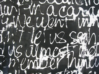
  • two different styles of lettering:  the top half is in close to my normal handwriting (but with lines so close together that it is not conducive to reading); the bottom half is in a consciously distorted writing.  The goal in this piece is to have the text recognizable as a narrative, but not necessarily to be read, so I'm aiming for reduced legibility.  I haven't decided yet which lettering style I prefer.
  • the transition between the turquoise and blue:  I wanted more mixture of the two than in the first large trial (where they appeared as stripes), and I succeeded in that, but I'd still like more interplay.  I think I'll try some horizontal dye scraping as well as vertical.

  • texture in the black:  In the first trial, the large black area came out uniform in appearance, even though I used four distinctive black dyes.  In this trial I did a few things to get more texture in this area:  I applied some splotches of color (blue, red, ochre) and then immediately went over them in black.  I also applied large splotches of different blacks, and let them sit for an hour before I filled in the rest of the area with the main black that I was using.  I also intentionally left some areas not thoroughly scraped with the dye, so that there would be some interruptions of white.  The screen also wrinkled in one area--not intentional--but I decided not to worry about it, and I think that just added some to the texture.  Here are some details of areas that show the variations:


When I look up close (as in the details), it seems like too much color shows in places, but if I step back and look at the whole, (as in the picture of the whole piece above), it looks better.  I may try diluting the under-colors a bit the next time.

I'd be happy for comments on any of this, and am especially eager for any suggestions on how to handle the turquoise/blue transition and the texture in the black area.  And if you have a preference for one of the two writing styles, I'd love to hear it.  Here are the two lettering styles, separated:

top rows


bottom rows