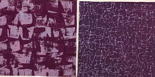
I pulled screens on 7 napkins last Wednesday. I can layout fabric for eight napkins on my large print table. I have six screens that I'm happy enough with to use.
I can re-use a screen in one session if I'm printing with the same color, which worked for the 7th (turquoise) napkin. It took about 2 hours to do the printing. So, it will take me a while to print all the fabric that I've readied for printing (32 napkins total). I may also try making a couple more screens.
Here's a review of the prints, and notes about how to proceed with the next prints. The two below were done with two different screens, but each of the screens was made in the same way. This may be difficult to understand without seeing it, but here goes: I used 2" square piece of plexiglass to stamp rows of squares onto the screen. The stamping medium was matte medium, brushed on with a paint brush cut into so that uneven lines are painted on the stamp, rather than a fully covered surface. Where the matte medium, stamped, sticks to the screen, no dye can go through. I made the screen on the right first, one of the first screens I made. Here I've used it to print black onto boysenberry fabric overprinted. There are many places on the screen where no matte medium stuck. I made a second screen trying to improve on the first, used on the green fabric below (printed with dark blue dye). On this screen, so much matte medium stuck that only the unstamped margins between the squares let through the dye. I like both of these, but I may try making a third screen to get a look somewhere in between these. By the way, the boysenberry/black piece is the only one in this batch where I just pulled the screen once. For all others, I pulled once with the pattern vertical, and then a second time turning the screen 90 degrees.
The next two show the pieces where I did the first pull with a dark value thickened dye, but then diluted the dye by 3 for the second pull. I think these came out well. In both these cases, the color of the dye was simply a darker value of the base fabric.
A friend asked, "Can you do a thinner line for the patterning, so that the color of the fabric is more of the star?" I would definitely like to do this as well. The most direct way to do this is to make the screen using a photo-emulsion process, where the drawn line will print (rather than these screens, line is a resist, and the background prints); I hope to have a chance to do that in December. The other thing I could do is take one of these screens that are drawn lines (like the words on the left above, and the floral design on the right), and use that screen to "print" matte medium onto another piece of polyester screen. On that secondary screen, the background will have the resist on it, and the lines will print. I may try that soon. . .
The next pair are both on boysenberry base fabric, printed with black on the left, and a burgundy color on the right (boysenberry dye with a little black added in). I like both combinations.
The pair below both use lavender base fabric. On the left, I used the burgundy color for printing, on the right a darker shade of lavender. I think both work, but from personal preference, I don't think I'd use the burgundy again on lavender.
I've had other obligations keeping me busy since last Wednesday, but I look forward to trying out some other color combinations and maybe making some new screens too.


