Back on April 23rd I promised posts on three projects in progress. Other things in life have held back progress on the third project, and I wanted to be closer to completion before writing about it. With the backing for this piece now being dyed, I'm ready to describe it. A detail shot is above, and below is what the full top looks like, laid out on the floor, edges not yet trimmed; it's about 52x67."
This piece is in memory of my mother, Helen Schine Gold, a kind of color portrait of her and my feelings about her. I started thinking about doing a quilt in memory of her many years ago (she died in 2003, a year before Jeremy), and started actively working on it in about 2010. The initial thinking was something that would convey the comfort of my mother's presence and of her care and concern for me, embodied in this story: When I was a sophomore in college, I came down with a serious case of mononucleosis, and wasn't eating. My mother flew to Chicago from New Haven to take care of me. (This is an indication of how badly sick I was, as this was the only time she came to Chicago until I graduated. I had visited the university on my own--my first plane flight ever--and had moved out for my freshman year on my own. My mother was nothing at all like today's "helicopter" parents.) Before my mom even came to my apartment-dorm, she stopped at the grocery store to buy the fixings for chicken soup. I ate it, and I began to get better.
I went through several different projects on this theme, advancing each one, but then putting it aside when I could see it had had less promise than I hoped. Finally in this last year or so I worked through to an approach that has gotten me closer to a completed work, one that I feel accomplishes what I've been trying to express.
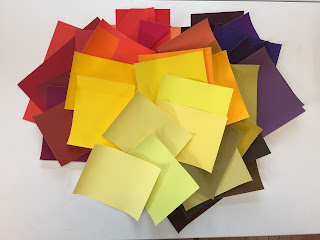
From the beginning, I had colors in mind, referencing chicken soup as well as colors I associated with warmth and care--a wide range of yellows and golds, and maybe a little orange. When I picked up this project again about a year ago, I still had those colors in mind, and thought about doing something that would combine the bowl shape I worked with a few years ago (itself a result of thinking about chicken soup). I did sketches, thinking about doing something large-scale, likely piecing fabric together in a way similar to my Shelter quilt.
I wasn't happy with the background color, so I started sampling on some linen cotton I had on hand that I'd dyed black.

In the last sample above, I was trying out stitches in the upper left that would give a line rather than define a shape. This reminded me of a quotation from a poem of Yehuda Amichai that I had recently noticed in the Shabbat morning service, a poem about the tallis or prayer shawl, that is often decorated with thin stripes:
And why is the tallis striped and not checkered black and white
like a chessboard? Because squares are finite and hopeless.
Stripes come from infinity and to infinity they go
like airport runways where angels land and take off.
Yes, lines. I roughly laid out strands of yarn on a large piece of black fabric. Yes, this could work.
But how to make the lines? I decided on an unbroken line of yarn, not something broken up by stitching, and tried a couching stitch, in which a strand of yarn is laid on top of the fabric and then held down by a series of stitches that wrap around it.
But I didn't like how visible the wrapping stitches were, even when done in the same color yarn. So instead I tried stitching inside the strand, moving the stitches between different strands of the 3-ply yarn so that all is held down.
I got even better at it, so that the interior stitching is really not visible.

A final note: Here'a shout-out to Judy Kirpich's moving interpretation of chicken soup, which I came across along the way, and which inspired me to continue searching for my own.


