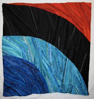
 The pressure was on to get the four tiers of "Shelter" put together in time for the talk I gave on Friday, "Study to Studio: Meaning and Motivation in Scholarship and Art." Here they are, roughly basted and pinned together, and the 4 edges also just basted under. (This is the top only.) Things that still need thinking about:
- the exact curves of the big joins--this is the easiest thing to fix up;
- the grey fabric worked into the black--this may need to go, also not hard to fix;
- the bottom right corner--big design flaw. Why did I make the black tier span both bottom and right edges? I think I did it to lessen reference to a kind of rainbow. But I did the final drawing in pencil only, on white paper. I didn't do a small final maquette with fabrics based on that drawing. Sigh. This will be more difficult to fix. I could do a quick fix by folding in the right side about 8 inches:
 But this results in a vertical composition, not what I had in mind, and the shape of the black tier is too uniform. I think I will probably have to re-work the tiers to get to a composition where the black tier ends only on the bottom. I'm going to put this aside until June, when I'm getting together with my Design Camp friends in Chicago for a day of talking about our work in progress. I know I will get helpful feedback then. And putting it away for a while will help me see things more clearly myself.
A new foray: here are beginning sketches and some paper trials for another project, combining some old ideas I've had "in storage" with new ideas and methods from the drawing class I'm taking.
 Next I'll do some trials with various sizes/colors/techniques, moving into fabric.

Penny -
ReplyDeleteI like the gray fabric in the black; my vote is do NOT make it go away! And why is it " a big design flaw" for the black tier to span both bottom and right edges? If you do want to limit the black to the bottom edge, could you just add onto the point of the red tier to extend it to the bottom corner...but I like it as it is!
Cookie