February 15, 2018

Napkins--patterns, colors, sets


I've been working on screen printed napkins off and on for about 18 months now, since a workshop with Claire Benn in October 2016.  At this point, I've developed nine patterns that I like, and about 10 colors, with about that number again tested and put aside. Through the sample making, I now have a large supply of lovely napkins for myself, and I look forward to making more for occasional house gifts. I'm thinking that before a stay, I would send my host pictures of the colors, patterns and possible types of sets, and ask what they would like as a gift.  

Double-click on any image to see it larger.

Here are some sample sets:


ONE BASE COLOR, four different patterns, 3 different screened colors (navy, black, burgundy, black)

ONE BASE COLOR, four different patterns, one screened color

on each napkin, ONE COLOR, TWO TONES 

ONE PATTERN, different colors

ONE PATTERN, different colors

ONE PATTERN, different colors

MIXTURE-1

MIXTURE-2

MIXTURE-3

Here are the color combinations that I like. (For variations of blue on plain muslin, scroll down to the table of images of all the patterns.)

 
light blue and black
 
light blue and dark blue
 
blueish green and black

 
blueish green, 2 values same color
 
gold, 2 values
 
gold and black
 
lavender and black
 
lavender and dark blue
 
lavender, 2 values
 
light gray and black
 
light gray and dark blue

medium gray and black
 
magenta and dark blue
 
magenta and burgundy

magenta and black

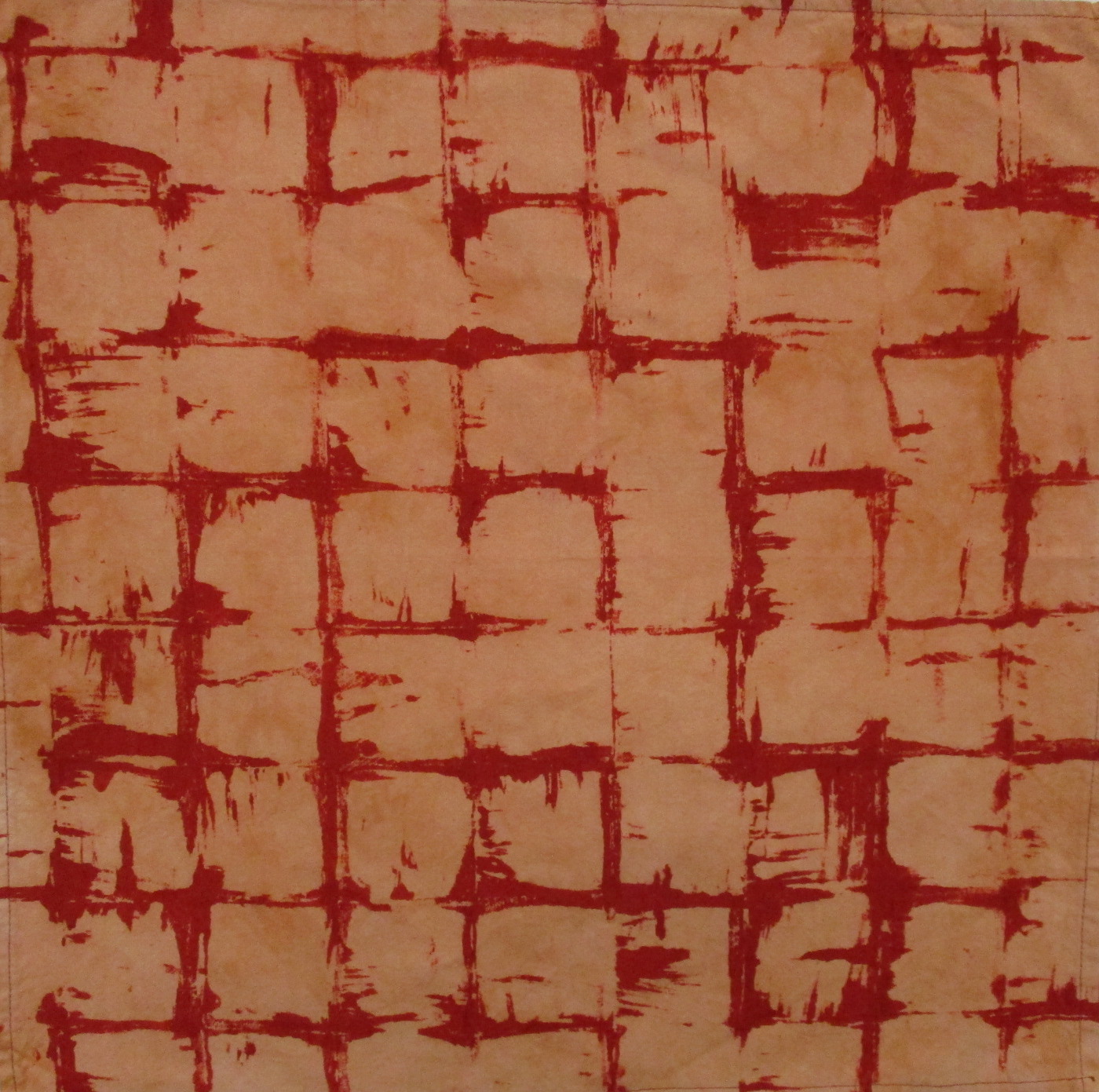
rust and black

 
rust, 2 values
 
rust and red
 
turquoise and dark blue
 
turquoise and black
 
turquoise, 2 values
 
red and black
 
yellow-green and black
 
yellow-green and dark blue
 
yellow-green, 3 values


And here are all the patterns, screened on a base of plain muslin with either one pull of dark blue, two pulls of dark blue, or two pulls of one dark and one medium blue. Further explanatory notes on how each screen was made follow the photos. (Note, there is some backstaining when washing out the dye, so the base color on plain muslin ends up a very pale grayish blue, rather than the cream color of the original muslin.)

 
bowls
 
bowls-over-printed horizontally
 
clover
 
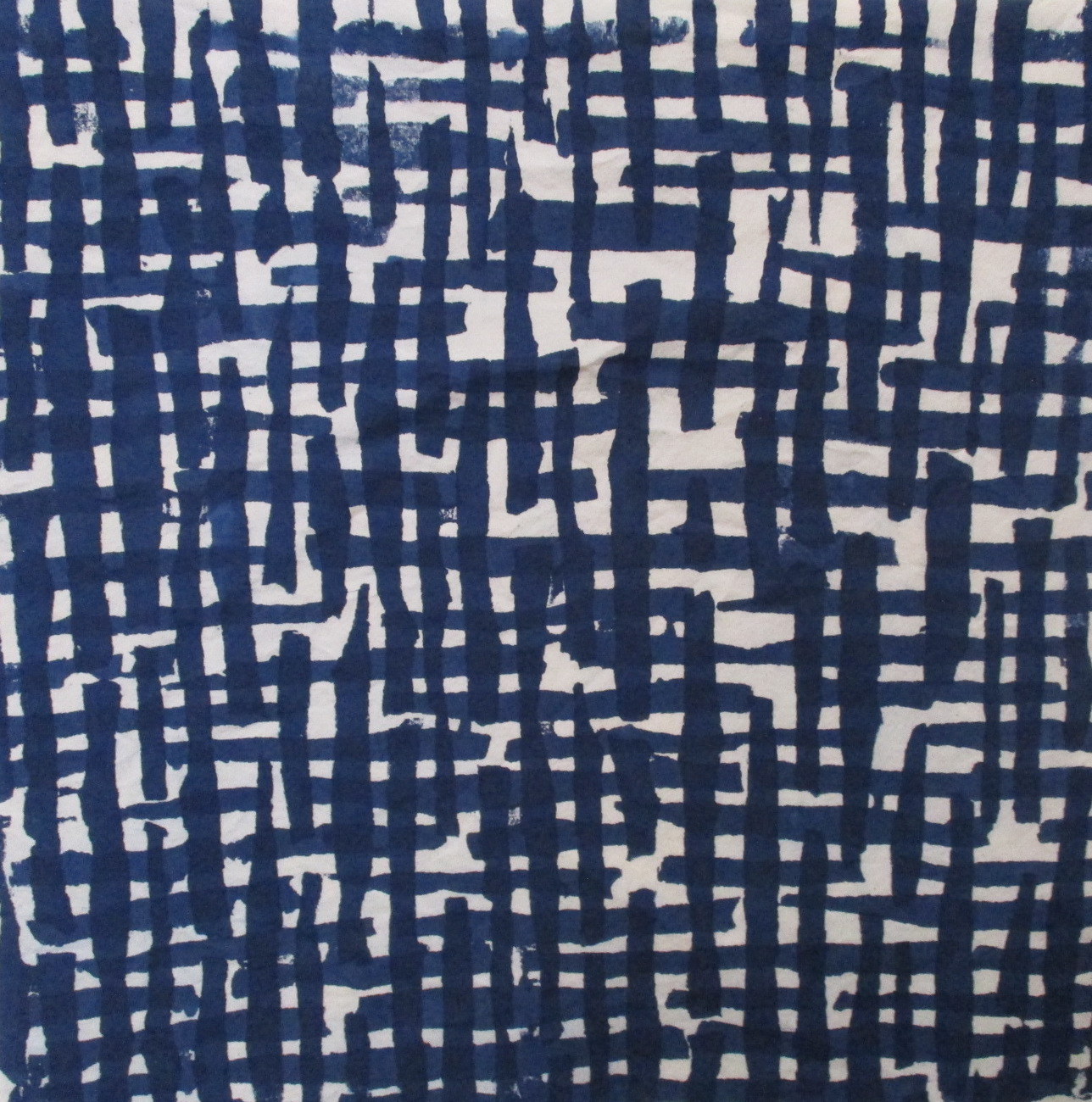
cross-hatch
 
quote
 
quote-fragmented
 
squares-open
 
squares-filled
 
vines


All the above designs were made with paper-laminated screens. For an explanation of the basic process, scroll down in this post. I realize that much of the explanation below of individual screens will likely be confusing to someone who hasn't done screen-printing, but at least it will give you some sense of the method. And since the original post, I made a couple of additional screens through a photo emulsion process, described here.

baklava (photo emulsion

quote-diagonal (photo emulsion)


BOWLS: I made a dozen or so stamps in a bowl shape, cut from a double layer of adhesive foam sheets and then stuck on foam core (easy stamp method learned from Carol Soderlund). I stamped onto the screen with matte medium. For the more complex over-printed design, I printed once with the screen in a vertical orientation, and then a second time with a horizontal orientation.
CLOVER: This is a motif taken from line-drawings I did several years ago. I put the design into Photoshop, made it into a repeat, printed it out, and then put the printout under the polyester to serve as a guide for drawing the design onto the screen with matte medium. (The drawing implement used is a squeeze bottle filled with matte medium.)
CROSS-HATCH: I ripped up pieces of masking tape and applied them to the screen in broken vertical lines, then pulled matte medium through the screen. When the medium had set, I pulled off the masking tape. The cross-hatch design was made by pulling the resulting screen twice, once in horizontal orientation and then in vertical.
QUOTE: The quotation is from Martin Buber: "When one eats in holiness, the table becomes an altar." I wrote out the quote in capital letters with matte medium. The screen has been pulled twice, once vertically with a dark blue and then horizontally with a medium blue. On the first version, the lettering is somewhat readable if you know what you're looking for. For the "fragmented" version: I made a reversed second screen from the first, so that I could be printing the letters themselves rather than the background. Much detail of the letters was lost in the process, but I love the fragmented look.  This was printed twice, horizontally and vertically, but all with the same color blue. 
SQUARES: These two screens were made by using a 2" plexiglass square as a stamp (method/design from Claire Benn). I brushed the square lightly with what Claire calls a "manky" brush--a brush where the bristles have been cut into. In the first screen, the matte medium was applied rather heavily, so the squares are almost entirely blocked from the screened dye, and you see mostly the margins between the stamped squares. This was screened twice, horizontally and vertically, to get enough of a design on the cloth.  In the second screen, the matte medium was applied less heavily, and you get more of a sense of lines across a number of the squares. This was screened just once.
VINES: This design is based on a quilting design that I use frequently. I drew it on the screen with matte medium. The screen has been pulled twice, once horizontally with a dark blue and then vertically with a medium blue.
BAKLAVA: I took a photo of a recently-baked tray of baklava and manipulated it through filters in Photoshop to get a simplified image. That photo was then used to make a screen through photo emulsion.
QUOTE-DIAGONAL: Same quote as for the other screens, but printed out quite small in capitals using a Wacom tablet, so that the image goes directly into a Photoshop file. In another layer, I turned the diagonal 180 degrees to get overlap, leaving one with the sense of letter forms, but the words are not readable.

And for any bloggers out there who wondered how I got the images nicely set into tables, see this helpful tutorial by Sharon Brennan.

February 14, 2018

Celebrating citizenship


Not my usual kind of quilt. . .

I made this quilt for Alain, a refugee from the Democratic Republic of the Congo whom I've been tutoring in English for the last two and a half years; the occasion was his success at his naturalization interview last week. This was an enormous accomplishment for Alain, and I was glad to be able to give him something to celebrate the occasion, and to remind him of the time we've spent together.

Part his preparation for the interview was having to memorize answers to 100 questions about U.S. history and government. One of the questions was "Where is the Statue of Liberty?" so the Statue was a topic we'd discussed.  In looking for fabric for the quilt, I searched for a panel with imagery that would be meaningful to the citizenship process, and I was glad to find this one of the Statue of Liberty. I am not one to display patriotic symbols--there's been too much government action in my life-time that I've been in opposition to. But Alain's path to citizenship made me think more about the many and fundamental ways in which I am so privileged in being a citizen of the United States, and that I should not take it for granted.

Working on the quilt got me thinking of my grandparents, all of whom immigrated to the U.S. in the early 20th century, most likely coming through Ellis Island. They were part of the huge wave of immigrants referenced in Emma Lazarus' poem at the base of the statue: "Give me your tired, your poor, your huddled masses yearning to breathe free, the wretched refuse of your teeming shore. Send these, the homeless, tempest-tost to me, I lift my lamp beside the golden door!"  These are certainly words for our time, still. (For an interesting account of Lazarus' intent, and how the poem came to be put on the Statue, take a look here.)


Congratulations, Alain!

January 26, 2018

African fabrics


Several years ago, some friends gifted me their collected African and South Asian fabrics; you can see what I did with them here. More recently, other friends were cleaning out their basement in preparation for a move, and hoped I could might want the African fabric they had collected over many years.  Of course I said yes!  It includes a wide variety of styles and colors. 


The fabric had been in their basement for many years, and smelled badly of mildew. I put it through multiple washings, and finally got it to the point where the fabric could be used.


Some of the fabric is in yardage, some is clothing that I cut up.  There was just one large piece of yardage that they were reluctant to part with, but knew they would never do anything with themselves; they had been thinking of it for a tablecloth.  I offered to make a tablecloth for them, in gratitude for the gift of the fabric.  Deal!  I finished the tablecloth yesterday.  Their table is six inches wider than mine, so the drop will be less than you see here:


I had to seam together two pieces of fabric to get to the width I was aiming for, and the seaming was more challenging that I had figured on.  After trying alternatives, I decided that the seam was less obvious if I changed the direction of the triangle bases, rather than having them all go in the same direction.  And though I had thought I would cut and machine stitch, I realized that joining with appliqué would give me greater control, so that's what I did. Here's a close-up of the seam (down the center vertically)--success!

I finished the edge of the tablecloth with double-fold binding made from the same fabric.  I didn't have enough to make bias binding, so I was pleased that when I tried some out cut on the straight of grain, it worked. The fabric is a close weave, and I didn't think it would "want" to go around a curve, but I'm glad it did.  The binding makes a very nice edge finishing.


December 23, 2017

A shorter mini bucket


Following up the comments from Cookie and Beth, I decided to try making a shorter version of the mini-bucket (multi-colored check bucket above).  While I was at it, I made another regular mini-bucket as well, with my favorite fabric from Maze & Vale.  I've been holding onto a small piece of this fabric for a couple of years, and realized this was a great use for it.  I'll put my overflow threads in here, and will now have it in view every day.  So maybe that's the main reason to make and use these buckets--to have some of my favorite fabrics out where I can see them. . .

The black dot bucket stands 4-1/4" and the multi-check bucket stands 3" high.  If you're following Leslie's tutorial, I changed the width of the mini-bucket rectangle to 4.75"  If I went much shorter than 3," you wouldn't get the play of two fabrics next to each other.

OK, I think I'm done with buckets for a while. Next some mending, then an end-of-the year straightening up of my studio, and then onto a new quilt project, as well as more pattern designs for napkins.

December 22, 2017

Bucket family


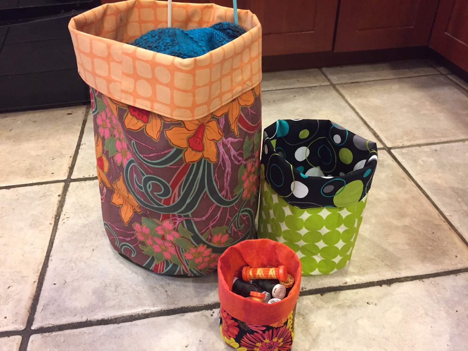
I made two more of the fabric buckets yesterday, so here are all three.  I've put my current knitting project in the largest one and threads in the little one, but can't figure out anything for the middle one. These are fun to make, but I don't think I'll make more unless I can figure out additional uses. Small kids' toys would be good, of the sort where they get dumped out for play; the buckets might not be as practical as a rigid plastic crate, but they're a lot cuter. Most of my own clutter is contained (to the extent that it is) in shallow containers where I can see everything that's there; the buckets are deep, so not as good for visibility. Nonetheless a fun project, and quick.  It took me about 40 minutes to sew one bucket; longer than that to choose fabrics and cut out the the pieces. The original tutorial is here, and a variation that includes an inside pocket for knitting needles and knitting accessories for the big bag is here. By the way, the bigger the bucket, the easier it is to do the sewing, but none of them are difficult.