December 26, 2011

Chinese silk brocade


I visited China in December 2007--a great trip all around.  In addition to the usual sites, I went to fabric markets in Beijing and Shanghai.  I came away with a small suitcase full of Chinese silk brocade. When I was an undergraduate at the University of Chicago, I would sometimes to go Marshall Field's and browse in some departments just to see beautiful things, and one of the displays I liked to look at was a table full of bolts of Chinese silk brocade.  Some 20 years later, I went back to visit them again, but alas, the fabric department was gone.  I think I carried that image of the fabrics with me still, and when I saw stalls filled with these silks, at extremely low prices (especially after the expected bargaining), I found myself buying one piece after another.  But then what to do with them?  I had visions of making wall hangings of some sort, but started out with smaller things.  The silk was very difficult to work with. I put it aside.  I tried something else.  Still didn't work out.  I made an occasional small gift (bookmarks, needle case), but kept thinking about what else I might do on a larger scale.  Finally, I got the idea to make a scarf, and this worked out well.  The photo above is a pile of several I've made.  Here they are hanging next to each other:


And then another idea occurred to me--a way of using large pieces of the fabric.  I could piece very large rectangles into a quilt top.  (My first thought was to cut the fabrics into blocks about 9x12", but decided I'd rather keep a large expanse of individual fabrics.)  I played today with the lengths of fabric that I have, and so far I like this layout (just pinned up roughly, selvages not yet cut off).  This is about 60x80":


I will ponder it some more, but I think this might work.  I'm thinking of using a somewhat puffy batting (Dream Puff), cordoroy on the back, and quilting it in large (10") squares.  Your thoughts much appreciated!

Here's the fabric I'll still have left:

December 20, 2011

Back or front?


I intended this improvised log cabin to be the back for a baby quilt I pieced a couple of weeks ago:

 
This is the "Posh Tot" pattern from Blue Underground Studios.  Love this pattern--I've had it for a long time, but just got around to making a version.  It goes together very easily.  

But the more I looked at the improvised log-cabin back I'd made, I more I wanted it to have a life of its own.  So, I made it a front instead, gave it a plain blue back, and quilted it in squares, which I haven't done before.  I like it so much, I'm keeping it for myself.  Here it is in the multi-purpose room where I have a couple of desks as well as our washer/dryer.


a close up of the quilting:


And here's what went on the back of "Posh Tot"--made from fabric I had on hand, so no purchase necessary.  Quilted with straight-line horizontal stitching.  (Seems I forgot to get a shot from the front before I sent it off to the new baby.)

About backs/fronts:  There have been other backs that I've shown people, and gotten the response, "That should be a front!"  I started piecing backs after being inspired by Mary Beth Clark's creations--almost all of her quilts have a lively back pieced together from fabrics leftover from the front, plus other fabrics from her stash.  I know she gets this comment frequently too.  This is the first time I've actually changed an intended back to a front.  Why this time?  I think because this "back" was not only a viable composition on its own (true of other backs that I've kept on the back) but that it actually turned out to be of more interest to me than the front (even as much as I like the front). 

About the beautiful fabric in the Posh Tot quilt--both were purchased at the Quilted Fox, a fantastic quilting store in St. Louis.  
Red with square dots: Moda Fabrics Sherbert Pips by Anella Hoey in Cherry
Paisley: Westminster/Rowan Fabrics, Marylebone by Liberty Art Fabric, Fordwych in Rust


October 1, 2011

Shades of gray-2


Here are the results of my experiment with dyeing three different grays, looking to dye fabric for the binding of my "Mod Mosaic" quilt.  A sample quilt block is at top.  From right: Kona medium gray, Kona ash (these 2 are commercial fabrics I could buy), then (using Carol Soderlund's formulas) Earth 102 (too blue), Basic 223 (this could be good), and Bright 212 (too green).  It's difficult to get a gray that doesn't lean towards one or another color.  I should have also tried a lighter value of Carol's basic black (Earth 566).  I think I'll audition these as actual binding strips once I have the quilt quilted, and if I'm not happy, try 566 also.

The next photo is for any dyers who might be reading.  I treated all three dyed fabrics exactly the same way, but the Bright 212 separated into green and pink instead of coming out gray.  Any thoughts on what I did wrong? (Double click on image to see the problem.)
 

September 17, 2011

Shades of gray


I've finished piecing the top for my Mod Mosaic quilt, and while it was up on the design wall, I auditioned fabrics for binding.  The logical choice given the design would be white, which looks very good, but I can't see putting a white binding on a quilt that is intended for use rather than to be hung for display.  I tried orange (bad) and green (OK, but not great).  As luck would have it, my friend Amy Walsh of Blue Underground Studios, was in town on Thursday to give a talk to the local quilt guild, and we had a few hours before and after to talk quilts.  She looked at the quilt with me and suggested gray, which looked very good.  I have some Kona ash that would work (this is what I auditioned), but we both thought a somewhat darker shade might look even better.  Kona has a medium gray I could order, but I decided to try dyeing my own instead.  Here are three pieces that are batching now.  For those who have Carol Soderlund's sample books, these are : Basic 223, Earth 012, and Bright 212.  In a couple of days, I'll post results.

By the way, Amy is a great speaker!  I highly recommend her for guild events, whether a program or a workshop or both.  Her website is above, and you can follow her blog here.

September 9, 2011

Mod Mosaic wedding quilt

Here is a quilt in process based on the "Mod Mosaic" pattern/process by Elizabeth Hartman. I gave the wedding couple a choice of a few different patterns, and they chose this one. They also liked the colors and types of fabrics that Elizabeth used, but they added in orange and greyish-brown to her palette of yellow, green, and grey. This quilt has been a lot of fun to work on--all improvisational piecing, which I enjoy. But now I think I know why Elizabeth did this as a pillow rather than a quilt. . . It is time consuming to sew the white strips between every piece of fabric. I have not begun the process of moving the blocks around to find a pleasing balance of color and value. I think I'll make about 6 more blocks and then start juggling. Here's a detail photo. As always, double-click on the image for a better view.

September 7, 2011

Dye experiments with less expensive fabric

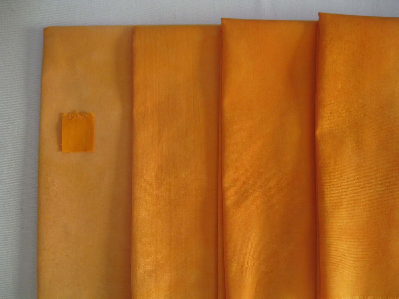
(double-click on the photo for a close-up and a much better version of the color) This post may be too technical for anyone not interested in dyeing fabric. Feel free to skip! Last year I tried out various "pfd" fabrics (prepared-for-dyeing, with no surface treatment that would interfere with the dye), and settled on Kaufman Patina for my standard fabric to dye. I purchase it online from Fiber on a Whim, and I went through 20 yards of it this summer. I chose this fabric because it has a beautiful hand, as well as taking up the dye very well, and it is well-suited for hand-applique as well as piecing. I understand that it is the base fabric used for Kaufman batiks. This is all good, but with cotton prices going up, I'd like to have a supply of a less expensive material as well, that I could use strictly for piecing and that I would feel more free to experiment with than a fabric that costs over $7/yd. If it was something I could get locally at JoAnn Fabrics, which regularly puts out 40% off coupons, that would bring the price down significantly. And if I could find a 90" fabric that would dye well, that would be convenient for the backings of quilts. So, I did a trial on four fabrics. Besides Kaufman Patina, I dyed regular white Kona cotton (not pfd), Kona Premier muslin (bleached), and Legacy Supreme muslin (bleached); the last two were 90" wide. I had high hopes for the two muslins, both of which are a higher thread count than ordinary muslin. The results are in the photo at the top. I put them from lightest on the left to darkest on the right, though the two fabrics on the right are quite close. To my surprise, the winner was the Kona cotton. The little square of orange on top of purple on the right is the sample square from Carol Soderlund's class; it's indistinguishable from the color I got on the Kona, and it disappears on the next one also, which is Kaufman Patina. The 3rd best was Kona premier muslin--not quite up to the value of the sample, but good enough that I would consider using this fabric, adjusting the amount of dye used. The fabric itself is not anything as nice as the Patina, but it is lighter and a higher thread count than the regular Kona. Legacy Studio came in last--so pale that it's not worth using this again. So, I am certainly not abandoning the Patina, but I feel I have a couple of other options as well. I may look for some other white fabric to try as well. Oh, I did "scour" the non-pfd fabrics before dyeing; for scouring, I washed in hot water with soda ash and Synthrapol). Here's a photo that shows the class sample on top of the Kona cotton (best in the trial, furthest to right):
And here's one that shows it on top of the Legacy Studio (worst in the trial, furthest to left):

Added 10-4-11:  Here is an additional trial that I finished today.  On the left is the Kaufman Patina.  In the middle is Roclon Bamboo-Cotton, scoured before dyeing, and on the right is the same Bamboo-Cotton, but not scoured first.  The little square sample from Carol Soderlund's class is on the middle piece--it blends in so well that it's very difficult to see.  If you double-click to enlarge the photo, you'll see little tufts of selvage at the top edge of it.  Someone on the MX-Dyers list mentioned that they didn't scour this fabric before dyeing, even though it's not marketed as PFD (prepared for dyeing).  You can see that the results are close to identical with the scoured sample in the middle.  (More mottling on the two bamboo/cotton pieces because I didn't feel like taking the time to manipulate the fabric as much as I did on the earlier samples.)  The bamboo/cotton has a lovely feel to it.  It is a little heavier than the Kaufman Patina, so probably wouldn't work as well for applique, though I haven't tried it.  I was eager to try this fabric, because it is more than $2/yd less than the Kaufman.  But alas, it seems that JoAnn Fabrics is no longer carrying this by the bolt, and that Roclon may have stopped producing it.  Well, at least I have the Kona option available.

August 20, 2011

Table runner-rectangular appliqué


I like to have handwork with me when I travel. I put together these simple blocks, playing with solids and scraps of batik. I intended to make a baby quilt, but I'm having too much pain in my hand from doing applique, so I called it quits and made a table runner (12 x 32"), which I'm quite happy with. I cut the batik rectangles by hand, and I like the way some sides are a little curvy, and angles are not necessarily 90 degrees. It's also a satisfying way to use up bits of fabric on hand. I'm going to try out some methods of machine applique, and perhaps do more of these blocks, but eliminating the hand sewing.

I tried out various fabrics for binding, and like this one that has both lavendar and gray in it; not a fabric that appears in the blocks, but it ties things together nicely. (Click on any of the photos for a larger view.)


When putting together the blocks, I just paid attention to the color of the solid background and the colors and shapes of the two rectangles on that particular block. Then, when putting together the table runner, I moved the blocks around until I found something pleasing. If I do this again, I think I would try laying out the solid blocks, and then laying out the rectangles on top. More work up front, but a more direct way to the composition.


Again, I did just the straight-line quilting, about 5/8" apart. Done!